Jun 30, 2025
(Notebooks and other code available at: https://github.com/csdurfee/hot_hand.)
Last time, we found that there are many players like LeBron, where their FG% is higher when they've missed most of their last 5 shots than when they've made most of them. However, most players don't have enough attempts when they've gone 0 or 5 out of their last 5 for a good statistical analysis.
So instead I will be looking at a binary split -- I will call a player cold when they've made 0, 1 or 2 of their last 5 shots, and hot when they've made 3, 4 or 5 of their last 5. Most players have a FG% between 40 and 60%, so this nicely splits them into times when they're shooting better than average versus worse than average.
Anthony Edwards
Anthony Edwards ("Ant") is particularly unstreaky for a young player. He's only completed 5 seasons in the league, but has the 5th biggest z score of the last 20 years. He could definitely catch LeBron someday.
Ant has the LeBron-like pattern of FG% trending downward when he's hot. He doesn't have anywhere near the volume of LeBron, so the spike at 20% (1/5) might just be noise. But overall, he shoots worse when he's been shooting well.
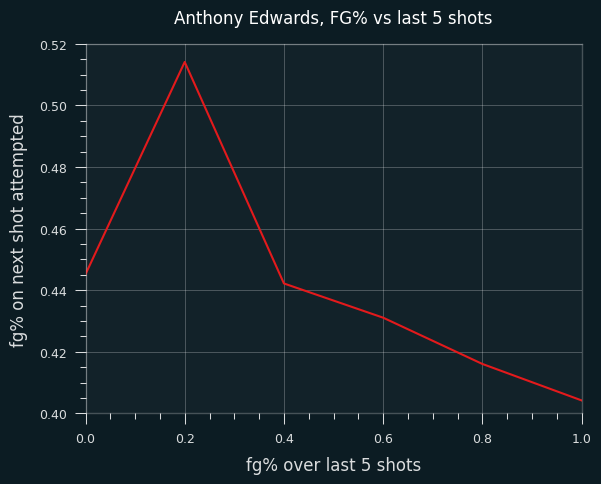
The trend appears to be due to shot selection. He takes far more above the break 3 pointers when he's hot than when he's cold. The additional 3 point attempts come at the expense of shots in the restricted area.
Here are the changes in tendencies:
| BASIC_ZONE            |   hot |   cold |   diff |
|:----------------------|------:|-------:|-------:|
| Above the Break 3     |  41.5 |   31.7 |    9.8 |
| Corner 3              |   3.6 |    4.8 |   -1.2 |
| In The Paint (Non-RA) |  13.4 |   14.6 |   -1.1 |
| Mid-Range             |  14.1 |   12.2 |    1.9 |
| Restricted Area       |  27.4 |   36.7 |   -9.4 |
Of course, this would be justified if Ant shot above the break 3's better when he's hot, but he doesn't. He makes 37% of his above the break 3's when he's cold but that drops to 34% when he's hot. So he's trading restricted area shots, with an expected value of .601 * 2 = 1.202 points, for above the break 3's, with an expected value of .34 * 3 = 1.02 points.
Here are the changes in FG percentages. His FG% on corner 3's goes up, but it's on insignificant volume:
| BASIC_ZONE            |   hot |   cold |   diff |
|:----------------------|------:|-------:|-------:|
| Above the Break 3     |  34   |   37.1 |   -3.1 |
| Corner 3              |  45   |   33   |   12   |
| In The Paint (Non-RA) |  40.8 |   34   |    6.8 |
| Mid-Range             |  36.3 |   34.8 |    1.5 |
| Restricted Area       |  60.1 |   65.4 |   -5.2 |
The rest of the league
I looked at league-wide shot selection in hot/cold situations. I restricted to the last 10 seasons, since the rise of the 3 pointer has dramatically changed shot selection. Here are changes in shot selection for all players:
| BASIC_ZONE            |   hot |   cold |   diff |
|:----------------------|------:|-------:|-------:|
| Above the Break 3     |  22.1 |   22.3 |   -0.2 |
| Corner 3              |   6.2 |    7   |   -0.9 |
| In The Paint (Non-RA) |  15.8 |   15.3 |    0.4 |
| Mid-Range             |  25.3 |   23.5 |    1.8 |
| Restricted Area       |  30.7 |   31.8 |   -1.2 |
The mid-range shot is the lowest value shot type, so it's notable that the rate goes up when players are hot. These additional mid ranges come at the expense of Corner 3's and Restricted Area shots, the two most valuable types of shots.
As before, changes in shot selection could be justified if players actually shoot differently based on their last 5 results, but they don't. Here are the changes in shooting percentages (hot minus cold) for all players:
| BASIC_ZONE            |   hot |   cold |   diff |
|:----------------------|------:|-------:|-------:|
| Above the Break 3     |  34.7 |   35   |   -0.3 |
| Corner 3              |  38.4 |   38.9 |   -0.4 |
| In The Paint (Non-RA) |  41.7 |   41.2 |    0.5 |
| Mid-Range             |  39.8 |   40.1 |   -0.3 |
| Restricted Area       |  62.7 |   60.7 |    2   |
For 3 out of 5 shot types, the hot FG percentages are lower than the cold ones. Combined with the changes in shot selection, I think there's evidence that the league as a whole is scoring less efficiently because of the false belief in the hot hand.
The data says that players are essentially trading Restricted Area (.627 * 2 = 1.25 points per shot) and Corner 3 (.384 * 3 = 1.15 points per shot) attempts for Mid-Ranges (.398 * 2 = .796 points per shot) when they think they've got the hot hand. That's clearly bad! If it happens once a game, that's 38 points a year lost, which might be enough to swing a game or two.
The change in restricted area and in the paint (non-RA) FG% is intriguing, but if the hot hand did exist, wouldn't we see it on 3 point or mid-range shots, rather than restricted area shots? The announcer doesn't say "he's heating up" after a guy has made 3 layups in a row, they say it after 3 longer range shots in a row, right?
Higher volume players
I decided to focus on players with at least 1000 streaks, which leaves 630 players. Collectively, they are responsible for 84% of all shots in the NBA over the last 20 years.
Their FG percentages are, on average, 1% lower when they are hot than when they are cold.
68% of them shoot worse when they're hot than when they're cold, which is a pretty dramatic split.
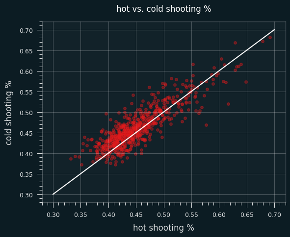
Here's a plot of the difference between hot and cold FG% versus z-score:
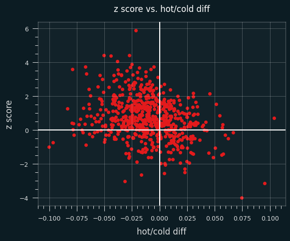
Players with negative values on the x axis shoot better when they're cold, and positive values shoot better when they're hot.
Now, there should be some correlation between z-scores and hot/cold shooting tendency. I've shown simulations where a tendency to shoot better cold produces unstreaky results (skewed towards positive z scores), and better hot will produce streaky results (negative z scores). So there should be more dots in the upper left and bottom right quadrants compared to the other diagonal.
But if players behaved by coin flips, we should see roughly the same number of players with positive and negative z scores, and roughly the same number of players who shoot better when they're hot and better when they're cold.
I simulated all 3.5 million shots by these players, using their career average FG% for every shot. So any streakiness or unstreakiness is going to be totally random. As you can see, the data is much less spread out across both the X and Y axis.
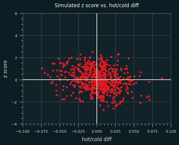
Here are the crosstabs from the simulation:
|
better cold |
better hot |
margin |
| positive z |
178 |
135 |
313 |
| negative z |
112 |
210 |
322 |
| margin |
290 |
345 |
|
As promised, the marginal values are pretty close to one another. That's what happens when "better hot" vs. "better cold" and "positive z" vs. "negative z" are determined purely by chance.
Here are the actual crosstabs. The marginal values are much more imbalanced.
|
better cold |
better hot |
margin |
| positive z |
343 |
126 |
469 |
| negative z |
88 |
78 |
166 |
| margin |
431 |
204 |
|
Things to note:
- 68% of the players shoot better when they're cold.
- 74% of the players have a positive z-score.
- Even among players with a negative z score, the majority of them shoot better when they're cold.
- Even among players that shoot better when they're hot, the majority of them still produce results that are less streaky than expected by chance.
That's all super weird!
As always, these are just general trends. There are 78 players in the "better hot" + "negative z" box, and there should be around 210 players. We can't really say which players are the 130 "missing" players, though.
That's all I've got on the hot hand in the NBA for now. I think I understand it a lot better now, and I hope you do, too.
Jun 18, 2025
(As usual, all code and notebooks are available at https://github.com/csdurfee/hot_hand)
Last time, we saw that LeBron James was by far the un-streakiest player in the NBA over the last 20 years and found out that it's at least partly caused by shot selection. He takes both lower percentage shots than average when he's shooting well and higher percentage shots than average when he's shooting poorly.
LeMartingale
I got the question of why it's OK to use a player's overall FG% to gauge their streakiness. We know that every shot a player takes has a slightly different level of difficulty, and thus a different probability that it will go in. Shouldn't that affect the streakiness?
It's a good question. Let's say you've got a bag with 2 types of coins inside. One of them comes up heads 40% of the time, the other comes up heads 60% of the time. You can't tell which is which. If you pick a coin randomly out of the bag and flip it, what are the chances, on average, it comes up heads?
It's 50%, right? The selecting of the coin and the flipping of the coin are two independent steps. We can multiply the probabilities at each step together, so the overall chances of heads are (.5 * .4) + (.5 * .6) = .5. If we kept randomly selecting from the bag and flipping a coin, the results would be indistinguishable from just flipping a single fair coin over and over.
In math, this is known as a Martingale. Previous outcomes don't give us information about the next event. (More in depth explanation here). That's different from LeBron. We know he essentially chooses the 60% heads coin when he's been getting a lot of tails recently, and the 60% tails coin when he's been getting a lot of heads recently.
LeSimulation
If I create a simulation of LeBron James that uses his exact shooting tendencies and FG percentages, and the shot selection is totally random, it shouldn't show any streaky or unstreaky tendencies beyond expected by chance. Let's see what LeSimulation looks like.
At the end of the last edition, I got LeBron's shooting stats:
Above the Break 3        0.344598
Backcourt                0.058824
In The Paint (Non-RA)    0.401369
Left Corner 3            0.394799
Mid-Range                0.379890
Restricted Area          0.720138
Right Corner 3           0.370370
And shooting tendencies (what percent of the time he takes each type of shot):
Above the Break 3        0.204940
Backcourt                0.001160
In The Paint (Non-RA)    0.109652
Left Corner 3            0.014431
Mid-Range                0.267715
Restricted Area          0.386442
Right Corner 3           0.015660
The simulation randomly chooses a shot type, based on the actual tendencies, then attempts a shot at the corresponding FG%.
The z-scores look like they should -- mean is very close to 0, standard deviation close to 1. No streaky/unstreaky tendencies, as promised. No evidence that shot attempts were at different FG%.
LeSimulation 2 - last 5 FG%
My next simulation uses LeBron's FG% over his last 5 shots. We've seen he shoots the best with 0 makes in his last 5; the worst with 5 makes in his last 5. The simulation uses his exact percentages at each level. For the first 5 shots of every game, it uses his career FG%.
I ran the simulation 1,000 times. Here are the z-scores:
As expected, this simulation is pretty un-streaky:
count    1000.000000
mean        1.635843
std         0.985464
min        -1.665389
25%         1.001550
50%         1.623242
75%         2.346864
max         4.509869
It's still not nearly as unstreaky as the man himself, though -- Lebron's z score of 5.9 would be way bigger than the largest value in 1,000 simulations (4.5). So he'd still be an outlier compared to these simulated un-streaky players.
LeSimulation 3 -- No resetting streaks
What about a fake player where the streaks don't reset between games? That should make the simulated player even more unstreaky.
In this version of the simulation, every shot will be influenced by the FG% of the previous 5 shots, even if they happened in the previous game(s).
Here are the corresponding z-scores:
count    1000.000000
mean        2.179821
std         0.963330
min        -1.033468
25%         1.536542
50%         2.203681
75%         2.865350
max         5.073167
So, the mean went from 1.6 to 2.2, and the max z score went from 4.5 to 5.1. That's still not nearly unstreaky enough to match LeReal LeBron, but at least it's closer.
It's possible that if we tracked the last 7 shots, or 9, instead of 5, we would see even more of a dramatic change in FG percentage. Or there's some other factor I haven't considered that is adding unstreakiness, such as the fact that his FG percentage tends to go down the more shots he's taken in a game.
DoppLeGangers
I was curious if I could find similar players to LeBron. There's a good way to do that, but I wanted to try my own way first. I found players where, like LeBron, their FG% steadily declines the more shots they've made out of the last 5. There are 18 such players in the 2004-2024 years: Karl Malone (his last season), Grant Hill, Ben Wallace, Eddie House, Michael Redd, Jarvis Hayes, Andres Nocioni, JJ Redick, Nicolas Batum, Goran Dragic, DeMar DeRozan, Patrick Beverley, Marcus Morris Sr., Bradley Beal, Kelly Oubre Jr., Norman Powell, Donte DiVincenzo, and Landry Shamet.
Overall, these players have a mean z-score of 1.47, which is pretty impressive, but except for Goran Dragic, there isn't much overlap over the players with the highest overall z scores. 18 players is a pretty small sample size, as well.
I also looked at a broader set of players where at least 4 out of the 5 comparisons were decreasing. This gave 180 players, with an average z score of 1.0.
LeRight way
The right way to identify LeBron-alikes is probably to use a similarity metric that I didn't invent. The fg percentages after 0,1,2...5/5 makes are sort of like a probability distribution.
In statistics and machine learning, we are often fitting a theoretical distribution to the actual observed data. Is it a good representation of the observed data? Do their distributions have the same sort of shape? The standard measure is relative entropy, also known as KL divergence.
If I normalize the shooting percentages and compare them to LeBron's, players with a low relative entropy should show the same tendency to shoot better when they're shooting worse than average over their last 5, and vice versa.
For example, LeBron's last 5 percentages are:
0    0.564612
1     0.50712
2    0.505937
3    0.496538
4    0.473849
5    0.464052
By normalizing them, they act like a probability distribution (they all add up to one) but still have the same relative proportions.
0    0.187448
1     0.16836
2    0.167968
3    0.164847
4    0.157315
5    0.154062
The normalization also corrects for the fact that shooters have different overall FG percentages.
Normalized values can then be compared to other players' values. The lower the entropy, the more similar their shapes are.
I also calculated the Jensen-Shannon distance, which is like relative entropy, but symmetrical (distance(le_bron, le_other_guy) = distance(le_other_guy, le_bron)).
The closest guys to LeBron by this measure are CJ McCollum, Terry Rozier, Andrea Bargnani, Marcus Morris, Richard Hamilton, Nikola Vucevic, Zach Randolph, Lauri Markkanen, Kawhi Leonard, and Kevin Huerter.
Since Richard Hamilton had the least streaky game in the last 20 years, it's not surpring to see him. But except for Randolph and Vucevic, none of the top 10 had exceptional z scores, though they were all positive.
The Jensen-Shannon distance results were extremely similar to entropy. It agreed exactly with the entropy on 73 of the top 100 players. The average z score for those players was 1.16, versus 1.15 for entropy. So, in aggregate, both were better than my homegrown metric at identifying unstreaky players.
This graph shows the shape of the 10 players most similar to LeBron. They all have the same downward trend.
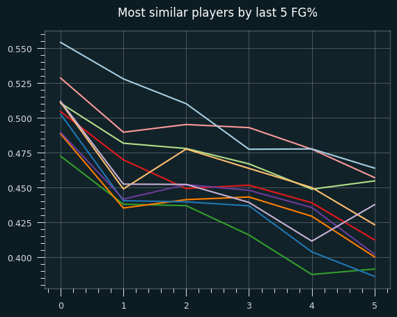
I haven't looked at whether the reason for the trend in last 5 FG% is due to shot selection for these other players, which is probably the interesting part. Some of the players flagged here are inevitably due to chance. It's based on six 50/50 measurements, so 1 in 64 players would get flagged as "LeBron like" even if the data was randomly generated.
None of my queries here turned up the un-streakiest players like Luka Doncic and Anthony Edwards. Whatever causes their extreme unstreakiness (beyond randomness) must be different from LeBron's tendencies. Stay tuned!
Jun 12, 2025
All code is available at https://github.com/csdurfee/hot_hand.
In previous installments, I've shown that NBA players are, as a whole, less streaky than they should be. This is apparent in game-level data, and more obvious looking at multi season trends.
So far, I've only looked at the past four seasons of the NBA. I decided to look at every single shot taken in the NBA regular season from 2004 to 2024.
Data is taken from https://www.kaggle.com/datasets/mexwell/nba-shots
The streakiest games of the past 20 years
As I showed in the last installment, there are two ways of measuring how relatively streaky each individual game is. We can use the normal approximation from the Wald-Wolfowitz test, or we can calculate the percentile ranks from the exact probabilities. The differences are negligible for whole seasons or careers, but they can be significantly different for individual games.
They give different answers to what is the streakiest game of the past 20 years. According to percentile rank, the streakiest ever was Cedi Osman, who in 2022 missed 10 shots in a row, followed by making 6 shots in a row, for an equivalent z-score of -3.6.
According to the normal approximation, the streakiest game ever was Chris Bosh in 2007, who made 15 shots in a row before missing his final 4. Bosh doesn't even make the top 5 by percentile rank.
Other strong performances include Andre Iguodala, who had 16 straight misses followed by 3 makes in 2008, and Willie Green, who had 5 misses followed by 12 makes. The sheer length of those streaks is impressive, but to maximize the number of expected streaks, there need to be similar numbers of makes and misses. A game with 5 makes and 5 misses has a maximum of 10 streaks. A game with 15 makes and 4 misses, like Chris Bosh's 2007 performance, has a maximum of 9 streaks.
Kobe Bryant's final game in the NBA also deserves mention. He went an extremely streaky 22 for 50, earning the highest number of expected streaks in the data I have (25.64): 11111000100110000101110000101100001100001111100000
The least streaky games
The least streaky was by Richard Hamilton in 2006, who had 10 makes and 13 misses, no two makes in a row: 01001010101010010101010
Kyrie Irving, Dejounte Murray (previously covered), and Kevin Martin also had strong showings.
The un-streaky GOAT
The 4th most un-streaky game of the past 20 years belongs to LeBron James. LeBron scored 31 points in an easy win over the SuperSonics in 2005. Aside from 2 makes in a row at the start of the game, he perfectly alternated makes and misses the rest of the game: 110101010101010101
In the 20 years of shot data I analyzed, LeBron stands out as by far the most un-streaky player. Here are the career z scores of every player from 2004-2024:
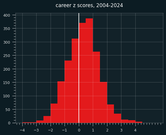
LeBron can't even be seen on this chart. He is in a world of his own, with a career z score of 5.9. We have to go to the Jon Bois style scatterplot with one extreme outlier in the corner:
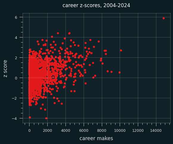
If this were a Youtube video, imagine me zooming in on the solitary dot in the upper right while I play the hook from Baker Street on a kazoo.
(While we're here, note the strong trend towards high volume shooters having positive z-scores. There is no player with over 6500 makes and a career negative z-score. Every single one of the ~25 people to hit that mark have a positive z-score.)
What LeBron has done is really, really unlikely by chance alone. The odds are around 1 in 550 million. That puts him in the 99.9999998th percentile.
If all 8.2 Billion people on the planet had LeBron's NBA career, taking over 29,000 shots like he has, at the same FG% he did, we'd expect 15 people to be that unstreaky or more. That's elite company. Not only is LeBron James the LeBron James of basketball, he's also the LeBron James of being unstreaky at shooting the basketball.
As both the most unstreaky player of all time, and the most prolific scorer of all time, LeBron James makes a perfect test subject for understanding unstreakiness.
He's had 15,159 shooting streaks in his career so far, which is 504 more streaks than expected. Say LeBron takes a low percentage shot because he feels like he has the hot hand. It might be a worse shot than usual, but it's probably not dramatically worse than his regular shot. Maybe it's a shot that goes in 40% of the time instead of 55%. So for him to have 500 more streaks than expected, that's potentially thousands of choices LeBron has made over his career that increased the likelihood of streaks getting broken.
Streak lengths
I simulated LeBron's career 1000 times and compared the frequency of streak lengths to his actual career. Here are his actual streaks as a percentage of the simulated frequencies:
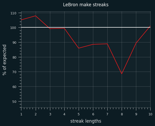
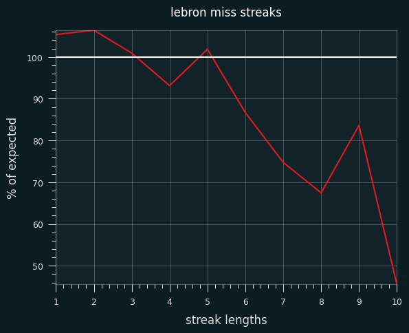
He has slightly more 1 and 2 shot make/miss streaks than expected, and fewer streaks of 5-6 or more. It's notable that it cuts both ways
Previously I discussed that players could cause unstreakiness because they go get a bucket when the shot isn't falling -- in other words, they take higher percentage shots when they're on a cold streak. They might try to draw contact from a defender, and if they do get fouled, it only counts as a shot attempt if the shot goes in, which makes it easier to break streaks of misses. On the other hand, they might take risky "heat check" shots when they are performing relatively well because they feel like they can't miss.
To capture hot versus cold, I decided to track the FG% over the previous 5 shots in the game. So, it's undefined for the player's first 5 shots of the game, then defined from the 6th on. Because LeBron is such a high volume scorer and has been for so many years, that's still a lot of data to look at.
here are the number of shot attempts by LeBron by each "last 5" shooting percentage.
NaN    7460
0.6    7222
0.4    6906
0.8    3518
0.2    3090
1.0     612
0.0     503
I have defined cold as making 0 or 1 of the last 5 shots, and hot as making 4 or 5 of the last 5. This was a semi-arbitrary choice based on make/miss streaks longer than 5 happening less frequently than chance would dictate. It also matches how my simulated un-streaky player works.
There's a clear trend. LeBron's FG% is 10% higher when he's missed his last 5 shots than when he's made his last 5.
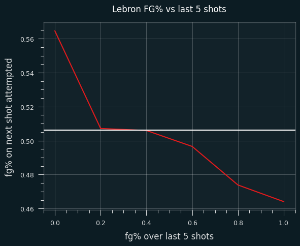
That's a pretty big swing.
LeBron is un-streaky due to shot selection
What's behind this trend?
LeBron takes a lot more high percentage shots when he's cold versus when he's hot.
Change in shot rates (cold minus hot):

Above the Break 3       -0.119694
Backcourt               -0.001659
In The Paint (Non-RA)    0.023637
Left Corner 3            0.000429
Mid-Range               -0.056841
Restricted Area          0.159098
When he's hot, he takes 29% of his shots in the restricted area (right near the basket, which is his highest percentage shot). When LeBron's cold, that jumps up to 45% of his shots. When he's hot, 29% of his shots are above the break 3's, but he only takes that shot 17% of the time when he's cold.
LeBron's FG% for each type of shot doesn't change much between times when he's hot and cold and in between. He's a tiny bit better at corner 3's when he's cold vs. hot, but that's on very small volume. LeBron is usually attacking the middle of the court, not standing in the corner.
LeBron's actually slightly worse at his three most common shot types (above the break 3, mid-range, restricted area) when he's on a cold streak. He's not un-streaky because he suddenly becomes a better shooter when his shot hasn't been falling. He chooses to "go get a bucket" and seek out a higher percentage shot.
Change in FG% (cold minus hot):

Above the Break 3       -0.036856
In The Paint (Non-RA)    0.001647
Left Corner 3            0.026525
Mid-Range               -0.023709
Restricted Area         -0.013754
Right Corner 3           0.157949
It looks like it cuts both ways. LeBron takes lower percentage shots when he's shooting well, and higher percentage shots when he's shooting poorly over the past 5 shots, compared to his average performance.
Shot order trends
LeBron's FG% appears to trend downward with the more shots that he takes in a game. The white line is his career average:
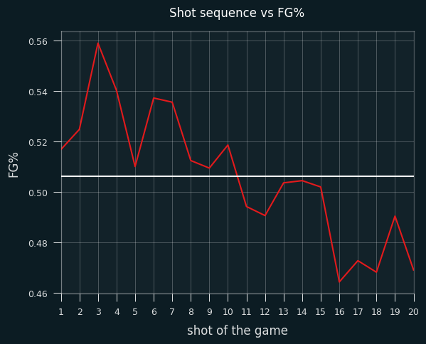
I haven't looked into it yet, but I suspect this is partially due to LeBron often taking the last shot of the game. Final shots of the game should be harder than average if it's a close game. Everybody knows the ball's going to LeBron for the final shot, so the defense is keying in on him. I'll save that for another installment, though.
Other unstreaky guys
Kyle Kuzma, Julius Randle, Elton Brand, and Anthony Edwards are all in the 4+ z score club, with Luka Doncic, Giannis, John Henson, Goran Dragic, and Jordan Poole also in the top 10. Anthony Edwards is the most notable to me, because he's only played 5 seasons.
Jordan Poole is notable because he's kind of the whole reason I kept working on this project. Fans would probably think of him as a streaky shooter who can get "red hot", but he's actually one of the un-streakiest guys in the league. I feel like I know the whole story now: he behaves like the hot hand is real, but it isn't, and so he's less streaky than he should be, because this misplaced self-confidence leads him to take knucklehead shots. It's just a product of how our brains remember things. We remember him "getting hot" then taking some crazy shot that goes in. We, and he, don't remember him ruining a streak of makes that would happen by chance alone because of his dodgy shot selection.
League-wide trends
I went back and did the same analysis for every non-LeBron shot over the last 20 years. The league as a whole doesn't show the same trends that LeBron does. FG% isn't correlated with number of makes out of the last 5. Here are the shooting percentages, graphed on the same scale as the one I used for LeBron:
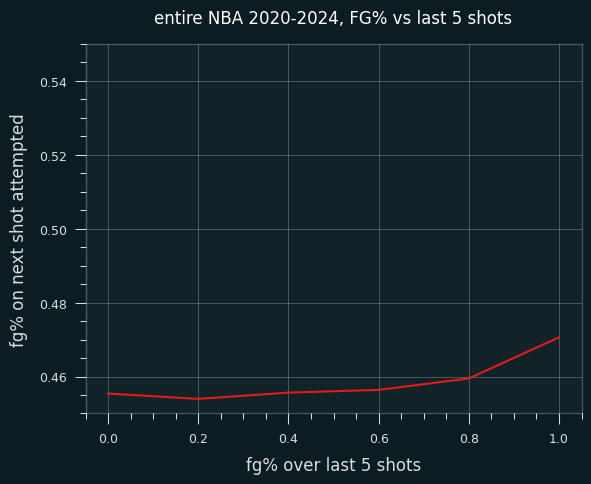
There's a very slight uptick when a player has made all 5 of their last 5 shots in the game, but otherwise it's remarkably flat.
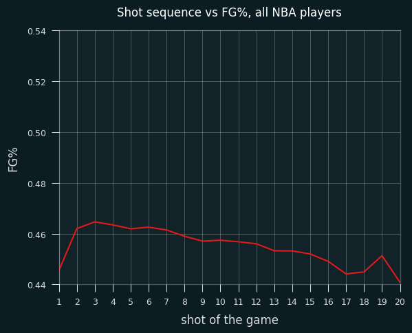
Looking at the order of of shots taken, the NBA as a whole shows the same rough trend as LeBron's, though less dramatically. Lower FG% on the first shot of the game, and FG% slowly going down as the number of attempts goes up. (Again, I've locked the Y axis to match the scale of LeBron's.)
Streaky guys
There's only one super streaky guy in the last 20 years, Ivica Zubac, with a Z score of -3.98. That's pretty crazy, but still plausibly within the realm of chance.
The other guys with extremely streaky behavior on high volume are Dwight Powell, Nemanja Bjelica, Erick Dampier, Aaron Nesmith and Rudy Gobert, with z scores around -3. Most of those guys are big men who aren't primarily scorers. My hunch is that this is due to sequences where a big man will miss a shot close to the basket, get their own rebound, miss another shot, and so on. If so, these types of players will have longer miss streaks than make streaks.
However, I don't think there's a need to deeply analyze the streaky players at this point, because it could be due to chance alone. The big mystery has always been why there are way more un-streaky players than streaky ones. Both types should exist.
Zydrunas Ilgauskas was a longtime player for the Cleveland Cavaliers who was nicknamed "The Big Z". However, his career z score was only 1.49, so I don't think it's a statistics based nickname. Which is too bad, because the game could use some of those. "Small Z" for Ivica Zubac's career -3.98 score might be confusing to people, unfortunately.
Final thoughts
If I were LeBron's coach, I'd try to talk him out of believing he has the hot hand, because acting like it exists has caused him to be the most lukewarm handed player of the past 20 years.
Shot selection shouldn't change for the worse just because a player is shooting well. LeBron on a hot streak has roughly the same shooting percentages for each type of shot as when he's not on a hot streak, or when he's on a cold streak.
His innate shooting skill doesn't change, he just takes lower percentage shots, perhaps believing they're not really lower percentage shots when he's feeling it. It's feel vs. real, as it often is in sports, and life in general. Regardless of feel, they're still worse shots than he would normally take.
Going the other way, it's like the old joke -- why don't they build the whole airplane out of the black box? If LeBron has a higher shooting percentage when he's cold and decides to "go get a bucket", and that works, why doesn't he just do that on every play?
I don't have a statistical answer to that question, but I do have a common sense one. In sports, part of the game is making the other team have to handle as many possibilities at a time. A quarterback in football shouldn't throw deep passes every play, because that's easy to defend when that's the only possible outcome. A baseball pitcher shouldn't just throw their best pitch every time, because that's easy for the hitter to anticipate.
Likewise, LeBron probably shouldn't just put his head down and "get a bucket" every possession, because that's easy to plan against. LeBron wouldn't be an all time great if he only shot in the restricted area. While 3 pointers and midrange shots may have a lower expected value versus driving to the hoop, they force the defender to worry about LeBron no matter where he is on the court. LeBron can shoot or pass or just dribble right past the defender at any place on the court.
As a hoops fan and a data nerd, I think trying to create a high percentage shot isn't a bad thing to do when a player is struggling in a game. That's especially true if a player can become less engaged in other aspects of the game when they are shooting poorly. A player taking low percentage heat check shots because they are shooting well is much less forgivable, and should be coached out of players.
Jun 08, 2025
(Notebooks and other code available at: https://github.com/csdurfee/hot_hand)
What is "approximately normal"?
In the last installment, I looked at NBA game-level player data, which involve very small samples.
Like a lot of things in statistics, the Wald Wolfowitz test says that the number of streaks is approximately normal. What does that mean in practical terms? How approximately are we talking?
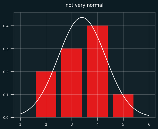
The number of streaks is a discrete value (0,1,2,3,...). In a small sample like 2 makes and 3 misses, which will be extremely common in player game level shooting data, how could that be approximately normal?
Below is a bar chart of the exact probabilities of each number of streaks, overlaid with the normal approximation in white. Not very normal, is it?
To make things more interesting, let's say the player made 7 shots and missed 4. That's enough for the graph to look more like a proper bell curve.
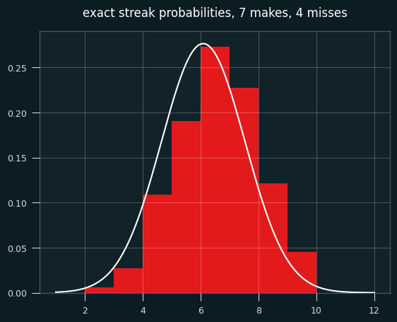
The bell curve looks skewed relative to the histogram, right? That's what happens when you model a discrete distribution (the number of streaks) with a continuous one -- the normal distribution.
A continuous distribution has zero probability at any single point, so we calculate the area under the curve between a range of values. The bar for exactly 7 streaks should line up with the probability of between 6.5 and 7.5 streaks in the normal approximation. The curve should be going through the middle of each bar, not the left edge.
We need to shift the curve to the right a half a streak for things to line up. Fixing this is called continuity correction.
Here's the same graph with the continuity correction applied:
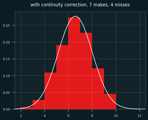
So... better, but there's still a problem. The normal approximation will assign a nonzero probability to impossible things. In this case of 7 makes and 4 misses, the minimum possible number of streaks is 2 and the max is 9 (alternate wins and losses till you run out of losses, then have a string of wins at the end.)
Yet the normal approximation says there's a nonzero chance of -1, 10, or even a million streaks. The odds are tiny, but the normal distribution never ends. These differences go away with big sample sizes, but they may be worth worrying about for small sample sizes.
Is that interfering with my results? It's quite possible. I'm trying to use the mean and the standard deviation to decide how "weird" each player is in the form of a z score. The z score gives the likelihood of the data happening by chance, given certain assumptions. If the assumptions don't hold, the z score, and using it to interpret how weird things are, is suspect.
Exact-ish odds
We can easily calculate the exact odds. In the notebook, I showed how to calculate the odds with brute force -- generate all permutations of seven 1's and four 0's, and measure the number of streaks for each one. That's impractical and silly, since the exact counting formula can be worked out using the rules of combinatorics, as this page nicely shows: https://online.stat.psu.edu/stat415/lesson/21/21.1
In order to compare players with different numbers of makes and misses, we'd want to calculate a percentile value for each one from the exact odds. The percentiles will be based on number of streaks, so 1st percentile would be super streaky, 99th percentile super un-streaky.
Let's say we're looking at the case of 7 makes and 4 misses, and are trying to calculate the percentile value that should go with each number of streaks. Here are the exact odds of each number of streaks:
2    0.006061
3    0.027273
4    0.109091
5    0.190909
6    0.272727
7    0.227273
8    0.121212
9    0.045455
Here are the cumulative odds (the odds of getting that number of streaks or fewer):
2    0.006061
3    0.033333
4    0.142424
5    0.333333
6    0.606061
7    0.833333
8    0.954545
9    1.000000
Let's say we get 6 streaks. Exactly 6 streaks happens 27% of the time. 5 or fewer streaks happens 33% of the time. So we could say 6 streaks is equal to the 33rd percentile, the 33.3%+27.3% = 61st percentile, or some value in between those two numbers.
The obvious way of deciding the percentile rank is to take the average of the upper and lower values, in this case mean(.333, .606) = .47. You could also think of it as taking the probability of streaks <=5 and adding half the probability of streaks=6.
If we want to compare the percentile ranks from the exact odds to Wald-Wolfowitz, we could convert them to an equivalent z score. Or, we can take the z-scores from the Wald Wolfowitz test and convert them to percentiles.
The two are bound to be a little different because the normal approximation is a bell curve, whereas we're getting the percentile rank from a linear interpolation of two values.
Here's an illustration of what I mean. This is a graph of the percentile ranks vs the CDF of the normal approximation.
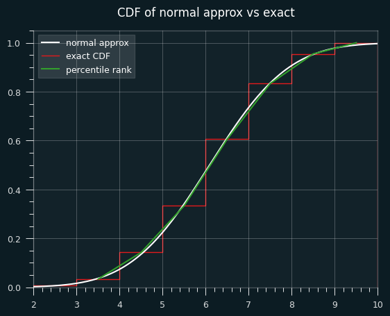
Let's zoom in on the section between 4.5 and 5.5 streaks. Where the white line hits the red line is the percentile estimate we'd get from the z-score (.475).
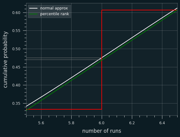
The green line is a straight line that represents calculating the percentile rank. It goes from the middle of the top of the runs <= 5 bar to the middle of the top of the runs <=6 bar. Where it hits the red line is the average of the two, which is percentile rank (.470).
In other situations, the Wald-Wolfowitz estimate will be less than the exact percentile rank. We can see that on the first graph. The green lines and white line are very close to each other, but sometimes the green is higher (like at runs=4), and sometimes the white is higher (like at runs=8).
Is Wald-Wolfowitz unbiased?
Yeah. The test provides the exact expected value of the number of streaks. It's not just a pretty good estimate. It is the (weighted) mean of the exact probabilities.
From the exact odds, the mean of all the streak lengths is 6.0909:
count    330.000000
mean       6.090909
std        1.445329
min        2.000000
25%        5.000000
50%        6.000000
75%        7.000000
max        9.000000
The Wald-Wolfowitz test says the expected value is 1 plus the harmonic mean of 7 and 4, which is 6.0909... on the nose.
Is the normal approximation throwing off my results?
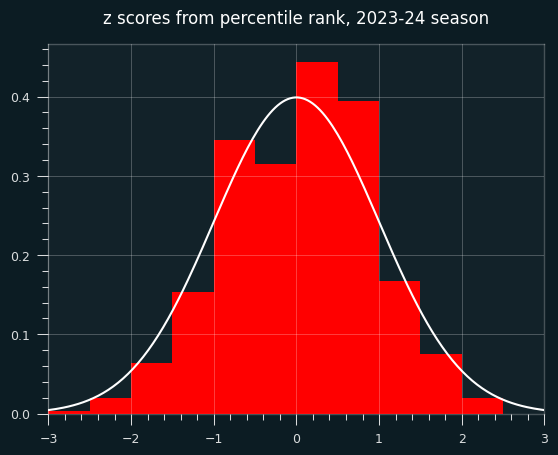
Quite possibly. So I went back and calculated the percentile ranks for every player-game combo over the course of the season.
Here's a scatter plot of the two ways to calculate the percentile on actual NBA player games. The dots above the x=y line are where the Wald-Wolfowitz percentile is bigger than the percentile rank one.
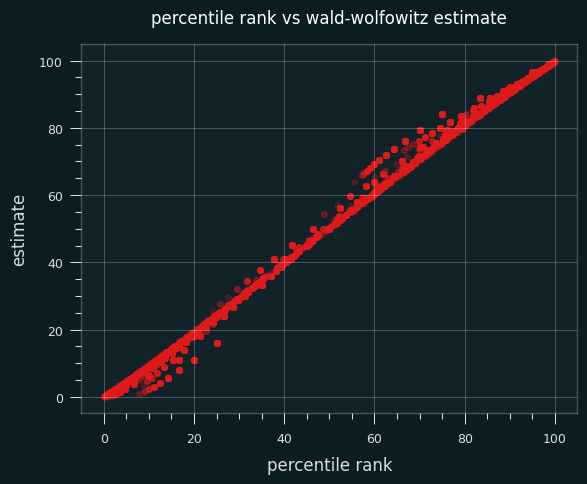
59% of the time, the Wald-Wolfowitz estimate produces a higher percentile value than the percentile rank. The same trend occurs if I restrict the data set to only high volume shooters (more than 10 makes or misses on the game).
Here's a bar chart of the differences between the W-W percentile and the percentile rank:
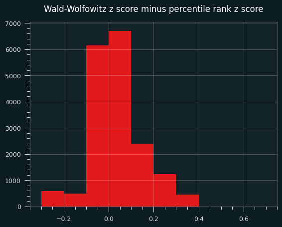
A percentile over 50, or a positive z score, means more streaks than average, thus less streaky than average. In other words, on this specific data set, the Wald-Wolfowitz z-scores will be more un-streaky compared to the exact probabilities.
Interlude: our un-streaky king
For the record, the un-streakiest NBA game of the 2023-24 season was by Dejounte Murray on 4/9/2024. My dude went 12 for 31 and managed 25 streaks, the most possible for that number of makes and misses, by virtue of never making 2 shots in a row.
It was a crazy game all around for Murray. A 29-13-13 triple double with 4 steals, and a Kobe-esque 29 points on 31 shots. He could've gotten more, too. The game went to double overtime, and he missed his last 4 in a row. If he had made the 2nd and the 4th of those, he could've gotten 4 more streaks on the game.
The summary of the game doesn't mention this exceptional achievement. Of course they wouldn't. There's no clue of it in the box score. You couldn't bet on it. Why would anyone notice?
box score on bbref
Look at that unstreakiness. Isn't it beautiful?
makes                                                  12
misses                                                 19
total_streaks                                          25
raw_data                  LWLWLWLWLWLWLLWLLLWLWLWLWLWLLLL
expected_streaks                                15.709677
variance                                         6.722164
z_score                                          3.583243
exact_percentile_rank                           99.993423
z_from_percentile_rank                           3.823544
ww_percentile                                   99.983032
On the other end, the streakiest performance of the year belonged to Jabari Walker of the Portland Trail Blazers. Made his first 6 shots in a row, then missed his last 8 in a row.
makes                                  6
misses                                 8
total_streaks                          2
raw_data                  WWWWWWLLLLLLLL
expected_streaks                7.857143
variance                        3.089482
z_score                        -3.332292
exact_percentile_rank             0.0333
z_from_percentile_rank         -3.403206
ww_percentile                   0.043067
Actual player performances
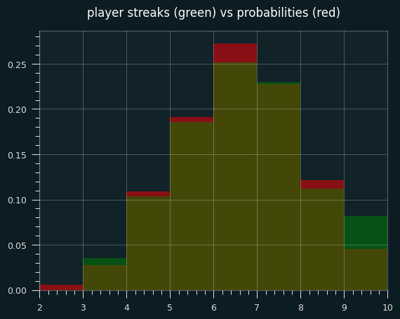
Let's look at actual NBA games where a player had exactly 7 makes and 4 misses. (We can also include the flip side, 4 makes and 7 misses, because it will be the same distribution of streak lengths)
The green areas are where the players had more streaks than the exact probabilities; the red areas are where players had fewer streaks. The two are very close, except for a lot more games with 9 streaks in the player data, and fewer 6 streak games.
The exact mean is 6.09 streaks. The mean for player performances is 6.20 streaks. Even in this little slice of data, there's a slight tendency towards unstreakiness.
Percentile ranks are still unstreaky, though
Well, for all that windup, the game-level percentile ranks didn't turn out all that different when I calcualted them for all 18,000+ player-game combos. The mean and median are still shifted to the un-streaky side, to a significant degree.
Plotting the deciles shows an interesting tendency: a lot more values in the 60-70th percentile range than expected. the shift to the un-streaky side comes pretty much from these values.
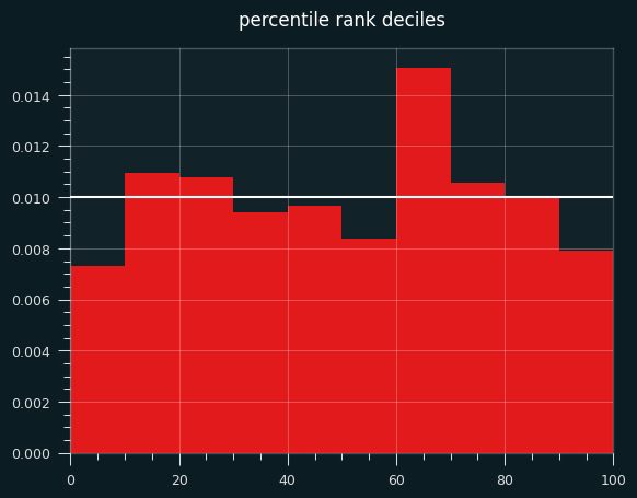
The bias towards the unstreaky side is still there, and still significant:
count    18982.000000
mean         0.039683
std          0.893720
min         -3.403206
25%         -0.643522
50%          0.059717
75%          0.674490
max          3.823544
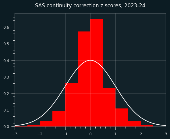
A weird continuity correction that seems obviously bad
SAS, the granddaddy of statistics software, applies a continuity correction to the runs test whenever the count is less than 50.
While it's true that we should be careful with normal approximations and small sample size, this ain't the way.
The exact code used is here: https://support.sas.com/kb/33/092.html
        if N GE 50 then Z = (Runs - mu) / sigma;
        else if Runs-mu LT 0 then Z = (Runs-mu+0.5)/sigma;
          else Z = (Runs-mu-0.5)/sigma;
Other implementations I looked at, like the one in R's randtests package, don't do the correction.
What does this sort of correction look like?
For starters, it gives us something that doesn't look like a z score. The std is way too small.
count    18982.000000
mean        -0.031954
std          0.687916
min         -3.047828
25%         -0.401101
50%          0.000000
75%          0.302765
max          3.390395
What does this look like on random data?
It could just be this dataset, though. I will generate a fake season of data like in the last installment, but the players will have no unstreaky/streaky tendencies. They will behave like a coin flip, weighted to their season FG%. So the results should be distributed like we expect z scores to be (mean=0, std=1)
Here are the z-scores. They're not obviously bad, but the center is a bit higher than it should be.
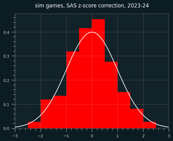
However, the continuity correction especially stands out when looking at small sample sizes (in this case, simulated players with fewer than 30 shooting streaks over the course of the season).
In the below graph, red are the SAS corrected z-scores, green are the wald-wolfowitz z scores, brown are the overlap.
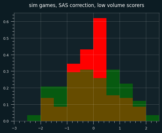
Continuity corrections are at best an imperfect substitute for calculating the exact odds. These days, there's no reason not to use exact odds for smaller sample sizes. Even though it ended up not mattering much, I should've started with the percentile rank for individual games. However, I don't think that the game level results are as important to the case I'm making as the career-long shooting results.
Next time, I will look at the past 20 years of NBA data. Who is the un-streakiest player of all time?
May 28, 2025
(Notebooks and other code available at: https://github.com/csdurfee/hot_hand. There's a bunch of stuff in the notebook about the Wald-Wolfowitz test that I will save for another week.)
In my last installment, I was looking at season long shooting records from the NBA, and I concluded that NBA players were less streaky than expected. They have fewer long strings of makes and misses than a series of coin flips would.
I've been thinking this could be due to "heat check" shots -- a player has made a bunch of shots in a row, or are having a good shooting game in general, so they take harder shots than they normally take.
It would explain some players that fans consider streaky or "heat check" players who are actually super un-streaky. Jordan Poole was the least streaky player over the last 4 seasons, which defies my expectations. Say he believes he is streaky, so tends to take bad shots when
Or it could be due to "get a bucket" shots -- a player is having a bad shooting game, so they force higher percentage shots and potentially free throws.
There's a quirk of NBA stats to remember: if a player is fouled while shooting, it only counts as a field goal attempt if they make the shot. So driving to the hoop is guaranteed to not decrease a player's field goal percentage if they successfully draw a foul, or get called for an offensive foul.
I'm not sure I've made an airtight case for the lukewarm hand. Combining every game in a season could hide the hot hand effect. What about individual games?
Game-level shooting statistics show a lukewarm tendency
I am using the complete shooting statistics available from this kaggle project: https://www.kaggle.com/datasets/mexwell/nba-shots
I'm looking at the 2023-2024 season, since the current season isn't included yet.
I went through every game that every player played in the NBA season and calculated the expected vs. actual number of streaks.
There are 24,895 player+game combos. 10,285 of them had more streaks than expected against 8,977 who had fewer streaks than expected (and around 5,000 that are exactly as expected). This is a significant imbalance towards the "lukewarm hand" side.
Here's the histogram of individual game z-scores:
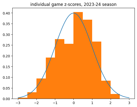
And the breakdown:
count    18982.000000
mean         0.051765
std          0.988789
min         -3.332292
25%         -0.707107
50%          0.104103
75%          0.816497
max          3.583243
Name: z_score, dtype: float64
Limiting to higher volume games (at least 10 makes or 10 misses) shows the same tendency.
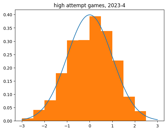
count    2536.000000
mean        0.055925
std         1.010195
min        -3.079575
25%        -0.616678
50%         0.072404
75%         0.750366
max         3.583243
Name: z_score, dtype: float64
There definitely appears to be a bias towards the lukewarm hand in individual game data. The mean z scores aren't that much bigger than zero, but it's a huge sample size.
Simulating streaky and non-streaky players
I coded up a simulation of a non-streaky player. When they have hit a minimum number of attempts in the game, if their shooting percentage goes above a certain level, they get a penalty. If it goes below a certain level, they get a boost.
I was able to create results that look like NBA players in aggregate with an extremely simplified model.
The parameters were arbitrarily chosen. By default, the thresholds are 20% and 80%, and the boost/penalty is 20%. So a 50% shooter who has taken at least 4 shots and is shooting 80% or better for the game will get their FG% knocked down to 30% till their game percentage drops below the threshold. Likewise if they hit 20% or less, they get a boost until they're over the threshold.
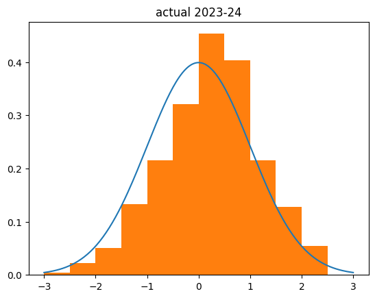
I used the game level shooting statistics I got for the individual game-by-game analysis. I then replayed every shot in the NBA in the 2023-24 season using the simulated lukewarm player (and the actual fg% and number of shots attempted in each game). This is what I got:

count    526.000000
mean       0.218032
std        0.965737
min       -2.397958
25%       -0.491051
50%        0.241554
75%        0.836839
max        3.787951
Name: z_score, dtype: float64
My simulation was actually less biased to the right than the actual results:
Several big things to note:
- I simulated every player in the league as being a little un-streaky.
- I simulated them being un-streaky in both directions
- The boost/penalty are pretty big -- going from 50% FG percentage to 30% is going from a good NBA player to a bad college player level, and the boost to 70% FG percentage has no precedent. The most accurate shooters in the NBA are usually big men who only shoot dunks and layups, and they still usually end up in the 60-65% range.
Which is to say, my simulation is kind of silly and seemingly over-exaggerated. And it's still not as lukewarm as real NBA players are. Wild, isn't it?
Streakiness in only one direction
I also simulated players who were only streaky in one direction: "get a bucket" players who get a boost to shooting percentage when they are shooting poorly, but no penalty when they are doing well, and "heat check" players who only get the penalty.
The results were biased to the unstreaky side, but about half as much as the ones that are streaky in both directions. I had to crank the penalties/boosts up to unrealistic levels to get the bias of the z-scores up to the .2-.3 range I'm seeing with real season-level data.
The truly streaky player
Of course, I had to simulate the hot hand. The TrulyStreakyPlayer is the exact opposite of the LukewarmPlayer. They get a 20% boost when they're shooting well on the game, and a 20% penalty when they're shooting poorly.
What stands out to me here is how much it affects the z-score. I was expecting the z-scores to be biased to the negative side by about as much as the unstreaky player was to the positive side. But the effect was a lot more dramatic:
count    524.000000
mean      -0.455522
std        1.144570
min       -4.413268
25%       -1.225128
50%       -0.458503
75%        0.404549
max        2.486584
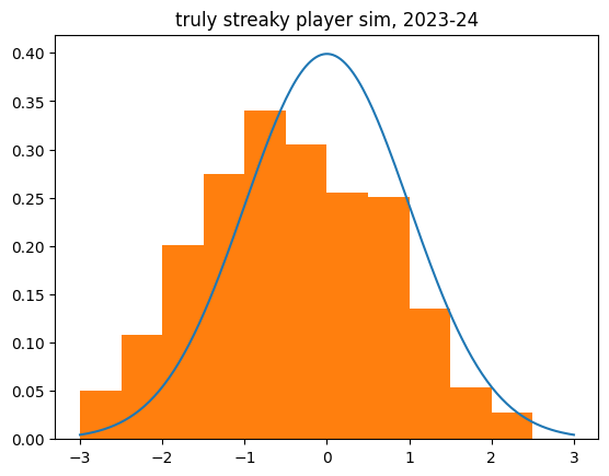
Unlike the un-streaky simulations, the streaky behavior increased the dispersion (std), like we saw with the real shot data. There are many more outliers to the negative side than we'd expect.
What next?
I could certainly sim a mixture of streaky and unstreaky players, and eventually maybe get something that matches the real numbers pretty closely. But there are so many parameters to fit that it would be pretty arbitrary. Someone else could produce a different model that works just as well.
Most importantly, it couldn't tell us which players might be streaky due to chance versus streaky due to behavior/shot selection. So I think the next step is looking at the shot selection in the "hot hand" vs. "get a bucket" situations -- do players switch to higher percentage shots when they're having a bad game, and worse shots when they're shooting better than usual?
May 23, 2025
(the code used is available at https://github.com/csdurfee/nfl_combine_data/).
Intro
Every year, the National Football League hosts an event called the Combine, where teams can evaluate the top prospects before the upcoming draft.
Athletes are put through a series of physical and mental tests over the course of four days. There is a lot of talk of hand size, arm length, and whether a guy looks athletic enough when he's running with his shirt off. It's basically the world's most invasive job interview.
NFL teams have historically put a lot of stock in the results of the combine. A good showing at the combine can improve a player's career prospects, and a bad showing can significantly hurt them. For that reason, some players will opt out of attending the combine, but that can backfire as well.
I was curious about which events in the combine correlate most strongly with draft position. There are millions of dollars at stake. The first pick in the NFL draft gets a $43 Million dollar contract, the 33rd pick gets $9.6 Million, and the 97th pick gets $4.6 Million.
The main events of the combine are the 40 yard dash, vertical leap, bench press, broad jump, 3 cone drill and shuttle drill. The shuttle drill and the 3 cone drill are pretty similar -- a guy running between some cones as fast as possible. The other drills are what they sound like.
I'm taking the data from Pro Football Reference. Example page: https://www.pro-football-reference.com/draft/2010-combine.htm. I'm only looking at players who got drafted.
Position Profiles
It makes no sense to compare a cornerback's bench press numbers to a defensive lineman's. There are vast differences in the job requirements. A player in the combine is competing against other players at the same position.
The graph shows a position's performance on each exercise relative to all players. The color indicates how the position as a whole compares to the league as a whole. You can change the selected position with the dropdown.
Cornerbacks are exceptional on the 40 yard dash and shuttle drills compared to NFL athletes as a whole, whereas defensive linemen are outliers when it comes high bench press numbers, and below average at every other event. Tight Ends and Linebackers are near the middle in every single event, which makes sense because both positions need to be strong enough to deal with the strong guys, and fast enough to deal with the fast guys.
Importance of Events by Position
I analyzed how a player's performance relative to others at their position correlates with draft rank. Pro-Football-Reference has combine data going back to 2000. I have split the data up into 2000-2014 and 2015-2025 to look at how things have changed.
For each position, the exercises are ranked from most to least important. The tooltip gives the exact r^2 value.
Here are the results up to 2014:
Here are the last 10 years:
Some things I notice:
The main combine events matter that much either way for offensive and defensive linemen. That's held true for 25 years.
The shuttle and 3 cone drill have gone up significantly in importance for tight ends.
Broad jump and 40 yard dash are important for just about every position. However, the importance of the 40 yard dash time has gone down quite a bit for running backs.
As a fan, it used to be a huge deal when a running back posted an exceptional 40 yard time. It seemed Chris Johnson's legendary 4.24 40 yard time was referenced every year. But I remember there being lot of guys who got drafted in the 2000's primarily based on speed who turned out to not be very good.
The bench press is probably the least important exercise across the board. There's almost no correlation between performance and draft order, for every position. Offensive and defensive linemen basically bench press each other for 60 minutes straight; for everybody else, that sort of strength is less relevant. Here's one of the greatest guys at throwing the football in human history, Tom Brady:
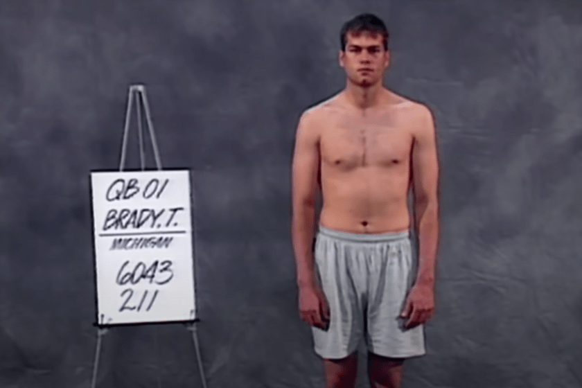
Compared to all quarterbacks who have been drafted since 2000, Brady's shuttle time was in the top 25%, his 3 cone time was in the top 50%, and his broad jump, vertical leap and 40 yard dash were all in the bottom 25%.
Changes in combine performance over time
Athlete performance has changed over time.
I've plotted average performance by year for each of the events. For the 40 yard dash, shuttle, and 3 cone drills, lower is better, and for the other events, higher is better.
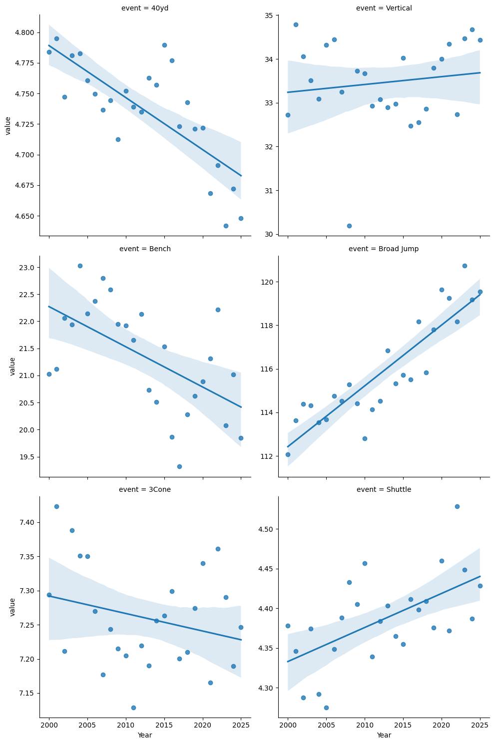
40 yard dash times and broad jump distances have clearly improved, whereas shuttle times and bench press reps have gotten slightly worse.
There's a cliche in sports that "you can't coach speed". While some people are innately faster than others, the 40 yard dash is partly a skill exercise -- learning to get off the block as quickly as possible without faulting, for starters. The high priority given to the 40 yard dash should lead to prospects practicing it more, and thus getting better numbers.
The bench press should be going down or staying level, since it's not very important to draft position.
There's been a significant improvement in the broad jump - about 7.5% over 25 years. As with the 40 yard dash, I'd guess it's better coaching and preparation. Perhaps it's easier to improve than some of the other events. I don't think there's more broad jumping in an NFL game than there was 25 years ago.
Shuttle times getting slightly worse is a little surprising. It's very similar to the 3 Cone drill, which has slightly improved. But as we saw, neither one is particularly important as far as draft position, and it's not a strong trend.
Caveats
Some of the best athletes skip the combine entirely, because their draft position is already secure. And some athletes will only choose to do the exercises they think they will do well at, and skip their weak events. This is known as MNAR data (missing, not at random). All analysis of MNAR data is potentially biased.
I'm assuming a linear relationship between draft position and performance. It's possible that a good performance helps more than a bad performance hurts, or vice versa.
I didn't calculate statistical significance for anything. Some correlations will occur even in random data. This isn't meant to be rigorous.
May 22, 2025
(notebook is available at github.com/csdurfee/ensemble_learning.)
Ensemble Learning
AI and machine learning systems are often used for classification. Is this email spam or not? Is this person a good credit risk or not? Is this a photo of a cat or not?
There are a lot of ways to build classifiers, and they all potentially have different strengths and weaknesses. It's natural to try combining multiple models together to produce better results than the individual models would.
Model A might be bad at classifying black cats but good at orange ones, model B might be bad at classifying orange cats but good at black ones, model C is OK at both. So if we average together the results of the three classifiers, or go with the majority opinion between them, the results might be better than the individual classifiers.
This is called an ensemble. Random forests and gradient boosting are two popular machine learning techniques that use ensembles of weak learners -- a large number of deliberately simple models that are all trained on different subsets of the data. This strategy can lead to systems that are more powerful than their individual components. While each little tree in a random forest is weak and prone to overfitting, the forest as a whole can be robust and give high quality predictions.
Majority Voting
We can also create ensembles of strong learners -- combining multiple powerful models together. Each individual model is powerful enough to do the entire classification on its own, but we hope to achieve higher accuracy by combining their results. The most common way to do that is with voting. Query several classifiers, and have the ensemble return the majority pick, or otherwise combine the results.
There are some characteristics of ensembles that seem pretty common sense [1]. The classifiers in the ensemble need to be diverse: as different as possible in the mistakes they make. If they all make the same mistakes, then there's no way for the ensemble to correct for that.
The more classification categories, the more classifiers are needed in the ensemble. However, in real world settings, there's usually a point where adding more classifiers doesn't improve the ensemble.
The Model
I like building really simple models. They can illustrate fundamental characteristics, and show what happens at the extremes.
So I created an extremely simple model of majority voting (see notebook). I'm generating a random list of 0's and 1's, indicating the ground truth of some binary classification problem. Then I make several copies of the ground truth and randomly flip x% of the bits. Each of those copies represent the responses from an individual classifier within the ensemble. Each fake classifier will have 100-x% accuracy. There's no correlation between the wrong answers that each classifier gives, because the changes were totally random.
For every pair of fake classifiers with 60% accuracy, they will both be right 60% * 60% = 36% of the time, and both wrong 40% * 40% = 16%. So they will agree 36% + 16% = 52% of the time at minimum.
That's different from the real world. Machine learning algorithms trained on the same data will make a lot of the same mistakes and get a lot of the same questions right. If there are outliers in the data, any classifier can overfit on them. And they're all going to find the same basic trends in the data. If there aren't a lot of good walrus pictures in the training data, every model is probably going to be bad at recognizing walruses. There's no way to make up for what isn't there.
Theory vs Reality
In the real world, there seem to be limits on how much an ensemble can improve classification. On paper, there are none, as the simulation shows.
What is the probability of the ensemble being wrong about a particular classification?
That's the probability that the majority of the classifiers predict 0, given that the true value is 1 (and vice versa). If each classifier is more likely to be right than wrong, as the number of classifiers goes to infinity, the probability of the majority of predictions being wrong goes to 0.
If each binary classifier has a probability > .5 of being right, we can make the ensemble arbitrarily precise if we add enough classifiers to the ensemble (assuming their errors are independent). We could grind the math using the normal approximation to get the exact number if need be.
Let's say each classifier is only right 50.5% of the time. We might have to add 100,000 of them to the ensemble, but we can make the error rate arbitrarily small.
Correlated errors ruin ensembles
The big difference between my experiment and reality is that the errors the fake classifiers make are totally uncorrelated with each other. I don't think that would ever happen in the real world.
The more the classifiers' wrong answers are correlated with each other, the less useful the ensemble becomes. If they are 100% correlated with each other, the ensemble will give the exact same results as the individual classifiers, right? An ensemble doesn't have to improve results.
To put it in human terms, the "wisdom of the crowd" comes from people in the crowd having wrong beliefs about uncorrelated things (and being right more often than not overall). If most people are wrong in the same way, there's no way to overcome that with volume.
My experience has been that different models tend to make the same mistakes, even if they're using very different AI/machine learning algorithms, and a lot of that is driven by weaknesses in the training data used.
For a more realistic scenario, I created fake classifiers with correlated answers, so that they agree with the ground truth 60% of the time, and with each other 82% of the time, instead of the minimum 52% of the time.
The Cohen kappa score is .64, on a scale from -1 to 1, so they aren't as correlated as they could be.
The simulation shows that if the responses are fairly strongly correlated with each other, there's a hard limit to how much the ensemble can improve things.
Even with 99 classifiers in the ensemble, the simulation only achieves an f1 score of .62. That's just a slight bump from the .60 achieved individually. There is no marginal value to adding more than 5 classifiers to the ensemble at this level of correlation.
Ensembles: The Rich Get Richer
I've seen voting ensembles suggested for especially tricky classification problems, where the accuracy of even the best models is pretty low. I haven't found that to be true, though, and the simulation backs that up. Ensembles are only going to give a significant boost for binary classification if the individual classifiers are significantly better than 50% accuracy.
The more accurate the individual classifiers, the bigger the boost from the ensemble. These numbers are for an ensemble of 3 classifiers (in the ideal case of no correlation between their responses):
| Classifier Accuracy |
Ensemble Accuracy |
| 55% |
57% |
| 60% |
65% |
| 70% |
78% |
| 80% |
90% |
Hard vs. soft voting
There are two different ways of doing majority voting, hard and soft. This choice can have an impact on how well an ensemble works, but I haven't seen a lot of guidance on when to use each.
Hard voting is where we convert the outputs of each binary classifier into a boolean yes/no, and go with the majority opinion. If there are an odd number of components and it's a binary classification, there's always going to be a clear winner. That's what I've been simulating so far.
Soft voting is where we combine the raw outputs of all the components, and then round the combined result to make the prediction. sklearn's documentation advises to use soft voting "for an ensemble of well-calibrated classifiers".
In the real world, binary classifiers don't return a nice, neat 0 or 1 value. They return some value between 0 or 1 indicating a relative level of confidence in the prediction, and we round that value to 0 or 1. A lot of models will never return a 0 or 1 -- for them, nothing is impossible, just extremely unlikely.
If a classifier returns .2, we can think of it as the model giving a 20% chance that the answer is 1 and an 80% chance it's 0. That's not really true, but the big idea is that there's potentially additional context that we're throwing away by rounding the individual results.
For instance, say the raw results are [.3,.4,.9]. With hard voting, these would get rounded to [0,0,1], so it would return 0. With soft voting, it would take the average of [.3,.4,.9], which is .53, which rounds to 1. So the two methods can return different answers.
To emulate the soft voting case, I flipped a percentage of the bits, as before. Then I replaced every 0 with a number chosen randomly from the uniform distribution from [0,.5] and every 1 with a sample from [.5,1]. The values will still round to what they did before, but there's additional noise on top.
In this simulation (3 classifiers), the soft voting ensemble gives less of a boost than the hard voting ensemble -- about half the benefits. As with hard voting, the more accurate the individual classifiers are, the bigger the boost the ensemble gives.
| Classifier Accuracy |
Ensemble Accuracy |
| 55% |
56% |
| 60% |
62% |
| 70% |
74% |
| 80% |
85% |
Discussion
Let's say a classifier returns .21573 and I round that down to 0. How much of the .21573 that got lost was noise, and how much was signal? If a classification task is truly binary, it could be all noise. Let's say we're classifying numbers as odd or even. Those are unambiguous categories, so a perfect classifier should always return exactly 0 or 1. It shouldn't say that three is odd, with 90% confidence. In that case, it clearly means the classifier is 10% wrong. There's no good reason for uncertainty.
On the other hand, say we're classifying whether photos contain a cat or not. What if a cat is wearing a walrus costume in one of the photos? Shouldn't the classifier return a value greater than 0 for the possibility of it not being a cat, even if there really is a cat in the photo? Isn't it somehow less cat-like than another photo where it's not wearing a walrus costume? In this case, the .21573 at least partially represents signal, doesn't it? It's saying "this is pretty cat-like, but not as cat-like as another photo that scored .0001".
When I'm adding noise to emulate the soft voting case, is that fair? A different way of fuzzing the numbers (selecting the noise from a non-uniform distribution, for instance) might reduce the gap in performance between hard and soft voting ensembles, and it would probably be more realistic. But the point of a model like this is to show the extremes -- it's possible that hard voting will give better results than soft voting, so it's worth testing.
Big Takeaways
- Ensembles aren't magic; they can only improve things significantly if the underlying classifiers are diverse and fairly accurate.
- Hard and soft voting aren't interchangeable. If there's a lot of random noise in the responses, hard voting is probably a better option, otherwise soft voting is probably better. It's definitely worth testing both options when building an ensemble.
- Anyone thinking of using an ensemble should look at the amount of correlation between the responses from different classifiers. If the classifiers are all making basically the same mistakes, an ensemble won't help regardless of hard vs. soft voting. If models with very different architectures are failing in the same ways, that could be a weakness in the training data that can't be fixed by an ensemble.
References
[1] Bonab, Hamed; Can, Fazli (2017). "Less is More: A Comprehensive Framework for the Number of Components of Ensemble Classifiers". arXiv:1709.02925
Tsymbal, A., Pechenizkiy, M., & Cunningham, P. (2005). Diversity in search strategies for ensemble feature selection. Information Fusion, 6(1), 83–98. doi:10.1016/j.inffus.2004.04.003
May 16, 2025
(The code used, and ipython notebooks with a fuller investigation of the data is available at https://github.com/csdurfee/hot_hand.)
Streaks
When I'm watching a basketball game, sometimes it seems like a certain player just can't miss. Every shot looks like it's going to go in. Other times, it seems like they've gone cold. They can't get a shot to go in no matter what they do.
This phenomenon is known as the "hot hand" and whether it exists or not has been debated for decades, even as it's taken for granted in the common language around sports. We're used to commentators saying that a player is "heating up", or, "that was a heat check".
As a fan of the game, it certainly seems like the hot hand exists. If you follow basketball, some names probably come to mind. JR Smith, Danny Green, Dion Waiters, Jamal Crawford. When they're on, they just can't miss. It doesn't matter how crazy the shot is, it's going in. And when they're cold, they're cold.
It's a thing we collectively believe in, but it turns out that there isn't clear statistical evidence to support it.
We have to be careful with our feelings about the hot hand. It certainly feels real, but that doesn't mean that it is. Within the drama of a basketball game, we're inclined to notice and assign stories to runs of makes or misses. Just because we notice them, that doesn't mean they're significant. This is sometimes called "the law of small numbers" -- our brains have a tendency to reach spurious conclusions from a very small amount of data.
Pareidolia is the human tendency to see human faces in inanimate objects -- clouds, the bark of a tree, a tortilla. While the faces might seem real, they are just a product of our brain's natural inclination to identify patterns. It's possible the "hot hand" is a similar phenomenon -- a product of the way human brains are wired to see patterns, rather than an objective truth.
Defining Streakiness
Streaks of 1's and 0's in randomly generated binary data follow regular mathematical laws, ones our brains can't realy replicate. Writer Joseph Buchdal found that he couldn't create a random-looking sequence by hand that would fool a statistical test called the Wald-Wolfowitz test, even though he knew exactly how the statistical test worked.
I think at some level, we're physically incapable of generating truly random data, so it makes sense to me that our intuitions about randomness are a little off. Our brains are wired to notice the streaks, but we seem to have no such circuitry for noticing when something is a little bit too un-streaky. Our brains are too quick to see meaningless patterns in small amounts of data, and not clever enough to see subtle, meaningful patterns in large amounts of data. Good thing we have statistics to help us escape those biases!
For the sake of this discussion, a streak starts whenever a sequence of outcomes changes from wins (W) to losses (L), or vice-versa. (I'm talking about makes and misses, but those start with the same letter, so I'll use "W" and "L".)
The sequence WLWLWL has 6 streaks: W, L, W, L, W, L
The sequence WWLLLW has 3 streaks: WW, LLL, W
Imagine I asked someone to produce a random-looking string of 3 W's and 3 L's. If they were making the results up, I think the average person would be more likely to write the first string. It just looks "more random", right?
If they flipped a coin, it would be more likely to produce something with longer streaks, like the second example. With a fair coin, both of those exact sequences are equally likely to occur. But the second sequence has a more probable number of streaks, according to the Wald-Wolfowitz Runs Test. The expected number in 3 wins and 3 losses is (2 * (3 * 3) / (3+3)) + 1 = 4.
The expected number of streaks is the harmonic mean of the number of wins and the number of losses, plus one. Neat, right?
Around 500 players attempted a shot in the NBA this season. Let's say we create a custom coin for each player. It comes up heads with the same percentage as the player's shooting percentage on the season. If we took those coins and simulated every shot in the NBA this season, some of the coins would inevitably appear to be "streakier" than others.
Players never intend to miss shots, yet most players shoot around 50%, so there has to be some element of chance as far as which shots go in or not. Otherwise, why wouldn't players just choose to make all of them?
So makes versus misses are at least somewhat random, which means if we look at the shooting records of 500 players in an NBA season, some will seem more or less consistent due to the laws of probability. That means a player with longer or shorter streaks than expected could just be due to chance, not due to the player actively doing something that makes them more streaky.
The Lukewarm Hand
We might call players who have fewer streaks than expected by chance consistent. Maybe they go exactly 5 for 10 every single game, never being especially good or especially bad. Or maybe they go 1 for 3 every game, always being pretty bad.
But that feels like the wrong word, and I don't think our brains aren't really wired to notice a player that has fewer streaks than average. As we already saw, the "right" number of streaks is counterintuitive.
I might notice a player is unusually consistent after the fact when looking at their basketball-reference page, but the feeling of a player having the hot hand is visceral, experienced in the moment. Even without consulting the box score, sometimes players look like they just can't miss, or can't make, a shot. They seem more confident, or their shot seems more natural, than usual. Both the shooter and the spectator seem to have a higher expectation that the shot will go in than usual. The hot hand is a social phenomenon.
(from https://xkcd.com/904/)
If we look at the makes and misses of every player in the league, do they look like the results of flipping a coin (weighted to match their shooting percentage), or is there a tendency for players to be more or less streaky than expected by chance?
We don't really have a formal word for players who are less streaky than they should be, so I'm going to call the opposite of the hot hand the lukewarm hand. While the lukewarm hand isn't a thing we would viscerally notice the way we do the hot hand, it's certainly possible to exist. And it's just as surprising, from the perspective of treating basketball players like weighted coins.
Some people I've seen analyze the hot hand treat the question as streaky versus non-streaky. But it's not a binary thing. There are two possible extremes, and a region in between. It's unusually streaky versus normal amount of streaky versus unusually non-streaky.
The Wald-Wolfowitz test says that the number of streaks in randomly-generated data will be normally distributed, and gives a formula for the variance of the number of streaks. The normal distribution is symmetrical, so there should be as many hot hand players as lukewarm hand ones. Players have varying numbers of shots taken over the course of the season so we can't compare them directly, but we can calculate the z score for each player's expected vs. actual number of streaks. The z score represents how "weird" the player is. If we look at all the z-scores together, we can see whether NBA players as a whole are streakier or less streaky than chance alone would predict. We can also see if the outliers correspond to the popular notions of who the streaky shooters in the NBA are.
Simplifying Assumptions
We should start with the assumption that athletes really are weighted random number generators. A coin might have "good days" and "bad days" based on the results, but it's not because the coin is "in the zone" one day, or a little injured the next day. At least some of the variance in a player's streakiness is due to randomness, so we have to be looking for effects that can't be explained by randomness alone.
So I am analyzing all shots a player took, across all games. This could cause problems, which I will discuss later on, but splitting the results up game-by-game or week-by-week leads to other problems. Looking at shooting percentages by game or by week means smaller sample sizes, and thus more sampling error. It also means that comparisions between high volume shooters and low volume shooters can be misinterpreted. The high volume shooters may appear more "consistent" simply because it's a larger sample size.
I think I need to prove that streakiness exists before making assumptions about how it works. Let's say the "hot hand" does exist. If a player makes a bunch of shots in a row, how long might they stay hot? Does it last through halftime? Does it carry over to the next game? How many makes in a row before they "heat up"? How much does a player's field goal percentage go up? Does a player have cold streaks and hot streaks, or are they only streaky in one direction?
There are an infinite number of ways to model how it could work, which means it's ripe for overfitting. So I wanted to start with the simplest, most easily justifiable model. The original paper about the hot hand was co-written by Amos Tversky, who went on to win a Nobel Prize for helping to invent behavioral economics. I figure any time you can crib off of a Nobel Prize winner's homework, you probably should!
Results
I started off by getting data on every shot taken in the 2024-25 NBA regular season. I calculated the expected number of streaks and actual number, then a z-score for every player.
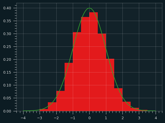
Players with a z-score of 0 are just like what we'd expect from flipping a coin. A positive z-score indicates there were more streaks than expected. More streaks than expected means the streaks were shorter than expected, which means less streaky than expected.
A negative z-score indicates the opposite. Those players had fewer streaks than expected, which means the streaks were longer. When people talk about the "hot hand" or "streaky shooters", they are talking about players who should have a negative z-score by this test.
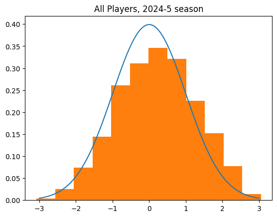
The curve over the top is the distribution of z-scores we'd expect if the players worked like weighted coin flips.
Just eyeballing it, it's pretty close. It's definitely a bell curve, centered pretty close to zero. If there is a skew, it's actually to the positive, un-streaky side, though. The mean z-score is .21, when we'd expect it to be zero.
count    554.000000
mean       0.212491
std        1.075563
min       -3.081194
25%       -0.546340
50%        0.236554
75%        0.951653
max        3.054836
The Wilk-Shapiro test is way to decide whether a set of data plausibly came from a normal distribution. It passed. There is no conclusive evidence that players in general are streakier or less streaky than predicted by chance. This data very well could've come from flipping a bunch of coins.
But it's still sorta skewed. There were 320 players with a positive z-score (un-streaky) versus 232 with a negative z-score (streaky). That's suspicious.
Outliers
A whole lot of those 554 players didn't make very many shots.
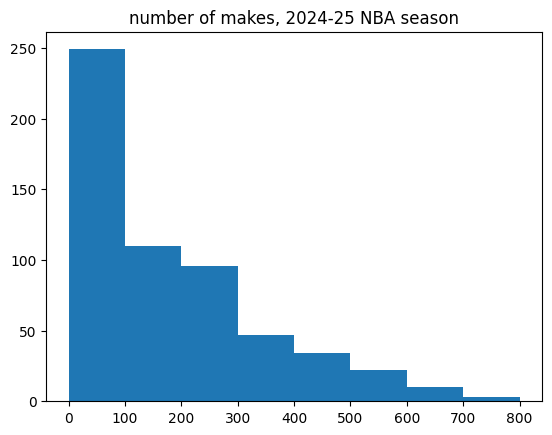
I decided to split up players with over 100 makes versus under 100 makes. Unlike high volume shooters, the low volume shooters had no bias towards unstreakiness. They look like totally random data.
Here are just the high volume shooters (323 players in total). Notice how none of them have a z-score less than about -2. It should be symmetrical.
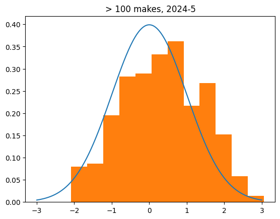
count    323.000000
mean       0.347452
std        1.068341
min       -2.082528
25%       -0.454794
50%        0.363949
75%        1.091244
max        3.054836
The Eye Test
I looked at which players had exceptionally high or low z scores. The names don't really make sense to me as an NBA fan. There were players like Jordan Poole and Jalen Green, who I think fans would consider streaky, but they had exceptionally un-streaky z-scores. I don't think the average NBA fan would say Jalen Green is less streaky than 97.5% of the players in the league, but he is (by this test).
On the other hand, two streakiest players in the NBA this year were Goga Bitadze and Thomas Bryant, two players who don't fit the profile of the stereotypical streaky shooter by any means.
Makes vs. Streakiness
The more shots a player made this season, the more un-streaky they tended to be. Here's a plot of makes on the 2024-25 season versus the z-score.
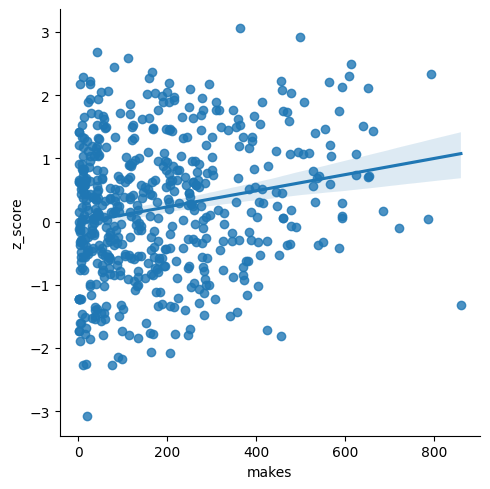
That's pretty odd, isn't it?
Getting more data: 2021-present
I figured a bigger sample size would be better. Maybe this season was just weird. So got the last 4 seasons of data (2021-22, 2022-2023, 2023-2024, 2024-2025) for players who made a shot in the NBA this season and combined them.
The four year data is even more skewed towards the lukewarm hand, or un-streaky side, than the single year data.
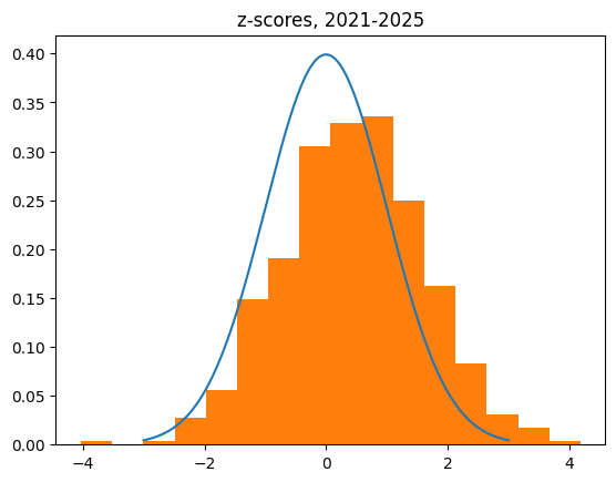
count    562.000000
mean       0.443496
std        1.157664
min       -4.031970
25%       -0.312044
50%        0.449647
75%        1.184918
max        4.184025
The correlation between number of makes and z-score is quite strong in the 4 year data:
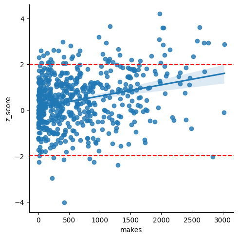
There were 48 players with a z-score > 2, versus only 9 with a score < -2. That's like flipping a coin and getting 48 heads and 9 tails. There's around a 2 in 10 million chance of that happening with a fair coin.
High Volume Shooters, Redux
The bias towards the lukewarm hand is even stronger among high volume shooters. Here are players with more than 500 makes over the past 4 years.
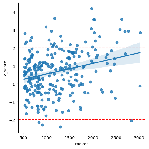
The z-scores are normally distributed according to the Wilk-Shapiro test, but they're no longer even close to being centered at zero. They're also overdispersed (the std is bigger than the expected 1.) It's not plausible that the true mean is 0, given the sample mean is .680.
count    265.000000
mean       0.680097
std        1.217946
min       -2.392061
25%       -0.149211
50%        0.776917
75%        1.485595
max        4.184025

Streak Lengths
I looked at the length of make/miss streaks for the actual NBA players versus simulating the results. The results were simulated by taking the exact number of makes and misses for each NBA player, and then shuffling those results randomly. What I found confirmed the "lukewarm hand" -- overall, NBA players have slightly more 1 and 2 shot streaks than expected, and fewer long streaks than expected.
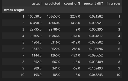
Obvious objections, and what about free throws?
I'm treating every field goal attempt like it has the same chance of going in. Clearly that's not the case. Players, especially high volume scorers, can choose which shots they take. It's easy to imagine a player that has missed several shots in a row and is feeling "cold" would concentrate on only taking higher percentage shots. There's also the fact that I'm combining games together. That could potentially lead to players looking less streaky than they are within the course of a single game. But it should also make truly unstreaky players look less unstreaky. Streaks getting "reset" by the end of the game should make players act more like a purely random process -- not too streaky or unstreaky. It shouldn't increase the standard deviation of the z-scores like we're seeing, or cause a shift towards unstreakiness.
I may do a simulation to illustrate that, but in the meantime, the most controlled shot data we have is free throw data. Every free throw should have exactly the same level of difficulty for the player.
I got the data for the 200,000+ free throws in the NBA regular season over the past four years (October 2021 through April 2025).
Here are the z-scores for all players. There's a big chunk taken out of the middle of the bell curve, but it's normal-ish other than that.
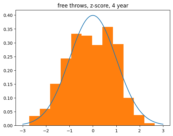
240 players have made over 200 free throws in the past 4 years. When I restrict to just those players, there's a slight skew towards the "hot hand", or being more streaky than expected. There are no exceptionally lukewarm hands when it comes to free throws. It's sort of the mirror image of what we saw with high volume field goal shooters.
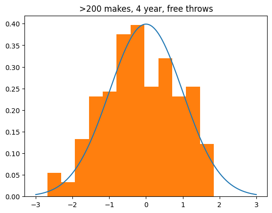
count    240.000000
mean      -0.144277
std        1.021330
min       -2.686543
25%       -0.854723
50%       -0.174146
75%        0.660302
max        1.845302
Conclusions, for now
I feel comfortable concluding that the hot hand doesn't exist when it comes to field goals. I can't say why there's a tendency towards unstreakiness yet, but I suspect it is due to shot selection. Players who have made a bunch of shots may take more difficult shots than average, and players who have missed a bunch of shots will go for an easier shot than average. While players can't choose when to "heat up" or "go cold", they can certainly change shot selection based on their emotions or the momentum of the game.
There may be a slight tendency towards the hot hand when it comes to free throws. It's worth investigating further, I think. But the effect there doesn't appear to be nearly as strong as the lukewarm hand tendency for field goals.
May 01, 2025
What geology can tell us about Kevin Durant's next team
When NBA superstar Kevin Durant left the Oklahoma City Thunder to join the Golden State Warriors, he said that doing so was taking "the hardest road". This was met with a lot of mockery, because the Golden State Warriors had just won 73 games, the most in NBA history, the previous year.
It was widely regarded as an uncool move, ring chasing, the ultimate bandwagon riding. It was clearly an absurd thing to say about the level of challenge he chose. It also made the NBA less interesting for several years, so he deserved some hate for it.
What people missed was that according to geology, he wasn't totally off-base. Streets are paved with asphalt, which is a combination of local rocks (aggregate) and tar. That means that some regions of America have harder roads than others, based on the local geology:
 (source: https://www.forconstructionpros.com/equipment/worksite/article/10745911/aggregate-hardness-map-of-the-united-states)
Oklahoma City is located right in the center of Oklahoma, with some of the softest aggregate in the United States. It's reasonable for someone who cares about road hardness to want to leave. Just about anywhere (except for Florida) would have been an improvement.
The "hardest road" out of OKC at that time would've been the one to New Orleans. It's about a 700 mile drive, and it looks like it's a nice gradient from some of the softest roads in the United States to the very hardest ones.
The New Orleans Pelicans at the time were pretty bad, basically just Anthony Davis, a couple good role players (Ryan Anderson, Jrue Holiday), and a rich collection of "Let's Remember Some Guys" Guys (Jimmer Fredette, Nate Robinson, Luke Babbitt, Ish Smith, Alonzo Gee, Norris Cole). KD and AD on the same team would have been cool, but even with Kevin Durant, the Pelicans would likely have been pretty bad. Certainly worse than the OKC team that Durant wanted to leave.
Although technically the "hardest road" out of Oklahoma City, going to New Orleans would have been a poor career choice for KD. The Pelicans have always been a cheap, poorly run team. I can't imagine it being a destination for any free agent of Kevin Durant's caliber.
He really should have said "I'm taking the hardest road that doesn't lead to a mismanaged tire fire of a team. Also by "hardest" I mean on the Mohs scale, not the challenge" and everybody would have understood.
Northern California has a medium-hard substrate, so his choice to go to the Warriors was definitely a harder road than a lot of other places he could have gone. Since leaving the Warriors, he's played for two other teams with medium-hard roads: the Brooklyn Nets and the Phoenix Suns. He's never chosen to take a softer road. Give him credit for that.
Now that there are rumors about Kevin Durant being traded from the Suns, what can geology tell us about Durant's next destination?
The other NBA cities with medium-hard to hard roads are New Orleans, Boston, Charlotte, Houston, New York, Sacramento, Utah, and Washington DC. He's from DC so that might be nice. But Durant always says he wants to compete for a championship. So we can rule them out, as well as New Orleans, Charlotte and Utah.
I can't really see Boston or New York wanting to tweak their rosters too much, because they're both already good enough to win a championship and don't have a lot of tradeable assets. Sacramento's not a great fit. The Kings would be dreadful on defense, and have too many players who need the ball at once.
That leaves Houston. Durant would fix the Rockets' biggest weakness -- not having a go-to scorer -- and Houston could surround him with a bunch of guys who can play defense. Most importantly, he'd get to continue to drive on medium-hard roads.
Kevin Durant to the Houston Rockets. The geology doesn't lie.