Sep 10, 2025

Song: Klonhertz, "Three Girl Rhumba"
Notebook available here
Think of a number
Pick a number between 1-100.
Say I write down the numbers from 1-100 on pieces of paper and put them in a big bag, and randomly select from them. After every selection, I put the paper back in the bag, so the same number can get picked more than once. If I do that 100 times, what is the chance of your number being chosen?
The math isn't too tricky. It's often easier to calculate the chances of a thing not happening, then subtract that from 1, to get the chances of the thing happening. There's a 99/100 chance your number doesn't get picked each time. So the probability of never getting selected is $(99/100)^{100} = .366$. Subtract that from one, and there's a 63.4% chance your number will be chosen. Alternately, we'd expect to get 634 unique numbers in 1000 selections.
When I start picking numbers, there's a low chance of getting a duplicate, but that increases as I go along. On my second pick, there's only a 1/100 chance of getting a duplicate. But if I'm near the end and have gotten 60 uniques so far, there's a 60/100 chance.
It's kind of a self-correcting process. Every time I pick a unique number, it increases the odds of getting a duplicate on the next pick. Each pick is independent, but the likelihood of getting a duplicate is not.
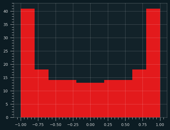
I could choose the numbers by flipping a biased coin that comes up heads 63.4% of the time for each one instead. I will get the same number of values on average, and they will be randomly chosen, but the count of values will be much more variable:
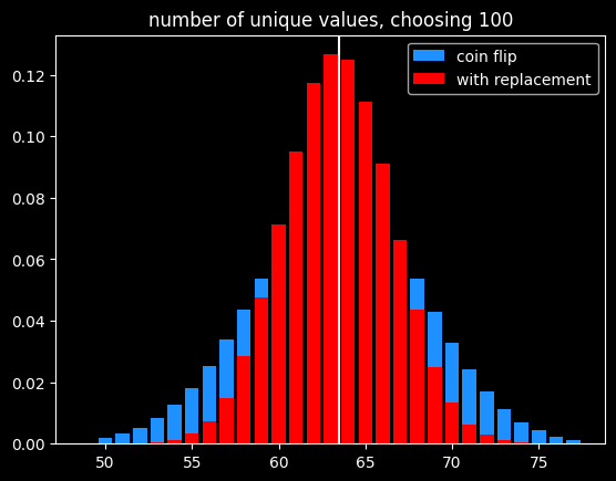
Of course, if the goal is to select exactly 63 items out of 100, the best way would be to randomly select 63 without replacement so there is no variation in the number of items selected.
A number's a number
Instead of selecting 100 times from 100 numbers, what if we selected a bajillion times from a bajillion numbers? To put it in math terms, what is $\lim\limits_{n\to\infty} (\frac{n-1}{n})^{n}$ ?
It turns out this is equal to $\frac{1}{e}$ ! Yeah, e! Your old buddy from calculus class. You know, the $e^{i\pi}$ guy?
As n goes to infinity, the probability of a number being selected is $1-\frac{1}{e} = .632$. This leads to a technique called bootstrapping, or ".632 selection" in machine learning (back to that in a minute).
Don't think of an answer
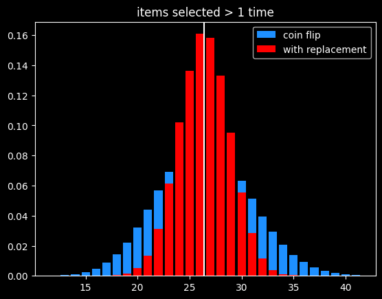
What are the chances that a number gets selected exactly once? Turns out, it's $\frac{1}{e}$, same as the chances of not getting selected! This was surprising enough to me to bother to work out the proof, given at the end.
That means the chances of a number getting selected more than once is $1 - \frac{2}{e}$.
The breakdown:
- 1/e (36.8%) of numbers don't get selected
- 1/e (36.8%) get selected exactly once
- 1-2/e (26.4%) get selected 2+ times
As before, the variance in number of items picked 2+ times is much lower than flipping a coin that comes up heads 26.4% of the time:
Derangements
Say I'm handing out coats randomly after a party. What are the chances that nobody gets their own coat back?
This is called a derangement, and the probability is also 1/e. An almost correct way to think about this is the chance of each person not getting their own coat (or each coat not getting their own person, depending on your perspective) is $\frac{(x-1)}{x}$ and there are $x$ coats, so the chances of a derangement are $\frac{x-1}{x}^{x}$.
This is wrong because each round isn't independent. In the first case, we were doing selection with replacement, so a number being picked one round doesn't affect its probability of being picked next round. That's not the case here. Say we've got the numbers 1 thru 4. To make a derangement, the first selection can be 2, 3 or 4. The second selection can be 1, 3 or 4. But 3 or 4 might have been picked in the first selection and can't be chosen again. 2/3rds of the time, there will only be two options for the second selection, not three.
The long way 'round the mountain involves introducing a new mathematical function called the subfactorial, denoted as $!x$, which is equal to the integer closest to $\frac{x!}{e}$. $e$ gets in there because in the course of counting the number of possible derangements, a series is produced that converges to $1/e$.
The number of derangements for a set of size x is $!x$ and the number of permutations is $x!$, so the probability of a derangement as x gets big is $\frac{!x}{x!} = \frac{1}{e}$
What about the chances of only one person getting their coat back? It's also $\frac{1}{e}$, just like the chances of a number getting selected exactly once when drawing numbers with replacement. The number of fixed points -- number of people who get their own coat back -- follows a Poisson distribution with mean 1.
The second process seems very different from the first one. It is selection with replacement versus without replacement. But $e$ is sort of the horizon line of mathematics -- a lot of things tend towards it (or its inverse) in the distance.
Bootstrapping
Say we're working on a typical statistics/machine learning problem. We're given some training data where we already know the right answer, and we're trying to predict for future results. There are a ton of ways we could build a model. Which model will do the best on the unknown data, and how variable might the accuracy be?
Bootstrapping is a way to answer those questions. A good way to estimate how accurate a model will be in the future is to train it over and over with different random subsets of the training data, and see how accurate the model is on the data that was held out. That will give a range of accuracy scores which can be used to estimate how well the model will be on new inputs, where we don't know the answers ahead of time. If the model we're building has a small set of parameters we're fitting (like the coefficients in a linear regression), we can also estimate a range of plausible values for those parameters. If that range is really wide, it indicates a certain parameter isn't that important to the model, because it doesn't matter if it's big or small.
Bootstrapping is a way of answering those questions, using the process described before -- if we have x datapoints, pick x numbers without replacement x times. The ones that get selected at least once are used to train the models, and the ones that don't get selected are used to generate an estimate of accuracy on unseen data. We can do that over and over again and get different splits every time.
It's a fine way to split up the training data and the validation data to generate a range of plausible accuracy scores, but I couldn't find a good reason other than tradition for doing it that way. The 63.2/36.8 split isn't some magical value. Instead of having the numbers that weren't picked be the holdout group, we could instead leave out the numbers that were only picked once (also 1/e of the numbers), and train on the ones not selected or selected more than once. But picking 63% of values (or some other percentage) without replacement is the best way to do it, in my opinion.
The original paper doesn't give any statistical insight into why the choice was made, but a remark at the end says, "it is remarkably easy to implement on the computer", and notes the $4 cost of running the experiments on Stanford's IBM 370/168 mainframe. Maybe it's just the engineer in me, but it seems like a goofy way to do things, unless you actually want a variable number of items selected each run.
In the notebook, I showed that bootstrapping is about 40% slower than selection without replacement when using numpy's choice() function. However, the cost of selecting which items to use for training vs. testing should be insignificant compared to the cost of actually training the models using that train/test split.
A chance encounter
A quick proof of the chances of being selected exactly once.
Doing x selections with replacement, the chance of a number being chosen as the very first selection (and no other times) is
$\frac{1}{x} * \frac{x-1}{x}^{x-1}$
There are x possible positions for a number to be selected exactly once. Multiply the above by x, which cancels out 1/x. So the chances of a number being selected exactly once at any position is $(\frac{x-1}{x})^{x-1}$.
Let's try to find a number $q$ so that $\lim\limits_{x\to\infty} (\frac{x-1}{x})^{x-1} = e^{q}$.
Taking the log of both sides:
$q = \lim\limits_{x\to\infty} (x-1) * log(\frac{x-1}{x}) = \lim\limits_{x\to\infty} \frac{log(\frac{x-1}{x})}{1/(x-1)}$
Let
$f(x) = log(\frac{x-1}{x})$
and
$g(x) = \frac{1}{x-1}$
By L'Hopital's rule, $\lim\limits_{x\to\infty} \frac{f(x)}{g(x)} = \lim\limits_{x\to\infty}\frac{f'(x)}{g'(x)}$
The derivative of a log of a function is the derivative of the function divided by the function itself, so:
$f'(x) = \frac{d}{dx} log(\frac{x-1}{x}) = \frac{d}{dx} log(1 - \frac{1}{x}) = \frac{\frac{d}{dx}(1-\frac{1}{x})}{1-\frac{1}{x}} =\frac{\frac{1}{x^{2}}}{{1-\frac{1}{x}}} = \frac{1}{x^{2}-x} = \frac{1}{x(x-1)}$
and
$g'(x) = \frac{-1}{(x-1)^{2}}$
Canceling out (x-1) from both, $\frac{f'(x)}{g'(x)} = \frac{1}{x} * \frac{x-1}{-1} = -1 * \frac{x-1}{x}$.
So $q = \lim\limits_{x\to\infty} -1 * \frac{x-1}{x} = -1$
At the limit, the probability of being selected exactly once is $e^{-1} = \frac{1}{e}$
References/Further Reading
https://oeis.org/A068985
https://mathworld.wolfram.com/Derangement.html
Great explanation of how to calculate derangements using the inclusion-exclusion principle: https://www.themathdoctors.org/derangements-how-often-is-everything-wrong/
The bible of machine learning introduces bootstrapping, but no talk of why that selection process. https://trevorhastie.github.io/ISLR/ISLR%20Seventh%20Printing.pdf
The original bootstrap paper: https://sites.stat.washington.edu/courses/stat527/s14/readings/ann_stat1979.pdf
Jul 26, 2025

After spending several weeks in the degenerate world of sports gambling, I figured we should go get some fresh air in the land of pure statistics.
The Abnormal Distribution
Everybody knows what the normal distribution looks like, even if they don't know it as such. You know, the bell curve? The one from the memes?
In traditional statistics, the One Big Thing you need to know is called the Central Limit Theorem. It says, if you collect some data and take the average of it, that average (the sample mean) will behave in nice, predictable ways. It's the basis of basically all experimental anything. If you take a bunch of random samples and calculate the sample mean over and over again, those sample means will look like a normal distribution, if the sample sizes are big enough. That makes it possible to draw big conclusions from relatively small amounts of data.
How big is "big enough"? Well, it partly depends on the shape of the data being sampled from. If the data itself is distributed like a normal distribution, it makes sense that the sample means would also be normally shaped. It takes a smaller sample size to get the sampling distributions looking like a normal distribution.
While a lot of things in life are normally distributed, some of them aren't. The uniform distribution is when every possible outcome is equally likely. Rolling a single die, for instance. 1-6 are all equally likely. Imagine we're trying to estimate the mean value for rolling a standard 6 sided die.
A clever way would be to team up sets of sides - 6 goes with 1, 5 goes with 2, 4 goes with 3. Clearly the mean value has to be 3.5, right?
A less clever way would be to roll a 6 sided die a bunch of times and take the average. We could repeat that process, and track all of these averages. If the sample size is big enough, those averages will make a nice bell curve, with the center at 3.5.
The uniform distribution is sort of obnoxious if you want to calculate the sample mean. The normal distribution, and a lot of other distributions, have a big peak in the middle and tail off towards the edges. If you pick randomly from one of these distributions, it's far more likely to be close to the middle than it is to be far from the middle. With the uniform distribution, every outcome is equally likely:
Couldn't we do even worse than the uniform distribution, though? What if the tails/outliers were even higher than the center? When I first learned about the Central Limit Theorem, I remember thinking about that - how could you define a distribution to be the most obnoxious one possible? The normal distribution is like a frowny face. The Uniform distribution is like a "not impressed" face. Couldn't we have a smiley face distribution to be the anti-normal distribution?
Waveforms and probabilities.
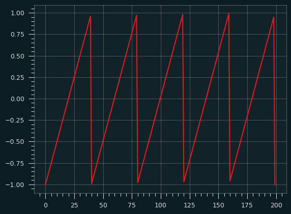
All synthesizers in electronic music use a mix of different types of simple waveforms. The sublime TB-303 synth line in the song at the top is very simple. The TB-303 a monophonic synth -- a single sawtooth wave (or square wave) with a bunch of filters on top that, in the right hands, turn it from buzzy electronic noise to an emotionally expressive instrument, almost like a digitial violin or human voice.
This got me thinking about what probability distributions based on different types of waveforms would look like. How likely is the waveform to be at each amplitude?
Here's the sawtooth waveform:
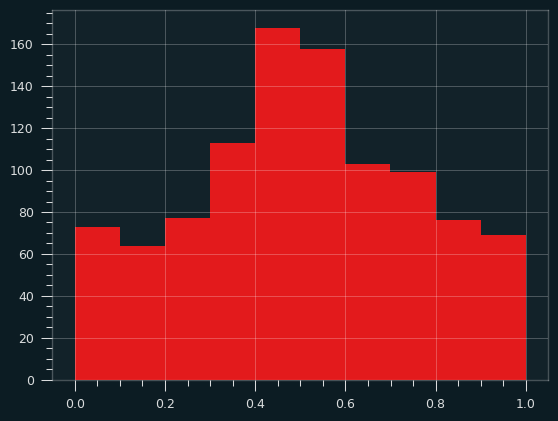
If we randomly sample from this wave (following a uniform distribution -- all numbers on the x axis are equally likely) and record the y value, then plot the values as a histogram, what would it look like? Think of it like we put a piece of toast on the Y axis of the graph, the X axis is time. How will the butter be distributed?
It should be a flat line, like the Uniform distribution, since each stroke of butter is at a constant rate. We're alternating between a very fast wipe and a slower one, but in both cases, it doesn't spend any more time on one section of bread than another because it's a straight line.
Advanced breakfast techniques
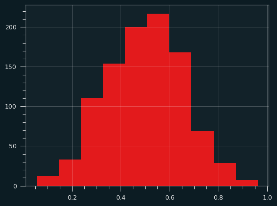
A square wave spends almost no time in the middle of the bread, so nearly all the butter will be at the edges. That's not a very interesting graph. What about a sine wave?
The sawtooth wave always has a constant slope, so the butter is evenly applied. With the sine wave, the slope changes over time. Because of that, the butter knife ends up spending more time at the extreme ends of the bread, where the slope is shallow, compared to the middle of the bread. The more vertical the slope, the faster the knife passes over that bit of bread, and the less butter it gets.
If we sample a bunch of values from the sine wave and plot their Y values as a histogram, we'll get something that looks like a smiley face -- lots of butter near the edges, less butter near the center of the toast. Or perhaps, in tribute to Ozzy, the index and pinky fingers of someone throwing the devil horns.
That's a perfectly valid buttering strategy in my book. The crust near the edges tends to be drier, and so can soak up more butter. You actually want to go a bit thinner in the middle, to maintain the structural integrity of the toast.
This distribution of butter forms a probability distribution called the arcsine distribution. It's an anti-normal distribution -- fat in the tails, skinny in the middle. A "why so serious?" distribution the Joker might appreciate. The mean is the least likely value, rather than the most likely value. And yet, the Central Limit Theorem still holds. The mean of even a fairly small number of values will behave like a Normal distribution.
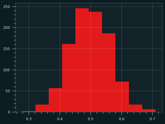
Here are 1,000 iterations of an average of two samples from the arcsine distribution:
And averages of 5 samples:
And 30 samples at a time. Notice how the x range has shrunk down.
There are a lot of distributions that produce that U-type shape. They're known as bathtub curves. They come up when plotting the failure rates of devices (or people). For a lot of things, there's an elevated risk of failure near the beginning and the end, with lower risk in the middle. The curve is showing conditional probability -- for an iPhone to fail on day 500, it has to have not failed on the first 499 days.

(source: Wikipedia/Public Domain, https://commons.wikimedia.org/w/index.php?curid=7458336)
Particle man vs triangle man
The Uniform distribution isn't really that ab-Normal. It's flat, but it's very malleable. It turns into the normal distribution almost instantly. The symmetry helps.
If we take a single sample from a Uniform distribution over and over again, and plot a histogram, it's going to look flat, because every outcome is equally likely.
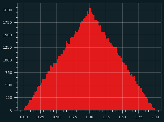
If we take the sum (or average) of two Uniform random variables, what would that look like? We're going to randomly select two numbers between 0 and 1 and sum them up. The result will be between 0 and 2. But some outcomes will be more likely than others. The extremes (0 and 2) should be extremely unlikely, right? Both the random numbers would have to be close to 0 for the sum to be, and vice versa. There are a lot of ways to get a sum of 1, though. It could be .9 and .1, or .8 and .2, and so on.
If you look online, you can find many explanations of how to get the PDF of the sum of two Uniform distributions using calculus. (Here's a good one). While formal proofs are important, it's not very intuitive. So, here's another way to think of it.
Let's say we're taking the sum of two dice instead of two Uniform random variables. We're gonna start with two 4 sided dice. It will be obvious that we can scale the number of faces up, and the pattern will hold.
What are the possible combinations of dice? The dice are independent, so each combination is equally likely. Let's write them out by columns according to their totals:
|
|
|
|
|
|
|
| (1, 1) |
(1,2) |
(1,3) |
(1,4) |
- |
- |
- |
| - |
(2,1) |
(2,2) |
(2,3) |
(2,4) |
- |
- |
| - |
- |
(3,1) |
(3,2) |
(3,3) |
(3,4) |
- |
| - |
- |
- |
(4,1) |
(4,2) |
(4,3) |
(4,4) |
If we write all the possibilities out like this, it's gonna look like a trapezoid, whether there are 4 faces on the dice, or 4 bajillion. Each row will have one more column that's blank than the one before, and one column that's on its own off to the right.
If we consolidate the elements, we're gonna get a big triangle, right? Each column up to the mean will have one more combo, and each column after will have one less.
|
|
|
|
|
|
|
| (1, 1) |
(1,2) |
(1,3) |
(1,4) |
(2,4) |
(3,4) |
(4,4) |
| - |
(2,1) |
(2,2) |
(2,3) |
(3,3) |
(4,3) |
- |
| - |
- |
(3,1) |
(3,2) |
(4,2) |
- |
- |
| - |
- |
- |
(4,1) |
- |
- |
- |
With a slight re-arrangement of values, it's clear the triangle builds up with each extra face we add to the dice.
|
|
|
|
|
|
|
| (1, 1) |
(1,2) |
(2,2) |
(2,3) |
(3,3) |
(3,4) |
(4,4) |
| - |
(2,1) |
(1,3) |
(3,2) |
(2,4) |
(4,3) |
- |
| - |
- |
(3,1) |
(1,4) |
(4,2) |
- |
- |
| - |
- |
- |
(4,1) |
- |
- |
- |
The results for two 2 sided dice are embedded in the left 3 columns of table, then the results for two 3 sided dice on top of them, then two 4 sided dice. Each additional face will add 2 columns to the right. I'm not gonna formally prove anything, but hopefully it's obvious that it will always make a triangle.
That's the triangular distribution.
Here's a simulation, calculating the sum of two random uniform variables over and over, and counting their frequencies:
3 is the magic number
The sum (or average) of 3 Uniform random variables looks a whole lot like the normal distribution. The sides of the triangle round out, and we get something more like a bell curve. It's more than a parabola because the slope is changing on the sides. Here's what it looks like in simulation:
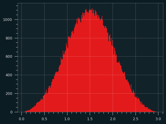
Here are three 4 sided dice. It's no longer going up and down by one step per column. The slope is changing as we go up and down the sides.
| 3 |
4 |
5 |
6 |
7 |
8 |
9 |
10 |
11 |
12 |
| (1, 1, 1) |
(2, 1, 1) |
(2, 2, 1) |
(2, 2, 2) |
(3, 3, 1) |
(3, 3, 2) |
(3, 3, 3) |
(4, 4, 2) |
(4, 4, 3) |
(4, 4, 4) |
| - |
(1, 2, 1) |
(2, 1, 2) |
(3, 2, 1) |
(3, 2, 2) |
(3, 2, 3) |
(4, 4, 1) |
(4, 3, 3) |
(4, 3, 4) |
- |
| - |
(1, 1, 2) |
(1, 2, 2) |
(3, 1, 2) |
(3, 1, 3) |
(2, 3, 3) |
(4, 3, 2) |
(4, 2, 4) |
(3, 4, 4) |
- |
| - |
- |
(3, 1, 1) |
(2, 3, 1) |
(2, 3, 2) |
(4, 3, 1) |
(4, 2, 3) |
(3, 4, 3) |
- |
- |
| - |
- |
(1, 3, 1) |
(2, 1, 3) |
(2, 2, 3) |
(4, 2, 2) |
(4, 1, 4) |
(3, 3, 4) |
- |
- |
| - |
- |
(1, 1, 3) |
(1, 3, 2) |
(1, 3, 3) |
(4, 1, 3) |
(3, 4, 2) |
(2, 4, 4) |
- |
- |
| - |
- |
- |
(1, 2, 3) |
(4, 2, 1) |
(3, 4, 1) |
(3, 2, 4) |
- |
- |
- |
| - |
- |
- |
(4, 1, 1) |
(4, 1, 2) |
(3, 1, 4) |
(2, 4, 3) |
- |
- |
- |
| - |
- |
- |
(1, 4, 1) |
(2, 4, 1) |
(2, 4, 2) |
(2, 3, 4) |
- |
- |
- |
| - |
- |
- |
(1, 1, 4) |
(2, 1, 4) |
(2, 2, 4) |
(1, 4, 4) |
- |
- |
- |
| - |
- |
- |
- |
(1, 4, 2) |
(1, 4, 3) |
- |
- |
- |
- |
| - |
- |
- |
- |
(1, 2, 4) |
(1, 3, 4) |
- |
- |
- |
- |
The notebook has a function to print it for any number of faces and dice. Go crazy if you like, but it quickly becomes illegible.
Here's the results of three 12 sided dice:

This isn't a Normal distribution, but it sure looks close to one.
Toast triangles
What if we feed the triangular distribution through the sin() function? To keep the toast analogy going, I guess we're spreading the butter with a sine wave pattern, but changing how hard we're pressing down on the knife to match the triangular distribution -- slow at first, then ramping up, then ramping down.
Turns out, if we take the sine of the sum of two uniform random variables (defined from the range of -pi to +pi), we'll get the arcsin distribution again! [2] I don't know if that's surprising or not, but there you go.
Knowing your limits
There's a problem with the toast analogy. (Well, at least one. There may be more, but I ate the evidence.)
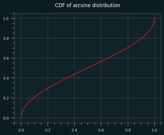
The probability density function of the arcsine distribution looks like this:
It goes up to infinity at the edges!
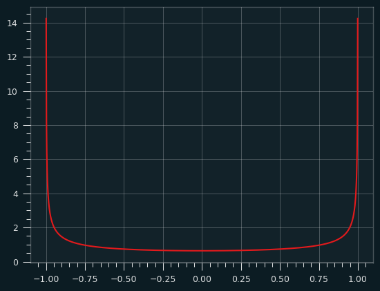
The derivative of the arcsin function is 1/sqrt(1-x**2) which goes to infinity as x approaches 0 or 1. That's what gives the arcsine distribution its shape. That also sort of breaks the toast analogy. Are we putting an infinite amount of butter on the bread for an infinetesimal amount of time at the ends of the bread? You can break your brain thinking about that, but you should feel confident that we put a finite amount of butter on the toast between any two intervals of time. We're always concerned with the defined amount of area underneath the PDF, not the value at a singular point.
Here's a histogram of the actual arcsine distribution -- 100,000 sample points put into 1,000 bins:
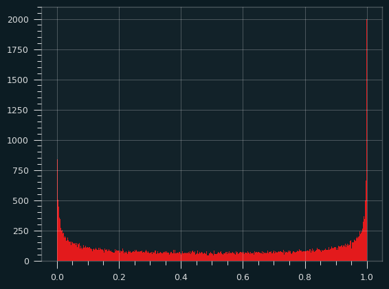
About 9% of the total probability is in the leftmost and rightmost 0.5% of the distribution, so the bins at the edges get really, really tall, but they're also really, really skinny. there's a bound on how big they can be.
The CDF (area under the curve of the PDF) of the arcsine distribution is well behaved, but its slope goes to infinity at the very edges.
One for the road
The sinc() function is defined as sin(x)/x. It doesn't lead to a well-known distribution as far as I know, but it looks cool, like the logo of some aerospace company from the 1970's, so here you go:
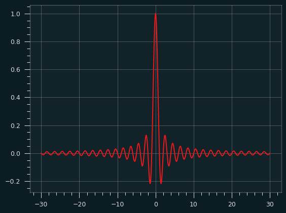
Would I buy a Camaro with that painted on the hood? Yeah, probably.
An arcsine of things to come
The arcsine distribution is extremely important in the field of random walks. Say you flip a coin to decide whether to turn north or south every block. How far north or south of where you started will you end up? How many times will you cross the street you started on?
I showed with the hot hand research that our intuitions about randomness are bad. When it comes to random walks, I think we do even worse. Certain sensible things almost never happen, while weird things happen all the time, and the arcsine distribution explains a lot of that.
References/further reading
Jun 08, 2025
(Notebooks and other code available at: https://github.com/csdurfee/hot_hand)
What is "approximately normal"?
In the last installment, I looked at NBA game-level player data, which involve very small samples.
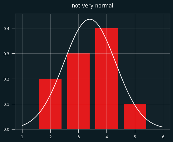
Like a lot of things in statistics, the Wald Wolfowitz test says that the number of streaks is approximately normal. What does that mean in practical terms? How approximately are we talking?
The number of streaks is a discrete value (0,1,2,3,...). In a small sample like 2 makes and 3 misses, which will be extremely common in player game level shooting data, how could that be approximately normal?
Below is a bar chart of the exact probabilities of each number of streaks, overlaid with the normal approximation in white. Not very normal, is it?
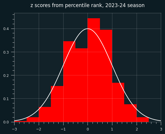
To make things more interesting, let's say the player made 7 shots and missed 4. That's enough for the graph to look more like a proper bell curve.
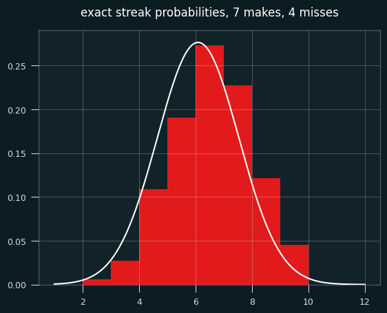
The bell curve looks skewed relative to the histogram, right? That's what happens when you model a discrete distribution (the number of streaks) with a continuous one -- the normal distribution.
A continuous distribution has zero probability at any single point, so we calculate the area under the curve between a range of values. The bar for exactly 7 streaks should line up with the probability of between 6.5 and 7.5 streaks in the normal approximation. The curve should be going through the middle of each bar, not the left edge.
We need to shift the curve to the right a half a streak for things to line up. Fixing this is called continuity correction.
Here's the same graph with the continuity correction applied:
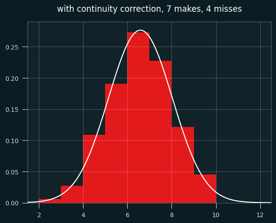
So... better, but there's still a problem. The normal approximation will assign a nonzero probability to impossible things. In this case of 7 makes and 4 misses, the minimum possible number of streaks is 2 and the max is 9 (alternate wins and losses till you run out of losses, then have a string of wins at the end.)
Yet the normal approximation says there's a nonzero chance of -1, 10, or even a million streaks. The odds are tiny, but the normal distribution never ends. These differences go away with big sample sizes, but they may be worth worrying about for small sample sizes.
Is that interfering with my results? It's quite possible. I'm trying to use the mean and the standard deviation to decide how "weird" each player is in the form of a z score. The z score gives the likelihood of the data happening by chance, given certain assumptions. If the assumptions don't hold, the z score, and using it to interpret how weird things are, is suspect.
Exact-ish odds
We can easily calculate the exact odds. In the notebook, I showed how to calculate the odds with brute force -- generate all permutations of seven 1's and four 0's, and measure the number of streaks for each one. That's impractical and silly, since the exact counting formula can be worked out using the rules of combinatorics, as this page nicely shows: https://online.stat.psu.edu/stat415/lesson/21/21.1
In order to compare players with different numbers of makes and misses, we'd want to calculate a percentile value for each one from the exact odds. The percentiles will be based on number of streaks, so 1st percentile would be super streaky, 99th percentile super un-streaky.
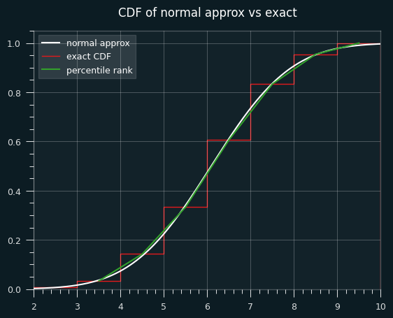
Let's say we're looking at the case of 7 makes and 4 misses, and are trying to calculate the percentile value that should go with each number of streaks. Here are the exact odds of each number of streaks:
2    0.006061
3    0.027273
4    0.109091
5    0.190909
6    0.272727
7    0.227273
8    0.121212
9    0.045455
Here are the cumulative odds (the odds of getting that number of streaks or fewer):
2    0.006061
3    0.033333
4    0.142424
5    0.333333
6    0.606061
7    0.833333
8    0.954545
9    1.000000
Let's say we get 6 streaks. Exactly 6 streaks happens 27% of the time. 5 or fewer streaks happens 33% of the time. So we could say 6 streaks is equal to the 33rd percentile, the 33.3%+27.3% = 61st percentile, or some value in between those two numbers.
The obvious way of deciding the percentile rank is to take the average of the upper and lower values, in this case mean(.333, .606) = .47. You could also think of it as taking the probability of streaks <=5 and adding half the probability of streaks=6.
If we want to compare the percentile ranks from the exact odds to Wald-Wolfowitz, we could convert them to an equivalent z score. Or, we can take the z-scores from the Wald Wolfowitz test and convert them to percentiles.
The two are bound to be a little different because the normal approximation is a bell curve, whereas we're getting the percentile rank from a linear interpolation of two values.
Here's an illustration of what I mean. This is a graph of the percentile ranks vs the CDF of the normal approximation.
Let's zoom in on the section between 4.5 and 5.5 streaks. Where the white line hits the red line is the percentile estimate we'd get from the z-score (.475).
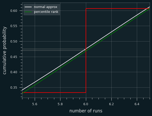
The green line is a straight line that represents calculating the percentile rank. It goes from the middle of the top of the runs <= 5 bar to the middle of the top of the runs <=6 bar. Where it hits the red line is the average of the two, which is percentile rank (.470).
In other situations, the Wald-Wolfowitz estimate will be less than the exact percentile rank. We can see that on the first graph. The green lines and white line are very close to each other, but sometimes the green is higher (like at runs=4), and sometimes the white is higher (like at runs=8).
Is Wald-Wolfowitz unbiased?
Yeah. The test provides the exact expected value of the number of streaks. It's not just a pretty good estimate. It is the (weighted) mean of the exact probabilities.
From the exact odds, the mean of all the streak lengths is 6.0909:
count    330.000000
mean       6.090909
std        1.445329
min        2.000000
25%        5.000000
50%        6.000000
75%        7.000000
max        9.000000
The Wald-Wolfowitz test says the expected value is 1 plus the harmonic mean of 7 and 4, which is 6.0909... on the nose.
Is the normal approximation throwing off my results?
Quite possibly. So I went back and calculated the percentile ranks for every player-game combo over the course of the season.
Here's a scatter plot of the two ways to calculate the percentile on actual NBA player games. The dots above the x=y line are where the Wald-Wolfowitz percentile is bigger than the percentile rank one.
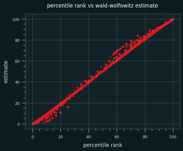
59% of the time, the Wald-Wolfowitz estimate produces a higher percentile value than the percentile rank. The same trend occurs if I restrict the data set to only high volume shooters (more than 10 makes or misses on the game).
Here's a bar chart of the differences between the W-W percentile and the percentile rank:
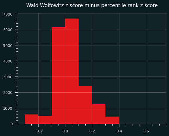
A percentile over 50, or a positive z score, means more streaks than average, thus less streaky than average. In other words, on this specific data set, the Wald-Wolfowitz z-scores will be more un-streaky compared to the exact probabilities.
Interlude: our un-streaky king
For the record, the un-streakiest NBA game of the 2023-24 season was by Dejounte Murray on 4/9/2024. My dude went 12 for 31 and managed 25 streaks, the most possible for that number of makes and misses, by virtue of never making 2 shots in a row.
It was a crazy game all around for Murray. A 29-13-13 triple double with 4 steals, and a Kobe-esque 29 points on 31 shots. He could've gotten more, too. The game went to double overtime, and he missed his last 4 in a row. If he had made the 2nd and the 4th of those, he could've gotten 4 more streaks on the game.
The summary of the game doesn't mention this exceptional achievement. Of course they wouldn't. There's no clue of it in the box score. You couldn't bet on it. Why would anyone notice?
box score on bbref
Look at that unstreakiness. Isn't it beautiful?
makes                                                  12
misses                                                 19
total_streaks                                          25
raw_data                  LWLWLWLWLWLWLLWLLLWLWLWLWLWLLLL
expected_streaks                                15.709677
variance                                         6.722164
z_score                                          3.583243
exact_percentile_rank                           99.993423
z_from_percentile_rank                           3.823544
ww_percentile                                   99.983032
On the other end, the streakiest performance of the year belonged to Jabari Walker of the Portland Trail Blazers. Made his first 6 shots in a row, then missed his last 8 in a row.
makes                                  6
misses                                 8
total_streaks                          2
raw_data                  WWWWWWLLLLLLLL
expected_streaks                7.857143
variance                        3.089482
z_score                        -3.332292
exact_percentile_rank             0.0333
z_from_percentile_rank         -3.403206
ww_percentile                   0.043067
Actual player performances
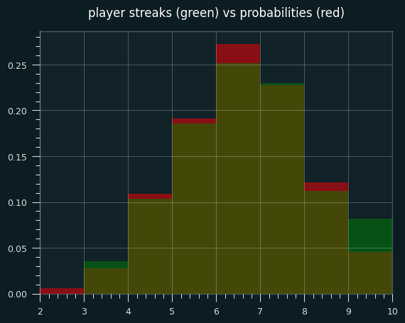
Let's look at actual NBA games where a player had exactly 7 makes and 4 misses. (We can also include the flip side, 4 makes and 7 misses, because it will be the same distribution of streak lengths)
The green areas are where the players had more streaks than the exact probabilities; the red areas are where players had fewer streaks. The two are very close, except for a lot more games with 9 streaks in the player data, and fewer 6 streak games.
The exact mean is 6.09 streaks. The mean for player performances is 6.20 streaks. Even in this little slice of data, there's a slight tendency towards unstreakiness.
Percentile ranks are still unstreaky, though
Well, for all that windup, the game-level percentile ranks didn't turn out all that different when I calcualted them for all 18,000+ player-game combos. The mean and median are still shifted to the un-streaky side, to a significant degree.
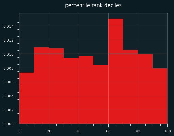
Plotting the deciles shows an interesting tendency: a lot more values in the 60-70th percentile range than expected. the shift to the un-streaky side comes pretty much from these values.
The bias towards the unstreaky side is still there, and still significant:
count    18982.000000
mean         0.039683
std          0.893720
min         -3.403206
25%         -0.643522
50%          0.059717
75%          0.674490
max          3.823544
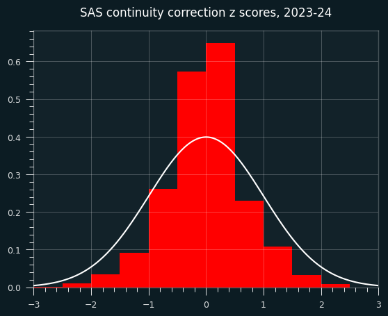
A weird continuity correction that seems obviously bad
SAS, the granddaddy of statistics software, applies a continuity correction to the runs test whenever the count is less than 50.
While it's true that we should be careful with normal approximations and small sample size, this ain't the way.
The exact code used is here: https://support.sas.com/kb/33/092.html
        if N GE 50 then Z = (Runs - mu) / sigma;
        else if Runs-mu LT 0 then Z = (Runs-mu+0.5)/sigma;
          else Z = (Runs-mu-0.5)/sigma;
Other implementations I looked at, like the one in R's randtests package, don't do the correction.
What does this sort of correction look like?
For starters, it gives us something that doesn't look like a z score. The std is way too small.
count    18982.000000
mean        -0.031954
std          0.687916
min         -3.047828
25%         -0.401101
50%          0.000000
75%          0.302765
max          3.390395
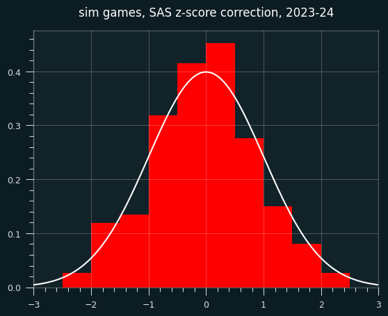
What does this look like on random data?
It could just be this dataset, though. I will generate a fake season of data like in the last installment, but the players will have no unstreaky/streaky tendencies. They will behave like a coin flip, weighted to their season FG%. So the results should be distributed like we expect z scores to be (mean=0, std=1)
Here are the z-scores. They're not obviously bad, but the center is a bit higher than it should be.
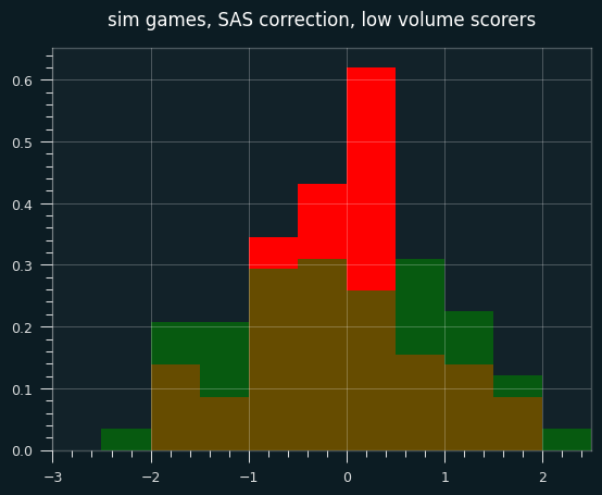
However, the continuity correction especially stands out when looking at small sample sizes (in this case, simulated players with fewer than 30 shooting streaks over the course of the season).
In the below graph, red are the SAS corrected z-scores, green are the wald-wolfowitz z scores, brown are the overlap.
Continuity corrections are at best an imperfect substitute for calculating the exact odds. These days, there's no reason not to use exact odds for smaller sample sizes. Even though it ended up not mattering much, I should've started with the percentile rank for individual games. However, I don't think that the game level results are as important to the case I'm making as the career-long shooting results.
Next time, I will look at the past 20 years of NBA data. Who is the un-streakiest player of all time?