Sep 23, 2025

Song: John Hollenbeck & NDR Big Band, "Entitlement"
I've been messing around with prime numbers, because there are several places where they intersect with both random walks and the arcsine distribution. It's going to take a while to finally tie that bow, though.
So it's a quick one this week: a kinda-cool story, and a kinda-cool graph.
Random Primes
The prime numbers are simple to find, but not easy. They're not randomly distributed, but it's hard to come up with easy ways to find them, and they act like random numbers in certain ways. Why is 47 prime and 57 non-prime? You can't really tell just by looking.
To find the primes, we can write down every number from, say, 1 to 1000. Then we cross out 2, and every number divisible by 2 (4, 6, 8, etc.). Repeat that with 3 (6, 9, 12, etc.), and so on. The numbers left behind are prime. This is the famous Sieve of Eratosthenes -- it's a tedious way to find prime numbers, but it's by far the easiest to understand.
The sieve gave mathematician David Hawkins an idea [1]: what about doing that same process, but randomly? For each number, flip a coin, if it comes up heads, cross the number out. That will eliminate half of the numbers on the first pass. Take the lowest number k that remains and eliminate each of the remaining numbers with probability 1/k. Say it's 4. For each remaining number, we flip a 4 sided die and if it comes up 4, we cross it out.
If we go through all the numbers, what's left over won't look like real prime numbers -- there should be as many even fake primes as odd ones, for starters. But the remaining numbers will be as sparse as the actual prime numbers. As the sample size N heads to infinity, the chances of a random number being a real prime, and being a fake prime, are the same -- 1/log(N).
This is a brilliant way to figure out what we know about prime numbers are due to their density, and what are due to other, seemingly more magical (but still non-random) factors.
Several characteristics of real primes apply to the random primes. And tantalizingly, things that can't be proven about real primes can be proven about the fake ones. It's been conjectured that there are infinitely many pairs of twin primes -- primes that are separated by 2 numbers. An example would be 5 and 7, or 11 and 13. It makes sense for a lot of reasons that there should be an infinite number of twin primes. But mathematicians have been trying to prove it for over 150 years, without success.
Random primes can be odd or even, so the analogy to twin primes would be two random primes that are only one apart, say 5 and 6. It's relatively simple to prove that there are an infinite number of random twin primes [2]. That could easily be fool's gold -- treating the primes like they're randomly distributed gives mathematicians a whole toolbox of statistical techniques to use on them, but they're not random, or arbitrary. They're perfectly logical, and yet still inscrutible, hidden in plain sight.
Largest prime factors of composite numbers
I was intrigued by the largest prime factor of composite (non-prime) numbers. Are there any patterns?
As background, every number can be split into a unique set of prime factors. For instance, the number 24 can be factored into 24 = 8 * 3 = 2 * 2 * 2 * 3. Let's say we knock off the biggest prime factor. We get: 2 * 2 * 2 = 8. The raw numbers rapidly get too big, so I looked at the log of the ratio:
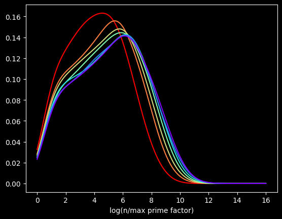
The red curve is the distribution of the first 100,000 composite numbers, the orange is the next 100,000 composite numbers, and so on.
What if we bump up an order of magnitude? This time, the red curve is the first million composite numbers, the orange is the next million, and so on. Here's what that looks like:
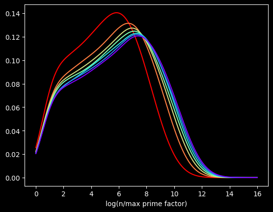
Pretty much the same graph, right? The X axis is different, but the shapes are very similar to the first one.
Let's go another order of magnitude up. The first 10,000,000 versus the next 10,000,000, and so on?
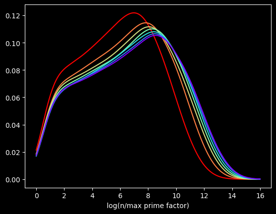
We get the same basic shapes again! The self-similarity is kinda cool. Is it possible to come up with some function for the distribution for this quantity? You tell me.
The perils of interpolation
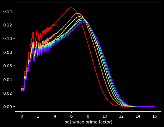
These graphs are flawed. I'm generating these graphs using Kernel Density Estimation, a technique for visualizing the density of data. Histograms, another common way, can be misleading. The choice of bin size can radically alter what the histogram looks like.
But KDE can also be misleading. These graphs make it look like the curve starts at zero. That's not true. The minimum possible value happens when a number is of the form 2*p, where p is a prime -- the value will be log(2), about .693.
This data is actually way chunkier than KDE is treating it. Every point of data is the log of a whole number. So there aren't that many unique values. For instance, between 0 and 1 on the X axis, there's only one possible value -- log(2). Between 1 and 3, there are only 18 possible values, log(2) thru log(19) -- those being the only integers with a log less than 3 and greater than 1.
This makes it hard to visualize the data accurately. There are too many possible values to display each one individually, but not enough for KDE's smoothing to be appropriate.
The kernel in Kernel Density Estimation is the algorithm used to smooth the data -- it's basically a moving average that assumes something about the distribution of the data. People usually use the Gaussian kernel, which treats the data like a normal distribution -- smooth and bell curvy. A better choice for chunky data is the tophat kernel, which treats the space between points like a uniform distribution -- in other words, a flat line. If the sparseness of the data on the X axis were due to a small sample size, the tophat kernel would display plateaus that aren't in the real data. But here, I calculated data for the first 100 Million numbers, so there's no lack of data. The sparseness of the data is by construction. log(2) will be the only value between 0 and 1, no matter how many numbers we go up to. So the left side of the graph should look fairly chunky.
The tophat kernel does a much better job of conveying the non-smoothness of the distribution:
References
[1] https://chance.dartmouth.edu/chance_news/recent_news/chance_primes_chapter2.html
[2] for sufficiently large values of simple
[3] https://scikit-learn.org/stable/auto_examples/neighbors/plot_kde_1d.html
[4] https://en.wikipedia.org/wiki/Kernel_density_estimation
Sep 10, 2025

Song: Klonhertz, "Three Girl Rhumba"
Notebook available here
Think of a number
Pick a number between 1-100.
Say I write down the numbers from 1-100 on pieces of paper and put them in a big bag, and randomly select from them. After every selection, I put the paper back in the bag, so the same number can get picked more than once. If I do that 100 times, what is the chance of your number being chosen?
The math isn't too tricky. It's often easier to calculate the chances of a thing not happening, then subtract that from 1, to get the chances of the thing happening. There's a 99/100 chance your number doesn't get picked each time. So the probability of never getting selected is $(99/100)^{100} = .366$. Subtract that from one, and there's a 63.4% chance your number will be chosen. Alternately, we'd expect to get 634 unique numbers in 1000 selections.
When I start picking numbers, there's a low chance of getting a duplicate, but that increases as I go along. On my second pick, there's only a 1/100 chance of getting a duplicate. But if I'm near the end and have gotten 60 uniques so far, there's a 60/100 chance.
It's kind of a self-correcting process. Every time I pick a unique number, it increases the odds of getting a duplicate on the next pick. Each pick is independent, but the likelihood of getting a duplicate is not.
I could choose the numbers by flipping a biased coin that comes up heads 63.4% of the time for each one instead. I will get the same number of values on average, and they will be randomly chosen, but the count of values will be much more variable:
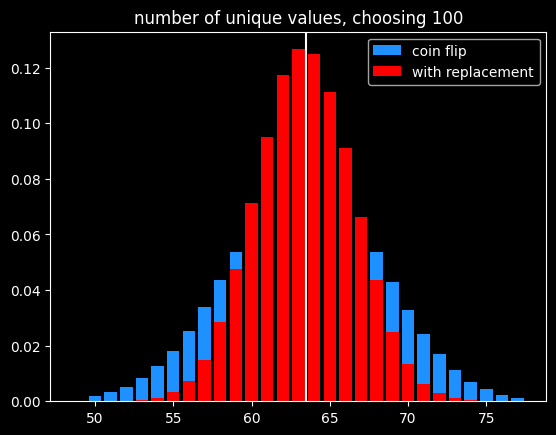
Of course, if the goal is to select exactly 63 items out of 100, the best way would be to randomly select 63 without replacement so there is no variation in the number of items selected.
A number's a number
Instead of selecting 100 times from 100 numbers, what if we selected a bajillion times from a bajillion numbers? To put it in math terms, what is $\lim\limits_{n\to\infty} (\frac{n-1}{n})^{n}$ ?
It turns out this is equal to $\frac{1}{e}$ ! Yeah, e! Your old buddy from calculus class. You know, the $e^{i\pi}$ guy?
As n goes to infinity, the probability of a number being selected is $1-\frac{1}{e} = .632$. This leads to a technique called bootstrapping, or ".632 selection" in machine learning (back to that in a minute).
Don't think of an answer
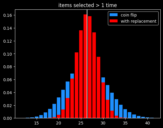
What are the chances that a number gets selected exactly once? Turns out, it's $\frac{1}{e}$, same as the chances of not getting selected! This was surprising enough to me to bother to work out the proof, given at the end.
That means the chances of a number getting selected more than once is $1 - \frac{2}{e}$.
The breakdown:
- 1/e (36.8%) of numbers don't get selected
- 1/e (36.8%) get selected exactly once
- 1-2/e (26.4%) get selected 2+ times
As before, the variance in number of items picked 2+ times is much lower than flipping a coin that comes up heads 26.4% of the time:
Derangements
Say I'm handing out coats randomly after a party. What are the chances that nobody gets their own coat back?
This is called a derangement, and the probability is also 1/e. An almost correct way to think about this is the chance of each person not getting their own coat (or each coat not getting their own person, depending on your perspective) is $\frac{(x-1)}{x}$ and there are $x$ coats, so the chances of a derangement are $\frac{x-1}{x}^{x}$.
This is wrong because each round isn't independent. In the first case, we were doing selection with replacement, so a number being picked one round doesn't affect its probability of being picked next round. That's not the case here. Say we've got the numbers 1 thru 4. To make a derangement, the first selection can be 2, 3 or 4. The second selection can be 1, 3 or 4. But 3 or 4 might have been picked in the first selection and can't be chosen again. 2/3rds of the time, there will only be two options for the second selection, not three.
The long way 'round the mountain involves introducing a new mathematical function called the subfactorial, denoted as $!x$, which is equal to the integer closest to $\frac{x!}{e}$. $e$ gets in there because in the course of counting the number of possible derangements, a series is produced that converges to $1/e$.
The number of derangements for a set of size x is $!x$ and the number of permutations is $x!$, so the probability of a derangement as x gets big is $\frac{!x}{x!} = \frac{1}{e}$
What about the chances of only one person getting their coat back? It's also $\frac{1}{e}$, just like the chances of a number getting selected exactly once when drawing numbers with replacement. The number of fixed points -- number of people who get their own coat back -- follows a Poisson distribution with mean 1.
The second process seems very different from the first one. It is selection with replacement versus without replacement. But $e$ is sort of the horizon line of mathematics -- a lot of things tend towards it (or its inverse) in the distance.
Bootstrapping
Say we're working on a typical statistics/machine learning problem. We're given some training data where we already know the right answer, and we're trying to predict for future results. There are a ton of ways we could build a model. Which model will do the best on the unknown data, and how variable might the accuracy be?
Bootstrapping is a way to answer those questions. A good way to estimate how accurate a model will be in the future is to train it over and over with different random subsets of the training data, and see how accurate the model is on the data that was held out. That will give a range of accuracy scores which can be used to estimate how well the model will be on new inputs, where we don't know the answers ahead of time. If the model we're building has a small set of parameters we're fitting (like the coefficients in a linear regression), we can also estimate a range of plausible values for those parameters. If that range is really wide, it indicates a certain parameter isn't that important to the model, because it doesn't matter if it's big or small.
Bootstrapping is a way of answering those questions, using the process described before -- if we have x datapoints, pick x numbers without replacement x times. The ones that get selected at least once are used to train the models, and the ones that don't get selected are used to generate an estimate of accuracy on unseen data. We can do that over and over again and get different splits every time.
It's a fine way to split up the training data and the validation data to generate a range of plausible accuracy scores, but I couldn't find a good reason other than tradition for doing it that way. The 63.2/36.8 split isn't some magical value. Instead of having the numbers that weren't picked be the holdout group, we could instead leave out the numbers that were only picked once (also 1/e of the numbers), and train on the ones not selected or selected more than once. But picking 63% of values (or some other percentage) without replacement is the best way to do it, in my opinion.
The original paper doesn't give any statistical insight into why the choice was made, but a remark at the end says, "it is remarkably easy to implement on the computer", and notes the $4 cost of running the experiments on Stanford's IBM 370/168 mainframe. Maybe it's just the engineer in me, but it seems like a goofy way to do things, unless you actually want a variable number of items selected each run.
In the notebook, I showed that bootstrapping is about 40% slower than selection without replacement when using numpy's choice() function. However, the cost of selecting which items to use for training vs. testing should be insignificant compared to the cost of actually training the models using that train/test split.
A chance encounter
A quick proof of the chances of being selected exactly once.
Doing x selections with replacement, the chance of a number being chosen as the very first selection (and no other times) is
$\frac{1}{x} * \frac{x-1}{x}^{x-1}$
There are x possible positions for a number to be selected exactly once. Multiply the above by x, which cancels out 1/x. So the chances of a number being selected exactly once at any position is $(\frac{x-1}{x})^{x-1}$.
Let's try to find a number $q$ so that $\lim\limits_{x\to\infty} (\frac{x-1}{x})^{x-1} = e^{q}$.
Taking the log of both sides:
$q = \lim\limits_{x\to\infty} (x-1) * log(\frac{x-1}{x}) = \lim\limits_{x\to\infty} \frac{log(\frac{x-1}{x})}{1/(x-1)}$
Let
$f(x) = log(\frac{x-1}{x})$
and
$g(x) = \frac{1}{x-1}$
By L'Hopital's rule, $\lim\limits_{x\to\infty} \frac{f(x)}{g(x)} = \lim\limits_{x\to\infty}\frac{f'(x)}{g'(x)}$
The derivative of a log of a function is the derivative of the function divided by the function itself, so:
$f'(x) = \frac{d}{dx} log(\frac{x-1}{x}) = \frac{d}{dx} log(1 - \frac{1}{x}) = \frac{\frac{d}{dx}(1-\frac{1}{x})}{1-\frac{1}{x}} =\frac{\frac{1}{x^{2}}}{{1-\frac{1}{x}}} = \frac{1}{x^{2}-x} = \frac{1}{x(x-1)}$
and
$g'(x) = \frac{-1}{(x-1)^{2}}$
Canceling out (x-1) from both, $\frac{f'(x)}{g'(x)} = \frac{1}{x} * \frac{x-1}{-1} = -1 * \frac{x-1}{x}$.
So $q = \lim\limits_{x\to\infty} -1 * \frac{x-1}{x} = -1$
At the limit, the probability of being selected exactly once is $e^{-1} = \frac{1}{e}$
References/Further Reading
https://oeis.org/A068985
https://mathworld.wolfram.com/Derangement.html
Great explanation of how to calculate derangements using the inclusion-exclusion principle: https://www.themathdoctors.org/derangements-how-often-is-everything-wrong/
The bible of machine learning introduces bootstrapping, but no talk of why that selection process. https://trevorhastie.github.io/ISLR/ISLR%20Seventh%20Printing.pdf
The original bootstrap paper: https://sites.stat.washington.edu/courses/stat527/s14/readings/ann_stat1979.pdf
Jul 31, 2025

Song: Donna Summer and Giorgio Moroder, "I Feel Love" (Patrick Cowley Remix)
Notebook: https://github.com/csdurfee/csdurfee.github.io/blob/main/harmonics.ipynb
I was gonna do random walks this week, but the thing about random walks is you don't know where you're gonna end up, and I ended up back at last week's topic again.
Last time, we saw that the sine wave, sawtooth wave and square wave produced very different distributions.
All three waveforms are used in electronic music, and they all have different acoustic properties. A sine wave sounds like a "boop" -- think of the sound they play to censor someone who says a swear word on the TV. That's a sine wave with a frequency of 1000Hz. Sawtooth waves are extremely buzzy. A square wave has, ironically, kind of a round sound, at least as far as how it gets used in electronic music. A good example is the bass line to this week's song.
It's not a pure square wave, and it's rare to ever hear pure sawtooth or square waves because they're harsh on the ears. Usually multiple waveforms are combined together and then passed through various filters and effects -- in other words, synthesized.
Pretty much every sound you've ever heard is a mix of different frequencies. Only sine waves are truly pure, just a single frequency. I tried looking for an actual musical instrument that produces pure sine waves, and the closest thing (according to the internet, at least) is a tuning fork.
Any other musical instrument, or human voice, or backfiring car, will produce overtones. There's one note that is perceived as the fundamental frequency, but every sound is kind of like a little chord when the overtones are included.
For musical instruments, the loudest overtones are generally at frequencies that are a multiple of the original frequency. These overtones are called harmonics.
For instance, if I play a note at 400 Hz on a guitar, it will also produce harmonics at 800 Hz (2x the fundamental frequency), 1200 Hz (3x), 1600 Hz (4x), 2000 Hz (5x), and so on. This corresponds to the harmonic series in mathematics. It's the sum of the ratios of the wavelengths of the harmonics to the fundamental frequency: 1 + 1/2 + 1/3 + 1/4 + 1/5 + ...
The clarinet is the squarest instrument
I played the clarinet in grade school and I am the biggest dork on the planet, so it's certainly metaphorically true. But it's also literally true.
There's a lot that goes into exactly which overtones get produced by a physical instrument, but most instruments put out the whole series of harmonics. The clarinet is different. Because of a clarinet's physical shape, it pretty much only produces odd harmonics. So, in our example, 400 Hz, 1200 Hz, 2000 Hz, etc.
The square wave is like an idealized version of a clarinet -- it also only puts out odd harmonics. This is a result of how a square wave is constructed. In the real world, they're formed out of a combination of sine waves. Which sine waves? You guessed it -- the ones that correspond to the odd harmonic frequencies.
Here's the fundamental frequency combined with the 3rd harmonic:
It already looks a bit square-wavey. Additional harmonics make the square parts a bit more square. Here's what it looks like going up to the 19th harmonic:
In the real world, we can only add a finite number of harmonics, but if we could combine an infinite number of them, we would get the ideal square wave. This is called the Fourier series of the square wave.
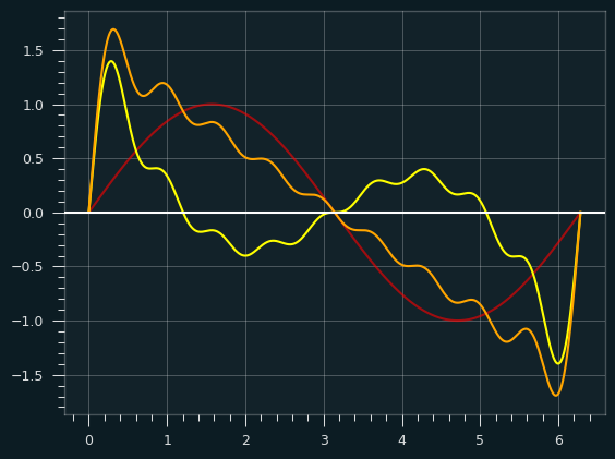
Here's an illustration to help show how the square wave gets built up:
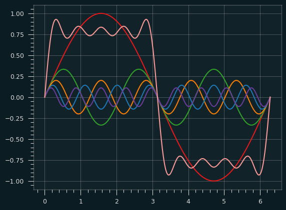
The red wave is the fundamental frequency. The orange square-ish wave is the result of combining the other colored waves with the red wave.
The sum normally would be scaled up a bit (multiplied by 4/pi), but it's easier without the scaling to see how the other waves sort of hammer the fundamental frequency into the shape of the square wave. At some points they are pushing it up, and other points pulling it down.
Perhaps this graph makes it clearer. The red is the fundamental, the yellow is the sum of all the other harmonics, and the orange is the combination of the two:
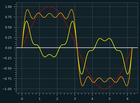
Where the yellow is above the X axis, it's pulling the fundamental frequency up, and where it's below, it's pulling the fundamental down.
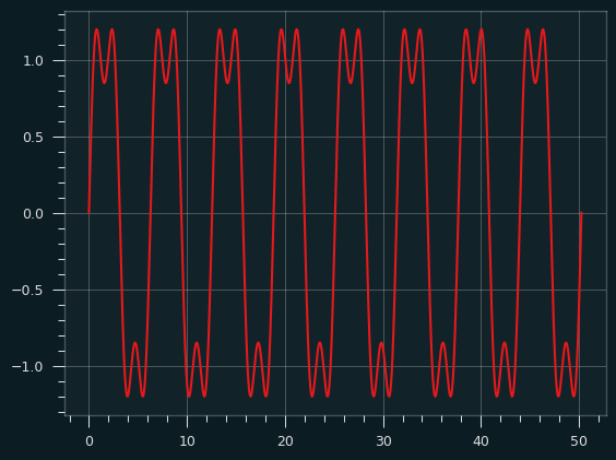
The sawtooth
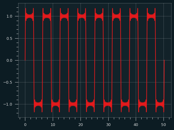
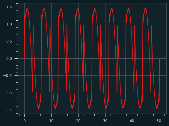
A sawtooth wave is what you get when you combine all the harmonics, odd and even. Like the square wave, it starts to take its basic shape right away. Here's the fundamental plus the second harmonic:
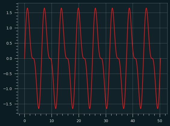
And here it is going all the way up to the 10th harmonic:
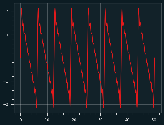
Red fundamental plus yellow harmonics produce the orange sawtooth wave:
Last time, I talked about the sawtooth wave producing a uniform distribution of amplitudes -- the butter gets spread evenly over the toast. The graph above isn't a very smooth stroke of butter. It's not steadily decreasing, particularly at the ends. Here's what the distribution looks like at this point:
With an infinite series of harmonics, that graph will even out to a uniform distribution
Getting even
What about only the even harmonics? Is that a thing? Not in the natural world as far as I know, but there's nothing stopping me from making one. (It wouldn't be the worst musical crime I've ever committed.)
Here's what a combo of just the even harmonics looks like:
Thanks to a little code from the pygame project, it's easy to turn that waveform into a sound file. It sounds like an angry computer beep, with a little flutter mixed in.
Here's an audio sample
In my prime
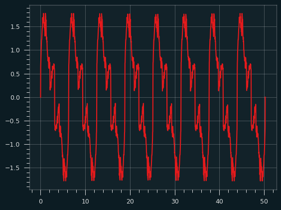
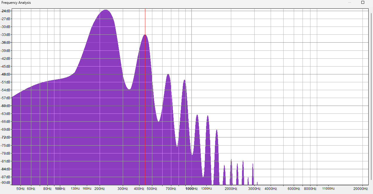
The harmonic series of primes is what it sounds like: the harmonic series, but just the prime numbers: 1 + 1/2 + 1/3 + 1/5 + 1/7 + 1/11 + 1/13 + ....
Although it's important in mathematics, I don't have a good musical reason to do this. But if you can throw the prime numbers into something, you gotta do it.
As a sound, I kinda like it. It's nice and throaty. Here's what it sounds like.
It doesn't really sound like a sawtooth wave or a square wave to me. Here's the waveform:
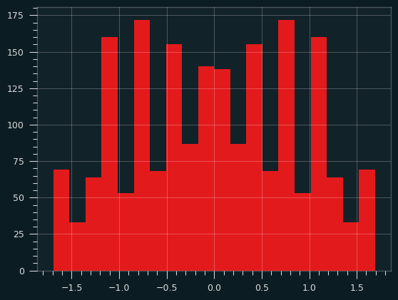
Here's what the distribution of amplitudes looks like:
Dissonance
Some of the overtones of the harmonic series don't correspond with the 12 notes of the modern western musical scale (called 12 tone equal temprament, or 12TET). The first 4 harmonics of the series are nice and clean, but after that they get weird. Each harmonic in the series is smaller in amplitude than the previous one, so it has less of an effect on the shape of the final wave. So the dissonance is there, but it's way in the background.
The prime number bloop I made above should be extra weird. The 2nd and 3rd harmonics are included, so those will sound nice, but after that they are at least a little off the standard western scale.
Say we're playing the prime bloop at A4 (the standard pitch used for tuning). Here's how the harmonics work out. A cent is 1% of a semitone. So a note that is off by 50 cents is right between two notes on the 12 tone scale.
| harmonic # |
frequency |
pitch |
error |
| 1 |
440 Hz |
A4 |
0 |
| 2 |
880 Hz |
A5 |
0 |
| 3 |
1320 |
E6 |
+2 cents |
| 5 |
2200 |
C#7 |
-14 cents |
| 7 |
3080 |
G7 |
+31 cents |
| 11 |
4840 |
D#8 |
-49 cents |
| 13 |
5720 |
F8 |
+41 cents |
| 17 |
7480 |
A#8 |
+5 cents |
(Note the 3rd harmonic, E6, is a little off in 12TET, despite being a perfect fifth -- an exact 3:2 ratio with the A5.)
Harmonics aren't everything
While it's true that any audio can be decomposed into a bunch of sine waves, the fundamental frequency and the harmonics aren't really what gives an instrument its unique timbre. It's hundreds or thousands of tiny overtones that don't line up with the harmonics.
Here are the spectra of two different piano sounds playing at 220 Hz. One is a somewhat fake piano sound (Fruity DX10), the other a natural, rich sounding one (LABS Soft Piano, which you might've heard before if you listen to those "Lofi Hip Hop Beats to Doomscroll/Not Study To" playlists). Can you guess which is which?
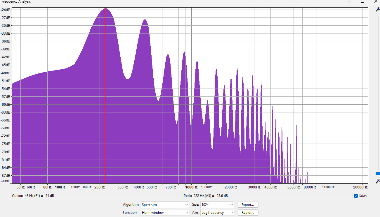
The answer may surprise you. I mean, it can't be that surprising since there are only 2 options. But I'd probably get it wrong, if I didn't already know which is which.
Sources/Notes
This website from UNSW was invaluable, particularly https://newt.phys.unsw.edu.au/jw/harmonics.html
Code used to generate the audio: https://stackoverflow.com/questions/56592522/python-simple-audio-tone-generator
"The internet" claiming the sound of a tuning fork is a sine wave here (no citation given): https://en.wikipedia.org/wiki/Tuning_fork#Description.
There are many good videos on Youtube about 12TET and Just Intonation, by people who know more about music than me. Here's one from David Bennett: https://www.youtube.com/watch?v=7JhVcGtT8z4
Jul 26, 2025
After spending several weeks in the degenerate world of sports gambling, I figured we should go get some fresh air in the land of pure statistics.
The Abnormal Distribution
Everybody knows what the normal distribution looks like, even if they don't know it as such. You know, the bell curve? The one from the memes?
In traditional statistics, the One Big Thing you need to know is called the Central Limit Theorem. It says, if you collect some data and take the average of it, that average (the sample mean) will behave in nice, predictable ways. It's the basis of basically all experimental anything. If you take a bunch of random samples and calculate the sample mean over and over again, those sample means will look like a normal distribution, if the sample sizes are big enough. That makes it possible to draw big conclusions from relatively small amounts of data.
How big is "big enough"? Well, it partly depends on the shape of the data being sampled from. If the data itself is distributed like a normal distribution, it makes sense that the sample means would also be normally shaped. It takes a smaller sample size to get the sampling distributions looking like a normal distribution.
While a lot of things in life are normally distributed, some of them aren't. The uniform distribution is when every possible outcome is equally likely. Rolling a single die, for instance. 1-6 are all equally likely. Imagine we're trying to estimate the mean value for rolling a standard 6 sided die.
A clever way would be to team up sets of sides - 6 goes with 1, 5 goes with 2, 4 goes with 3. Clearly the mean value has to be 3.5, right?
A less clever way would be to roll a 6 sided die a bunch of times and take the average. We could repeat that process, and track all of these averages. If the sample size is big enough, those averages will make a nice bell curve, with the center at 3.5.
The uniform distribution is sort of obnoxious if you want to calculate the sample mean. The normal distribution, and a lot of other distributions, have a big peak in the middle and tail off towards the edges. If you pick randomly from one of these distributions, it's far more likely to be close to the middle than it is to be far from the middle. With the uniform distribution, every outcome is equally likely:
Couldn't we do even worse than the uniform distribution, though? What if the tails/outliers were even higher than the center? When I first learned about the Central Limit Theorem, I remember thinking about that - how could you define a distribution to be the most obnoxious one possible? The normal distribution is like a frowny face. The Uniform distribution is like a "not impressed" face. Couldn't we have a smiley face distribution to be the anti-normal distribution?
Waveforms and probabilities.
All synthesizers in electronic music use a mix of different types of simple waveforms. The sublime TB-303 synth line in the song at the top is very simple. The TB-303 a monophonic synth -- a single sawtooth wave (or square wave) with a bunch of filters on top that, in the right hands, turn it from buzzy electronic noise to an emotionally expressive instrument, almost like a digitial violin or human voice.
This got me thinking about what probability distributions based on different types of waveforms would look like. How likely is the waveform to be at each amplitude?
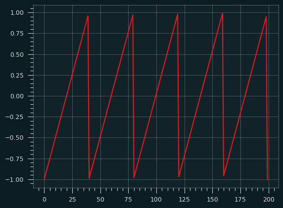
Here's the sawtooth waveform:
If we randomly sample from this wave (following a uniform distribution -- all numbers on the x axis are equally likely) and record the y value, then plot the values as a histogram, what would it look like? Think of it like we put a piece of toast on the Y axis of the graph, the X axis is time. How will the butter be distributed?
It should be a flat line, like the Uniform distribution, since each stroke of butter is at a constant rate. We're alternating between a very fast wipe and a slower one, but in both cases, it doesn't spend any more time on one section of bread than another because it's a straight line.
Advanced breakfast techniques
A square wave spends almost no time in the middle of the bread, so nearly all the butter will be at the edges. That's not a very interesting graph. What about a sine wave?
The sawtooth wave always has a constant slope, so the butter is evenly applied. With the sine wave, the slope changes over time. Because of that, the butter knife ends up spending more time at the extreme ends of the bread, where the slope is shallow, compared to the middle of the bread. The more vertical the slope, the faster the knife passes over that bit of bread, and the less butter it gets.
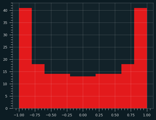
If we sample a bunch of values from the sine wave and plot their Y values as a histogram, we'll get something that looks like a smiley face -- lots of butter near the edges, less butter near the center of the toast. Or perhaps, in tribute to Ozzy, the index and pinky fingers of someone throwing the devil horns.
That's a perfectly valid buttering strategy in my book. The crust near the edges tends to be drier, and so can soak up more butter. You actually want to go a bit thinner in the middle, to maintain the structural integrity of the toast.
This distribution of butter forms a probability distribution called the arcsine distribution. It's an anti-normal distribution -- fat in the tails, skinny in the middle. A "why so serious?" distribution the Joker might appreciate. The mean is the least likely value, rather than the most likely value. And yet, the Central Limit Theorem still holds. The mean of even a fairly small number of values will behave like a Normal distribution.
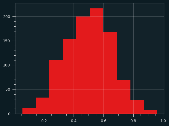
Here are 1,000 iterations of an average of two samples from the arcsine distribution:
And averages of 5 samples:
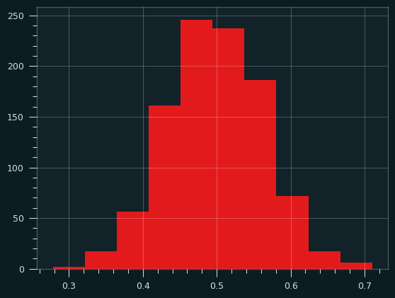
And 30 samples at a time. Notice how the x range has shrunk down.
There are a lot of distributions that produce that U-type shape. They're known as bathtub curves. They come up when plotting the failure rates of devices (or people). For a lot of things, there's an elevated risk of failure near the beginning and the end, with lower risk in the middle. The curve is showing conditional probability -- for an iPhone to fail on day 500, it has to have not failed on the first 499 days.

(source: Wikipedia/Public Domain, https://commons.wikimedia.org/w/index.php?curid=7458336)
Particle man vs triangle man
The Uniform distribution isn't really that ab-Normal. It's flat, but it's very malleable. It turns into the normal distribution almost instantly. The symmetry helps.
If we take a single sample from a Uniform distribution over and over again, and plot a histogram, it's going to look flat, because every outcome is equally likely.
If we take the sum (or average) of two Uniform random variables, what would that look like? We're going to randomly select two numbers between 0 and 1 and sum them up. The result will be between 0 and 2. But some outcomes will be more likely than others. The extremes (0 and 2) should be extremely unlikely, right? Both the random numbers would have to be close to 0 for the sum to be, and vice versa. There are a lot of ways to get a sum of 1, though. It could be .9 and .1, or .8 and .2, and so on.
If you look online, you can find many explanations of how to get the PDF of the sum of two Uniform distributions using calculus. (Here's a good one). While formal proofs are important, it's not very intuitive. So, here's another way to think of it.
Let's say we're taking the sum of two dice instead of two Uniform random variables. We're gonna start with two 4 sided dice. It will be obvious that we can scale the number of faces up, and the pattern will hold.
What are the possible combinations of dice? The dice are independent, so each combination is equally likely. Let's write them out by columns according to their totals:
|
|
|
|
|
|
|
| (1, 1) |
(1,2) |
(1,3) |
(1,4) |
- |
- |
- |
| - |
(2,1) |
(2,2) |
(2,3) |
(2,4) |
- |
- |
| - |
- |
(3,1) |
(3,2) |
(3,3) |
(3,4) |
- |
| - |
- |
- |
(4,1) |
(4,2) |
(4,3) |
(4,4) |
If we write all the possibilities out like this, it's gonna look like a trapezoid, whether there are 4 faces on the dice, or 4 bajillion. Each row will have one more column that's blank than the one before, and one column that's on its own off to the right.
If we consolidate the elements, we're gonna get a big triangle, right? Each column up to the mean will have one more combo, and each column after will have one less.
|
|
|
|
|
|
|
| (1, 1) |
(1,2) |
(1,3) |
(1,4) |
(2,4) |
(3,4) |
(4,4) |
| - |
(2,1) |
(2,2) |
(2,3) |
(3,3) |
(4,3) |
- |
| - |
- |
(3,1) |
(3,2) |
(4,2) |
- |
- |
| - |
- |
- |
(4,1) |
- |
- |
- |
With a slight re-arrangement of values, it's clear the triangle builds up with each extra face we add to the dice.
|
|
|
|
|
|
|
| (1, 1) |
(1,2) |
(2,2) |
(2,3) |
(3,3) |
(3,4) |
(4,4) |
| - |
(2,1) |
(1,3) |
(3,2) |
(2,4) |
(4,3) |
- |
| - |
- |
(3,1) |
(1,4) |
(4,2) |
- |
- |
| - |
- |
- |
(4,1) |
- |
- |
- |
The results for two 2 sided dice are embedded in the left 3 columns of table, then the results for two 3 sided dice on top of them, then two 4 sided dice. Each additional face will add 2 columns to the right. I'm not gonna formally prove anything, but hopefully it's obvious that it will always make a triangle.
That's the triangular distribution.
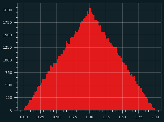
Here's a simulation, calculating the sum of two random uniform variables over and over, and counting their frequencies:
3 is the magic number
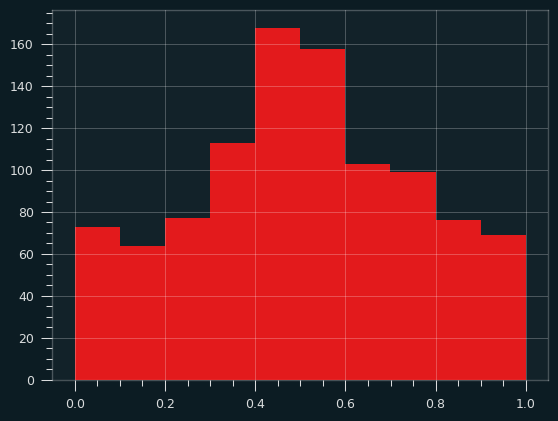
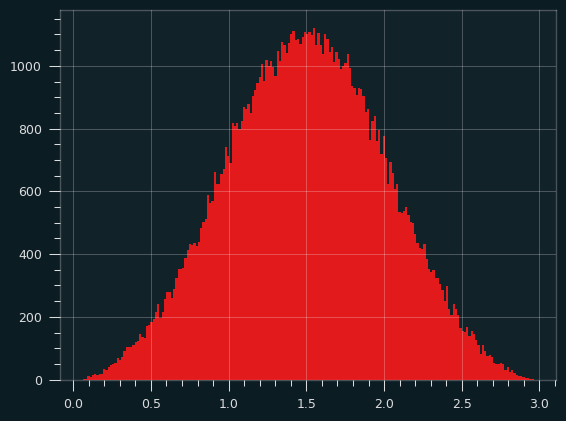
The sum (or average) of 3 Uniform random variables looks a whole lot like the normal distribution. The sides of the triangle round out, and we get something more like a bell curve. It's more than a parabola because the slope is changing on the sides. Here's what it looks like in simulation:
Here are three 4 sided dice. It's no longer going up and down by one step per column. The slope is changing as we go up and down the sides.
| 3 |
4 |
5 |
6 |
7 |
8 |
9 |
10 |
11 |
12 |
| (1, 1, 1) |
(2, 1, 1) |
(2, 2, 1) |
(2, 2, 2) |
(3, 3, 1) |
(3, 3, 2) |
(3, 3, 3) |
(4, 4, 2) |
(4, 4, 3) |
(4, 4, 4) |
| - |
(1, 2, 1) |
(2, 1, 2) |
(3, 2, 1) |
(3, 2, 2) |
(3, 2, 3) |
(4, 4, 1) |
(4, 3, 3) |
(4, 3, 4) |
- |
| - |
(1, 1, 2) |
(1, 2, 2) |
(3, 1, 2) |
(3, 1, 3) |
(2, 3, 3) |
(4, 3, 2) |
(4, 2, 4) |
(3, 4, 4) |
- |
| - |
- |
(3, 1, 1) |
(2, 3, 1) |
(2, 3, 2) |
(4, 3, 1) |
(4, 2, 3) |
(3, 4, 3) |
- |
- |
| - |
- |
(1, 3, 1) |
(2, 1, 3) |
(2, 2, 3) |
(4, 2, 2) |
(4, 1, 4) |
(3, 3, 4) |
- |
- |
| - |
- |
(1, 1, 3) |
(1, 3, 2) |
(1, 3, 3) |
(4, 1, 3) |
(3, 4, 2) |
(2, 4, 4) |
- |
- |
| - |
- |
- |
(1, 2, 3) |
(4, 2, 1) |
(3, 4, 1) |
(3, 2, 4) |
- |
- |
- |
| - |
- |
- |
(4, 1, 1) |
(4, 1, 2) |
(3, 1, 4) |
(2, 4, 3) |
- |
- |
- |
| - |
- |
- |
(1, 4, 1) |
(2, 4, 1) |
(2, 4, 2) |
(2, 3, 4) |
- |
- |
- |
| - |
- |
- |
(1, 1, 4) |
(2, 1, 4) |
(2, 2, 4) |
(1, 4, 4) |
- |
- |
- |
| - |
- |
- |
- |
(1, 4, 2) |
(1, 4, 3) |
- |
- |
- |
- |
| - |
- |
- |
- |
(1, 2, 4) |
(1, 3, 4) |
- |
- |
- |
- |
The notebook has a function to print it for any number of faces and dice. Go crazy if you like, but it quickly becomes illegible.
Here's the results of three 12 sided dice:

This isn't a Normal distribution, but it sure looks close to one.
Toast triangles
What if we feed the triangular distribution through the sin() function? To keep the toast analogy going, I guess we're spreading the butter with a sine wave pattern, but changing how hard we're pressing down on the knife to match the triangular distribution -- slow at first, then ramping up, then ramping down.
Turns out, if we take the sine of the sum of two uniform random variables (defined from the range of -pi to +pi), we'll get the arcsin distribution again! [2] I don't know if that's surprising or not, but there you go.
Knowing your limits
There's a problem with the toast analogy. (Well, at least one. There may be more, but I ate the evidence.)
The probability density function of the arcsine distribution looks like this:
It goes up to infinity at the edges!
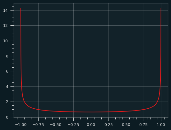
The derivative of the arcsin function is 1/sqrt(1-x**2) which goes to infinity as x approaches 0 or 1. That's what gives the arcsine distribution its shape. That also sort of breaks the toast analogy. Are we putting an infinite amount of butter on the bread for an infinetesimal amount of time at the ends of the bread? You can break your brain thinking about that, but you should feel confident that we put a finite amount of butter on the toast between any two intervals of time. We're always concerned with the defined amount of area underneath the PDF, not the value at a singular point.
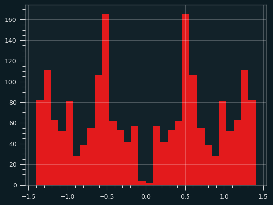
Here's a histogram of the actual arcsine distribution -- 100,000 sample points put into 1,000 bins:
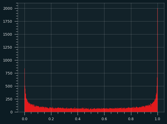
About 9% of the total probability is in the leftmost and rightmost 0.5% of the distribution, so the bins at the edges get really, really tall, but they're also really, really skinny. there's a bound on how big they can be.
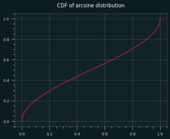
The CDF (area under the curve of the PDF) of the arcsine distribution is well behaved, but its slope goes to infinity at the very edges.
One for the road
The sinc() function is defined as sin(x)/x. It doesn't lead to a well-known distribution as far as I know, but it looks cool, like the logo of some aerospace company from the 1970's, so here you go:
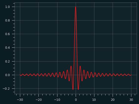
Would I buy a Camaro with that painted on the hood? Yeah, probably.
An arcsine of things to come
The arcsine distribution is extremely important in the field of random walks. Say you flip a coin to decide whether to turn north or south every block. How far north or south of where you started will you end up? How many times will you cross the street you started on?
I showed with the hot hand research that our intuitions about randomness are bad. When it comes to random walks, I think we do even worse. Certain sensible things almost never happen, while weird things happen all the time, and the arcsine distribution explains a lot of that.
References/further reading