Dec 10, 2025

Song: Delia Derbyshire - Pot Au Feu (1968)
Notebook: https://github.com/csdurfee/csdurfee.github.io/blob/main/notebooks/free-throws.ipynb
The Bucks
There's a lot of buzz around the Milwaukee Bucks right now because their star player has asked to be traded, but I'm gonna stick to the math. The NBA take-industrial complex has got the Giannis situation covered, and I do math better than drama.
I noted a few weeks ago that the Bucks make a surprisingly low number of free throws given that they have a guy with one of the highest free throw rates in the league. They're also bad on defense and end up fouling a lot. That's a bad combination.
As of December 5th, the Bucks are dead last in free throws made (14.4 per game) and 6th worst in free throws made by the other team (21.3 per game). Aren't they essentially having to play every game with a 6.9 point handicap?
Although it's an intuitively simple way of looking at things, it's too simple. Basketball strategy is a series of tradeoffs. There are a lot of "good" numbers -- stats that correlate with more wins -- but it's usually hard to make one good number go up without a bad number going up, or another good number going down, in response.
I'm looking at the last 25 years of team data from nba.com/stats.
Things to remember about free throws
There are complications to analyzing free throws because they're not a fixed quantity. Some fans will see a game where one team gets 20 free throws and the other team gets 35, and take it as evidence that the refs were biased. That's naive -- some players/teams foul more on defense, some players/teams take more foul-worthy shots on on offense, and there's plenty of random variation form game to game. It would be weird if every team committed exactly 30 fouls every single game.
There's seasonality to foul calls as well. On top of formal rule changes, the NBA issues points of emphasis for its officials each year, which change how the rules are interpreted. Certain types of fouls may be emphasized, or de-emphasized, causing the total number of fouls called to go up or down. It's hard to find a formal record of these de facto rule changes, but as a fan, I've seen it several times. For instance, I previously talked about the middle of the 2023 season, where the league told officials to stop calling so many fouls in general, without telling teams or the general public.
There was another shift in the early 2010's where the officials quit calling so many fouls caused by the actions of the shooter rather than the defender. A shooter can shoot in a somewhat artificial way to ensnare the defender's arms. This type of grifting still exists in the league -- looking at you, James Harden -- but the league reduced the number of cheap fouls called in the early 2010's. I couldn't find exactly when they formally made the proclamation, but we can see a big shift in the free throw data after the 2010-11 season.
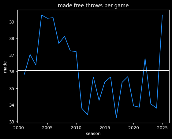
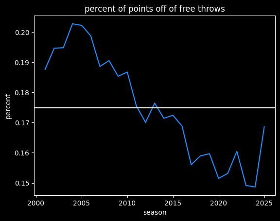
The current season has been more like the NBA from 2004-2010, at over 39 made free throws a game. However, there's a lot more scoring now, so free throws are a smaller percentage of a team's total points:
Do free throw differentials matter?
Of course, there's going to be a lot more variance in the 20 games of this season when compared to a full 82 games.
The Bucks' free throw differential of -6.9 (not nice) would be by far the worst of the last 25 years, if it held for the whole season. The Celtics' current differential of -6.3 also stands out.
90% of NBA seasons are between the two white lines. We'd expect there to be 3 outliers by the end of the season, instead of 7.
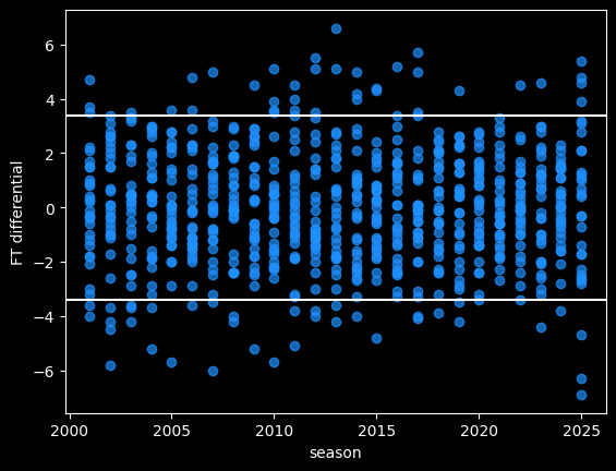
Some of the differential is due to chance. We should charitably assume that referees make random errors when calling or not calling fouls. Refs can make both Type I errors (fouls they shouldn't have called) and Type II errors (fouls they should have called and missed). Some teams will get called for more fouls than other teams, due to randomness, rather than conspiracy. Over a larger sample size, the refereeing luck will even out.
Free throw differential is positively correlated with winning.
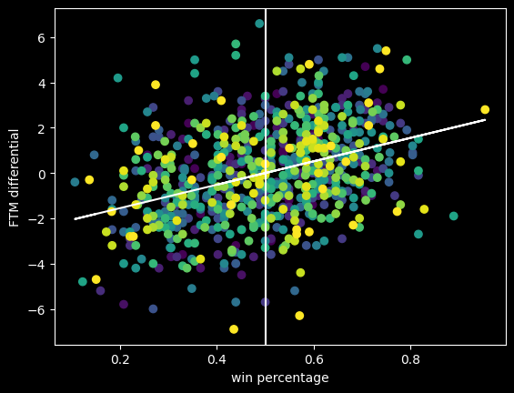
The diagonal line is the overall trendline. Even though it's a positive trend, the teams with some of the biggest positive and negative differentials are close to .500 win percentage. This is a good example of why it's important to visualize data, not just look at the correlation. The bigger picture shows it's good to have a positive free throw point differential, but not a magic ticket to winning.
Do referees try to keep fouls roughly even?
It's possible referees have an unconscious bias towards calling an even number of fouls on both teams. There's certainly a correlation between more free throws made and more free throws given up to the other team.
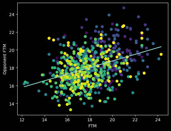
However, this overall picture is misleading. The number of fouls called per game goes up and down season-to-season based on rule changes and points of emphasis. So from year to year, the center of all the dots should move up and down along the diagonal line FTM=Opponent FTM. We should expect a positive correlation overall that isn't necessarily there in the individual seasons -- an example of Simpson's paradox.
Here's an animation of the correlations year-by-year:
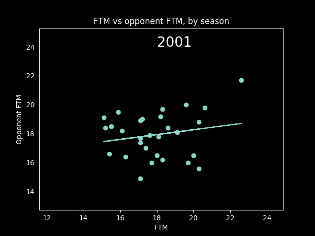
A lot of seasons, the trendline is basically flat. But plotting correlations year by year, there are a lot more positive years than negative.
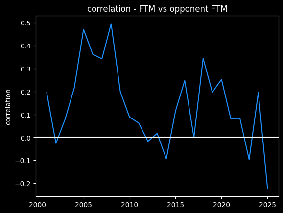
So I do think it's possible that refs call more fouls on teams that get fouled a lot, a conscious or subconscious bias towards fairness. Or perhaps, teams that play physical on offense also tend to play physical on defense as well. We'd need to look at individual games -- we're not going to see evidence of that in the yearly averages.
Basketball strategy and opportunity cost
The opponent's number of free throws made has a higher correlation with winning percentage (r=-0.260) than a team's number of free throws made (r=0.153). If it were possible to make such a binary tradeoff, the Bucks would be better off trying to foul the other team less, rather than trying to draw more fouls. That's especially true given the Bucks are the best 3 point shooting team in the league -- drawing more fouls would mean fewer 3 point attempts. They have the 2nd highest eFG%, so they're already making the most of their shot attempts.
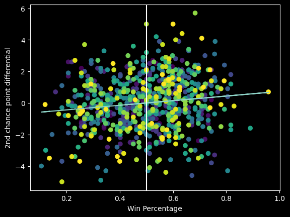
Why isn't their offense better overall? One big reason is their offensive rebounding rate is the lowest in the league. They score the fewest 2nd chance points in the league, at only 10.5 2nd chance points a game, versus 18 a game for the top teams. Does that mean another de facto 7 point handicap?
Not necessarily, because offensive rebounding rate is a schematic choice. Do the bigs try to get the rebound (crash the boards), or do they try to hustle back and play defense? Teams coached by Doc Rivers tend to have low offensive rebounding rates. The "Lob City" Clippers were a great rebounding team, yet in their heyday from 2014-2018, they were 21st, 28th, 29th, and 24th in offensive rebounding, so it's not surprising the Bucks have that same tendency.
The Thunder have the 3rd fewest second chance points, so a team can definitely be elite and not get a lot of offensive rebounds. But unlike the Thunder, the Bucks are bad on defense (22nd in defensive rating) and foul way too much, so they're not in a good place to make defense their identity. If this were NBA 2K, I'd probably move the "crash the boards" slider to the left for the Bucks and see what happens, because the Bucks are closer to being elite on the offensive end. There's more strength to build on.
There is only a very slight positive correlation between 2nd chance point differential and winning percentage. It's a bad predictor of team success.
The Nets are fun... for now
The Brooklyn Nets had a bunch of draft picks and cap space going into this offseason, and they didn't seem to maximize those resources. A lot of people didn't like the trade they made for Michael Porter Jr., which got the Denver Nuggets out of salary cap hell in exchange for a fairly small return. The Nets were the only team in the league with the financial flexibility to take on bad contracts in trades, so they probably could have gotten more.
They also didn't trade any of the five first round picks they accumulated in this year's draft. Why didn't they trade some of them for future picks? The conventional wisdom is that teams shouldn't try to develop too many rookies at once. What's a team supposed to do with five rookies (two of whom are teenagers), with some overlap in the positions they play?
Well for one thing, they're supposed to be terrible. The Nets have been bottoming out for a few seasons, and I doubt that will stop this season. Catch them in the next few weeks while they're sort of trying to win games, if you're curious. They've won 3 out of their last 4 games and they've been entertaining.
They were fun for a few weeks at this point in the season last year, too. The front office will probably try to trade away their best players over the next couple of months to keep them from being too good. But right now, MPJ is a good stats/bad team All-Star, Nic Claxton is solid as always, rookie Danny Wolf is already a fan favorite, and a couple other rookies show promise.
As fun as they are, I'm not encouraged by the Nets' approach to rebuilding. I'm always a lot more concerned with process than outcomes, because the process can be controlled. It seems like their idea is that if they draft enough first rounders, inevitably some of them will be good. It's treating players like lotto scratch tickets -- players are inherently winners or losers, and it's the front office's job to play the percentages and get as many picks as possible.
That's bad process to me. Players are more like a packet of seeds. The final result is heavily dependent on how and where they are grown. The same seed grown in two different environments can give two very different results. Some seeds are better than others, but without the right environment, even the best seeds won't grow to their maximum potential. I don't know if they have the culture and support system to develop their five rookies. It will be a few years before we'll see what sort of trees they're growing in Brooklyn.
The Mathletix Bajillion, week whatever
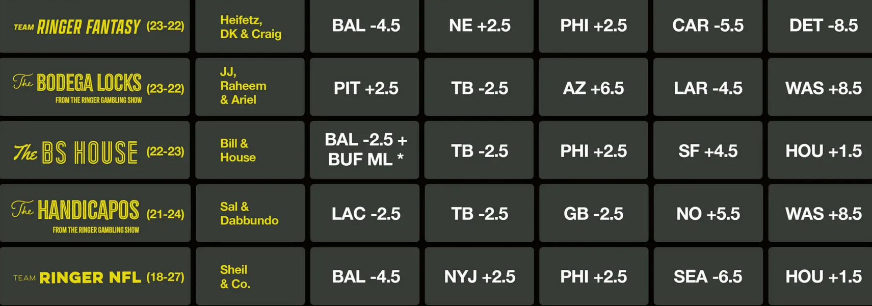
As usual, one set of NFL picks is algorithmic, the other is random.
Mathletix won the week, with a total record of 6-4 versus the Ringer's 10-15 record (note: their website incorrectly lists The Handicapos as going 5-0 when they actually went 4-1. I'm petty enough to notice, but not petty enough to email them about it.)
The Ringer currently has 3 teams at 33-37 and 2 teams at 31-39, for a cumulative record of 161-189 (46.0% winning rate). Of course, some of the Ringer's picks contradict each other -- one Ringer team taking the home team, and another taking the away team on the same game. Removing the bets where Ringer teams contradicted each other would just make things worse, though, because taking both sides of a bet has a winning percentage of 50%, which is better than the Ringer's overall win rate.
Someone taking the opposite of every one of the Ringer experts' picks would be up 11.9 units on the year, for a +3.4% rate of return. There's only a 6.7% chance of getting results that bad by flipping a coin.
As I've written about before, I don't think that makes them bad as far as gambling experts go. Rather, I believe everything they know about football has already been incorporated into the line, so their knowledge is kind of a curse -- they're overvaluing information that the market has already absorbed, so they end up losing more than 50% of the time.
Lines taken Wednesday morning
The Neil McAul-Stars
last week: 4-1, +304
Overall: 15-10, +480
line shopping: +80
- CIN +2.5 -101 (lowvig)
- NYG -2 -110 (hard rock)
- MIA +3.5 -105 (lowvig)
- BUF PK -110 (lowvig)
- NYJ +13.5 -105 (prophetX)
The Vincent Hand-Eggs
last week: 2-3, -108
Overall: 9-15-1, -671
line shopping: +79
- PHI -11.5 -105 (lowvig)
- DET +6 -105 (lowvig)
- WAS +2.5 +105 (prophetX)
- KC -4.5 -109 (prophetX)
- CIN +2.5 -101 (lowvig)
Dec 02, 2025
Song: Hobo Johnson, "Sacramento Kings Anthem (we’re not that bad)"
Stats are as of 12/1/2025. Spreadsheet here
The Kings
The Sacramento Kings are going through it. Again. For most other teams, the choices they've made recently would be a historically incompetent period, a basketball Dark Ages. For the Kings, it's just another season.
Firing the only coach that's had success with the team in a long time and replacing him with a buddy of the owner who is willing to work cheap. Drafting two All-Star point guards and trading both of them away. Trading for two guys (LaVine and DeRozan) who everybody knew would be a bad fit from their years playing together on the Bulls. Trading the very good, ultra reliable Jonas Valančiūnas for the washed Dario Saric just to save a tiny bit of money.
Do you know the definition of insanity? The Kings' front office doesn't.
Sacramento is 5-16 so far. They're definitely not a good team, but maybe they're not that bad? They went 40-42 last season, which is respectable in the loaded Western Conference. They've had a brutally hard schedule, and 21 games is not a large sample size.
I'll get back to the Kings, but first, the other side of the coin.
The Heat
The Miami Heat were arguably in a worse place than the Kings at the end of last season. They won 37 games, 3 fewer than the Kings, and play in the easier conference. They looked totally checked out by the end of the season, another team stuck in the middle of the NBA standings.
It was a disappointing, dysfunctional run where they traded away their best player and seemed to be going nowhere. The vibes were bad, but they didn't blow up the team for the hope of maybe being good again someday, or run back the same players and the same scheme for another bout of mediocrity. Instead, they trusted the culture they built and tried something innovative.
They've been one of the best stories in the NBA so far, greatly outperforming expectations by playing a radical brand of basketball on the offensive end. They completely overhauled their offense to quickly attack one-on-one matchups before the defense can get set, rather than the traditional approach of creating mismatches using pick-and-rolls.
Here's a good video from Thinking Basketball explaining the strategy, an even more turbo-charged version of the scheme the Grizzlies used to great success last year. As a basketball fan, it's a bit weird to watch at first, because pick and rolls are such an traditional part of basketball, but it's refreshing.
I don't know why more teams don't have the courage to try unconventional things -- or in the Grizzlies' case, stick with something unconventional that was working. In the NBA, it takes a great coach and front office to defy the conventional wisdom and try to get more out of the players already on the roster -- putting them in a position to succeed rather than re-shuffling the deck.
The most remarkable part is that overhauling the offense hasn't sacrificed the Heat's identity as a top-tier defensive team at all. They have the 4th best defense in the league so far by Defensive Rating. They're doing this while playing at the fastest pace in the league this year. Teams that play fast are usually just trying to outscore their opponents, with little attention to defense.
But the Heat are using their scheme to generate high quality offensive opportunities for players that are primarily on the court for their defense. They're building on their core identity rather than changing directions entirely. They're building on strength.
An elite playmaker like Tyrese Halliburton, or a generational talent like SGA or Jokic, can set up defense-first players for easy looks, but most teams that concentrate on defense struggle generating enough offensive firepower. The Orlando Magic have been plagued by that problem for years. The system Miami is running seems like a cheat code for defensively minded teams -- at least until the league inevitably figures out ways to slow it down.
I couldn't find anybody in the media who knew the Heat's scheme change was coming, much less an idea of how much of an impact it would have. I looked at a bunch of preseason power rankings, and they were all pretty down on the Heat for the same reasons, without any hint that they could fix the problems with a different play style. It's much easier to assess the impact of roster changes.
For example, this is from NBC Sports' preseason power rankings:
this was a middle-of-the-pack Heat team last season that made no bold moves, no massive upgrades, leaving them in the same spot they were a year ago.
Here's Bleacher Report's
for an offensively challenged team, replacing [Tyler Herro's] scoring (21.5 points over the last four seasons) and distribution (4.6 assists in the same span) is going to be tough.
And USA Today's:
Losing Tyler Herro for the first two months of the season, potentially, comes as a significant blow to a team that struggled to score — especially late in games — even when he was on the floor.
With the change in style the Heat are still only a mid-tier team on offense, ranking 14th in Offensive Rating. But that's a big step up from last year, when they were 21st, especially given they haven't had their best offensive player for the first month of the season.
Are they going to win a title with the present roster? No, but in addition to giving their fans something to cheer for, all their players will look much better on paper than they did at the start of this season. If they do decide to trade players, the Heat can get more in return for them. And it's not hard to get free agents to move to Miami if the team is winning and the vibes are good, so they could be a real contender again quickly.
It's weird that tanking is seen as the best way to increase the chances of future success in the NBA, rather than building a winning culture and innovating. The two teams with the most success in recent years at doing a major rebuild have been the Spurs and the Thunder. They were both bad for a few years, but they're also two of the best run teams in the league. They draft well, they trade well, they do player development well, they do analytics well. They had a clear vision of the type of team they wanted to build and the clear ability to develop players. If a team doesn't have those organizational competencies, what's the point of a tank? They're just going to waste their high-level draft picks, not develop the rest of the roster, and be mediocre again in 5 years.
Power ranking the power rankers
I collected data from six preseason NBA power rankings. There's a link to the spreadsheet at the top of the article. I would've liked to collect more data, and I'm sure there are other sites that did good NBA power rankings, but stuff like that is basically impossible to find these days, lost in a sea of completely LLM generated baloney or locked behind paywalls. It's not useful interrogating why some LLM stochastically decided that the Warriors are the 4th best team in the NBA this year, but there's seemingly an endless supply of that type of nonsense. Which is to say: thanks for reading this, however you managed to get here. I hope you'll keep coming back for this completely human generated baloney.
I compared the rankings from each list to each team's point differential, which is a better estimate of how good a team is than their win-loss record. How good were our mighty morphin' power rankers at predicting the current standings?
So far, the most accurate ranking has been RotoBaller's, with a Spearman correlation of .76. The worst has been USA Today, at .69. Taking the median rank of all six sources produced a correlation of .74, which was better than 5 out of the 6 individual scores. So we're getting a "wisdom of crowds" effect, which is interesting, since all the rankings are fairly similar to each other. (Previously discussed in Majority voting in ensemble learning.)
I also included rankings based on my own preseason win total estimates. I got a score of .73, right in the middle of the pack. That's respectable, but I can't believe I'm getting beat by the freaking New York Post.
Comparing rankings to records, the power rankers were too high on the Clippers, Cavaliers, Pacers, Kings and Warriors. They were too low on the Raptors, Suns, Heat, Spurs and Pistons.
Strength of schedule
Scheduling matters. Some teams have played much harder schedules than others, and we're dealing with small sample sizes, so win-loss records can be deceiving early in the season.
I grabbed adjusted Net Rating (aNET) data from dunksandthrees, which calculates the offensive and defensive ratings for each team, adjusted for strength of schedule. I also included Simple Rating System (SRS) data from basketball-reference, which is the same idea as aNET, but a different methodology.
The difference between aNET and average point differential gives a sense of which team records might be the most misleading compared to the team's actual skill level. For instance, the Sacramento Kings have already played the Thunder, Nuggets and Timberwolves three times apiece, going 2-7 over those games. Even a decent team would be expected to have a losing record against those opponents.
Based on aNET, the Cavaliers, Warriors, Clippers, Kings and Celtics are probably better than their records indicate.
Going the other way, the Raptors have had a deceptively easy schedule, going 7-1 in games against the woeful Nets, Hornets, Pacers and Wizards. Going 7-1 doesn't tell us much, because those are teams pretty much everybody should be able to beat.
The stats indicate that the Raptors, Hornets, Spurs, Jazz, and Suns are probably not as good as their records.
Most of the teams the power rankers got wrong have been hurt or helped significantly by their schedules so far. The biggest exception has been the Miami Heat, who apparently nobody saw coming, and are probably about as good as their record says they are.
The Kangz
What to make of the Kings? According to basketball-reference, they've had the hardest schedule in the league so far. It's fair to say they're not as bad as the record says.
While they're 28th in point differential, they're 25th by aNET, and 26th by SRS. So they might have 7 or 8 wins instead of 5 if they'd played a league average schedule. That's not that much, though, and a clear step back from last year.
Their rookie, Nique Clifford, has not looked good so far, and they don't have many players that other teams would want in a trade. It doesn't seem like they have any clue of how to develop young talent. Their highest paid player, Zach LaVine, has another year on his contract, doesn't play defense, and has put up a -1.1 VORP this year. They just benched their one big signing of the offseason (Dennis Schröder), and are instead starting Russell Westbrook, a man born during the Reagan Administration playing on a one year minimum deal.
On paper, they don't have much they can do to get better. But everybody was saying that about the Heat at the end of last year, and look at them now. I just can't see the Kings having that type of organizational courage, but I hope they find it somehow rather than spend years on another doomed rebuild. Sacramento fans deserve better than another version of the current mess. At least an innovative mess would be a change of pace from trying the same stupid thing over and over. What's the worst that could happen?
Sacramento's roster isn't great, but like the Grizzlies, the biggest problems I see are organizational. I understand the Kings are a rich man's toy, not a serious basketball team, but wouldn't it be more fun to own a team that wasn't a giant tire fire? I don't get spending billions of dollars to buy a sports team just to run it into the ground like this.
The Mathletix Bajillion, week 5
As usual: One of these teams picks NFL games randomly, the other uses a simple algorithm.
4 of 5 Ringer 107 teams had a losing week, going 10-15 collectively. All five still have a losing record on the season, so right now the McAul-Stars are the undisputed leaders.
Bluster aside, the important thing to notice is how much they're saving taking cheaper lines than the standard -110 odds. The McAul-Stars would be up +110 instead of +176 if the bets were taken at a retail sportsbook, and the Hand-Eggs would be down -620 instead of -563.
Lines taken Tuesday morning. Since it's early in the week, the reduced juice isn't quite as juicy as usual.
The Neil McAul-Stars
last week: 4-1, +296
Overall: 11-9, +176
line shopping: +66
- SEA -7 -108 (lowvig)
- DAL +3 -104 (prophetx)
- CIN +5.5 -108 (draftkangz)
- JAX +2 -108 (prophetx)
- LAC +2.5 +108 (prophetx)
The Vincent Hand-Eggs
last week: 1-4, -316
Overall: 7-12-1, -563
line shopping: +57
- WAS +1.5 +100 (lowvig)
- CIN +5.5 -108 (draftkangz)
- LAR -8 -101 (prophetx)
- DEN -7.5 +100 (lowvig)
- CLE -3.5 -108 (prophetx)
Nov 28, 2025

Song: The Jimi Hendrix Experience - Voodoo Child (Slight Return) (Live In Maui, 1970)
Jimmy Butler: still good
Last season, Jimmy Butler quiet quit on his team. He wanted a new contract from the Miami Heat, and they didn't want to give him one, so he just stopped trying. As a fan, it seemed like an annoying and entitled thing to do. He couldn't just play the season out?
Butler eventually ended up getting traded to the Golden State Warriors, who gave him the extension he wanted, and he started trying again.
Setting aside whether Butler was justified, was the extension worth it or not? Butler is 36 years old, an age where it's totally expected for players to start to decline. The NBA salary cap rules now make it so a team can't afford to get a contract as big as Butler's wrong.
The Warriors took a calculated risk, and it paid immediate dividends when Jimmy helped them sneak into the playoffs last year, but the team is about in the same position they were before they got him -- a few high level players, but not in the upper echelon of the league due being old and incomplete.
Jimmy's doing great, though. He's at career highs in True Shooting (TS%) and effective FG percent (eFG%).

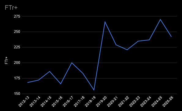
He's always been an efficient scorer, due to his ability to draw a lot of fouls. That means shooting a lot of free throws, which are easy points. Jimmy has been getting about 2.4x the number of free throws per shot attempt compared to the league average.
That's about where he's been for several seasons now. His free throw rate saw a huge jump when he moved to the Miami Heat in the 2019-2020 season, and he's maintained that ever since:
The career highs in TS% and eFG% probably aren't sustainable, though. Butler's a career 33% 3 point shooter who's making 45% of them this season. I wouldn't bet on that continuing, but he'll always be valuable on offense if he can draw that many free throws.
Butler's defense is still great, as well. The Warriors are 6.5 points per 100 possessions better on defense when he's on the floor.
He stands out on all the advanced metrics. Right now, he's 4th in WS/48 (behind Jokic, Shai and Giannis), 8th in PER, 8th in VORP, 3rd in Offensive Rating, 8th in Box Plus/Minus, and 11th in EPM.
For the numbers he's putting up, I think he's worth the money.
Ewing theory, 2025 edition
Individuals don't win games, teams do. Sometimes it can be hard to tell how much of player's individual contribution is actually increasing the likelihood of their team winning. And there's always opportunity cost: perhaps a big man would've been more valuable to this team than Butler has been.
When a star player gets injured, sometimes a team plays better, a phenomenon Bill Simmons coined "The Ewing Theory". We're seeing some of that this year.
The Atlanta Hawks are 2-3 this season when star Trae Young plays, and 9-4 when he doesn't.
The Memphis Grizzlies are 4-8 when star Ja Morant plays, and 2-4 when he doesn't. (While the win percentage is the same, the team has looked less hapless in those 6 games.)
The Orlando Magic are 6-6 when star Paolo Banchero plays, and 4-2 when he doesn't.
All three players have distinctive play styles that their team must run to maximize their talents -- to paraphrase James Harden, they are the system. Sometimes maximizing the opportunities for the best player means wasting some of the talents of the other players on the team.
Similar distinctive players like Harden, Jokic and Halliburton are far more essential -- their teams are much worse when they are out, despite the same potential on paper for holding their teams back.
What's the difference between the Hawks, who have been doing better without Trae Young, and the Pacers, who are completely hapless without Tyrese Halliburton? I'm not going to read too much into such small sample sizes, but it's an interesting thing to watch out for.
SGA's FTAs
Debates involving subjects anybody can have an opinion about tend to be much louder than subjects requiring specialized knowledge. It's the law of triviality. The purest form of this in sports is the question of who is the most valuable player. TThe NBA version of this debate is probably the loudest and least interesting of any sport.
There are people who don't know much about basketball or statistics, but will argue endlessly on the internet whether BPM or EPM or RAPTOR or VORP is the right metric for deciding who is the best player. Or rather, they decide on the player they like, then find the statistic that says what they want to hear.
For me, the MVP usually comes down to personal preference -- there are always a handful of players that are clearly better than everybody else, and which one is the most valuable among that set is a matter of taste, and often gets decided by narratives rather than anything rigorous. Perhaps rigor is futile. Pretty much every MVP caliber player is a unique basketball talent. None of them are really interchangeable -- they all break the mold in some way. Any sort of all-in-one number is bound to fail at capturing what makes each one special.
Perhaps because it is a matter of taste and ultimately a very trivial question, people tend to latch onto style points. Who is funnest to watch, who would be the funnest to play with. Who scores points ethically and unethically.
People who think that Shai Gilgeous-Alexander (SGA) shouldn't be the MVP derisively call him FTA, implying he gets awarded more free throws than he deserves, or is otherwise a free throw merchant -- someone who baits defenders into fouling him.
Shai is currently currently the leader in FTAs this year, so the FTA nickname is accurate in one sense. Here are the 10 players with the most free throw attempts this season, plus Jokić (15th place.)
| Name |
Attempts |
FTr |
FTr+ |
PPG |
| Shai Gilgeous-Alexander |
167 |
0.465 |
164 |
32.2 |
| Luka Dončić |
150 |
0.551 |
194 |
34.5 |
| Deni Avdija |
143 |
0.472 |
166 |
24.9 |
| Devin Booker |
141 |
0.416 |
147 |
26.4 |
| James Harden |
139 |
0.488 |
172 |
27.8 |
| Franz Wagner |
136 |
0.471 |
166 |
23 |
| Giannis Antetokounmpo |
132 |
0.532 |
188 |
31.2 |
| Jimmy Butler |
132 |
0.667 |
235 |
19.9 |
| Pascal Siakam |
130 |
0.444 |
156 |
24.8 |
| Tyrese Maxey |
125 |
0.334 |
118 |
33 |
| Nikola Jokić |
116 |
0.395 |
139 |
29.6 |
Shai's FTr+ of 164 indicates he gets 1.64x more free throws per shot attempt than the average player.
In a vacuum, that seems high, but everybody on this list has an FTr+ of over 100. They're all good at drawing fouls. Most high volume scorers are. They score a lot and get fouled a lot for the same reason, they're hard to guard. Jimmy Butler is the king, though -- the only player on the list averaging under 20 points a game, and the only one with an FTr over .600.
Jimmy's getting 2 free throws per every 3 shots he attempts. Since he makes 80% of them, that's a free half point Butler gets every time he attempts a shot. As far as free throw merchants go, he's Giovanni de' Medici.
Compared to his peers, SGA's free throw rate is pretty tame. It's 7th on this list -- lower than Luka Dončić, Deni Avdija, James Harden, Franz Wagner, Giannis, and Jimmy Butler.
It's a little higher than Jokić's, but I don't know how you decide that an FTr+ of 139 is ethical, but an FTr+ of 164 is unethical (or a sign that the refs are in the tank for SGA). Where's the line? Why do other MVP candidates like Luka and Giannis escape criticism, when they draw more fouls per shot than SGA does?
I'll take a deeper dive into the topic some other time, but the fact that Luka's free throw rate took a jump when he got traded to the Lakers is another example of why the NBA stands for Not Beating Allegations.
Mathletix Bajillion, week 4
As usual: one team picks randomly, one team uses a simple algorithm.
Both the mathletix teams have losing records now, but so do all 5 Ringer teams, so it's still anyone's game. We're still saving a lot of (imaginary) money by shopping for lines, instead of taking them at -110. Even though I got lazy with shopping, I still managed to find all 10 bets at reduced juice.
Lines as of Friday morning.
The Neil McAul-Stars
last week: 1-4, -323
Overall: 7-8, -120
line shopping: +60
- MIA -5.5 -104 (prophetX)
- HOU +3.5 -107 (prophetX)
- WAS +6 -108 (prophetX)
- CAR +10 -108 (prophetX)
- NE -7 +100 (prophetX)
The Vincent Hand-Eggs
last week: 3-2, +97
Overall: 6-8-1, -247
line shopping: +33
- LV +9.5 -104 (lowvig)
- CLE +5 -104 (prophetX)
- PHI -7 -108 (prophetX)
- PIT +3 +100 (lowvig)
- WAS +6 -108 (prophetX)
Sources
All data sourced from basketball-reference.com
Nov 19, 2025

Song: Talking Heads, "Cities", live at Montreaux Jazz Festival, 1982
What's going on with the Grizzlies?
The easiest answer is they're miserably bad on offense. It's also the oddest thing about this team to me, since they scored effortlessly last year. The Grizzlies had found something that worked last season. They had the 6th best Offensive Rating, and 10th best Defensive Rating. Considering the Indiana Pacers made it within one game of winning the NBA Championship with the 9th best Offensive Rating and 13th best Defensive Rating, the Grizzlies were definitely a borderline contender.
This year, they're 27th in Offensive Rating, 21 positions worse than last year. (The falloff on defense is a little more understandable, since they have several very good defensive players injured right now.)
eFG+ is a measure of effective FG%, normalized so that 100 is league average. Here are the top 8 Grizzlies players by minutes played the last two seasons:
| Position |
2025 |
2024 |
2025 eFG+ |
2024 eFG+ |
Diff |
| Center |
Jock Landale |
Zach Edey |
108 |
111 |
-3 |
| PF |
Jaren Jackson Jr |
Jaren Jackson Jr |
98 |
101 |
-3 |
| SF |
Jaylen Wells |
Jaylen Wells |
82 |
97 |
-15 |
| SG |
KCP |
Desmond Bane |
77 |
104 |
-27 |
| PG |
Ja Morant |
Ja Morant |
71 |
93 |
-22 |
| Bench 1 |
Santi Aldama |
Santi Aldama |
96 |
106 |
-10 |
| Bench 2 |
Cedric Coward |
Scottie Pippen Jr |
105 |
102 |
3 |
| Bench 3 |
Cam Spencer |
Brandon Clarke |
109 |
115 |
-6 |
Except for rookie Cedric Coward, every single slot is a downgrade. Wells and Aldama have been significantly worse than last season, but the most dramatic is Ja Morant. The only player with around as many minutes played and a lower eFG+ are Ben Sheppard and Jarace Walker of the Indiana Pacers, young players who have been forced into playing a lot of minutes due to injuries.
Where have all the backup PGs gone?
A big problem for the Grizzlies is that they don't really have a backup point guard. They're far from the only team with a lack of PGs on the roster this season.
The Dallas Mavericks have been playing rookie forward Cooper Flagg as PG even though they knew their starting PG, Kyrie Irving, was injured coming into the season. The Nuggets have been experimenting with having forward Peyton Watson as backup PG. The Houston Rockets have no true PG in their "oops, all bigs" starting lineup, though Reed Sheppard is playing more and more off the bench, and looking pretty good.
It's an odd trend to me. Backup point guards have traditionally been cheap and easy to find -- guys like Ish Smith and D.J Augustin. They're like small, functional trucks. They made a ton of them back in the day, but they kinda don't exist anymore, despite how useful and reasonably priced they were. Does that make Yuki Kawamura the Kei truck of this analogy? Yes, yes it does.
The Rockets and Nuggets are doing fine so far without playing a backup PG, but the Grizzlies' situation is just baffling to me. Ja Morant is one of the more injury prone players in the league. You didn't think you needed to find a real backup for him? (Wouldn't Russell Westbrook look good in a Grizzlies uniform?)
The Grizzlies have a stretch of easier opponents coming up, so I think they'll start looking a little better for that reason alone. Maybe they'll get some mojo back. But I'm always about process, rather than outcomes, and I just don't get the Grizzlies' process right now. They had something pretty cool going last year, and now they don't.
Teams can't control a lot of factors. Injuries, who they play on a given night, the bounce of the ball on the rim on a last second shot. There's a lot of luck. But the Grizzlies' problems seem to come down to things the coaching staff and front office can control: vision, planning, vibes, communication, style of play.
Mathletix Bajillion, week 3
One of these teams is random, one is chosen by an algorithm put together by me, a non-football guy. Can you guess which one is which?
All lines are as of Thursday morning.
The Neil McAul-Stars
last week: 1-4, -301
Overall: 6-4, +203
line shopping: +43
- PIT +2.5 -105 (lowvig)
- GB -6.5 +100 (lowvig)
- NO -2 -108 (prophetx)
- TB +6.5 +101 (prophetx)
- PHI -3 -110 (hard rock)
The Vincent Hand-Eggs
last week: 2-2-1, -10
Overall: 3-6-1, -344
line shopping: +16
- CIN +6.5 -107 (rivers)
- CHI -2.5 -105 (lowvig)
- ATL +2 -102 (prophetx)
- BUF -5.5 -101 (prophetx)
- DET -10.5 -102 (prophetx)
Nov 18, 2025

Song: "Round 6", by Prince Jammy
A few interesting statistics from the first dozen games of the 2025-26 NBA season.
I'm generally talking about stats per 100 possessions, rather than raw stats (unless otherwise noted).
The absurd OKC Thunder
The OKC Thunder have been a godless basketball killing machine this year. Almost every win is a blowout, despite their second best player being injured. They look like they don't even have to try all that hard, and they're winning by an average of 16 points.
To me, their secret sauce is that they make it nearly impossible to score against them. There are no easy buckets. Here are some good ways to get easy points in the NBA:
- make lots of 3's
- get lots of free throws (and make them)
- take a lot of shots close to the basket
- get points off of turnovers
- get out on the fast break
- get second chance points
The Thunder are middle of the pack at the first two. They're only 15th in 3 pointers made against them per game, and 12th in free throws given up.
They're ridiculously elite at everything else that makes scoring hard. The Thunder are first in the league at:
- Defensive Rating
- Defensive Rebounding
- Steals
- Fewest opponent fast break points
- Fewest opponent points in the paint
- Fewest opponent points scored
- Lowest opponent effective FG%
They're second in the league at:
- Fewest turnovers
- Fewest opponent points off turnovers
- Fewest opponent 2nd chance points
- Fewest opponent assists
- Most opponent turnovers
The most remarkable part is how they've built their team. Their 3rd and 4th leading scorers, Ajay Mitchell and Aaron Wiggins, were both 2nd round draft picks. Their 5th leading scorer, Isaiah Joe, was a 2nd round pick by the 76ers who got waived, then refurbished by the Thunder like an estate sale armoire. Their best defender, Lu Dort, went undrafted.
The team just finds a way to bring the best out of players that any other team could have had. What did they see that everybody else missed, and what did they do to develop them?
As a fan of another NBA team, and someone who lived in Seattle in the 15 years after the Sonics were stolen away to OKC, I want to get off Mr Presti's Wild Ride. But statistically, it's great.
Bucking trends
Victor Wembanyama is by far the best shot blocker in the NBA, averaging 3.6 blocks a game. But the Spurs are only 6th overall in blocks. Nikola Jokic is by far the best passer in the NBA, but the Nuggets are only 5th overall in assists. Steph Curry is the best 3 point shooter of all time. But the Warriors are only 12th in 3 point percentage. This isn't all that surprising. Just because one player is good at a particular skill, that doesn't mean the rest of the team is.
What's more surprising to me is that Giannis Antetokounmpo draws the most free throws in the league, but the Bucks are 28th in free throw attempts. Teams that get a lot of free throw attempts tend to attack the basket a lot, or be the Los Angeles Lakers. The Bucks are weird because pretty much only Giannis does anything free throw-worthy. At the time I wrote this, Center Myles Turner had not shot a single free throw in his last 63 minutes of game time. That doesn't seem like a recipe for success for the Bucks.
Basketball is broken
And I know the guy who did it: Nikola Jokić. Advanced stats aren't everything, but right now he has a Win Shares per 48 (WS/48) of .441. Win Shares are probably a little biased towards big men who score efficiently, and affected by the pace of the game. That aside, it's a pretty good stat as far as having a single number to quantify how good somebody is at basketball. It correlates pretty strongly with actual basketball watching, I think. The top players in WS/48 are usually the top candidates for the MVP every year. And it matches who we think the best players are historically.
Last year, the top player by WS/48 was Shai Gilgeous-Alexander, at .309. The year before, it was Jokic, at .299. The year before, it was Jokic at .308. In 2014, it was Steph Curry, at .288. In 2004, when the pace of play was slower, the leaders were Nowitzki and Garnett at .248. In 1994, it was David Robinson, at .273.
Pretty much anything over .250 is an MVP caliber season. There's really no historical precedent for a WS/48 of .441. After 12 games played, Jokic could be the worst player in the league for the next 7 games, and he'd still be having an MVP-type season overall.
Before last game, it was .448. What did Jokic do last game that caused his WS/48 to go down a tiny bit? He got 36 points, 18 rebounds, and 13 assists, on good scoring efficiency and only 2 turnovers. That's a slightly below average game for him right now.
The perils of hand-rolled metrics, pt. 137
I was trying to put together something to show how historically off the charts OKC has been defensively. I started with using a fancy technique, PCA, before realizing that just adding up the ranks of each of the statistics was better and simpler. If one team is 1st in blocks, 2nd in steals, 2nd in opponent points in thde paint, etc., just add the ranks up, lowest score is best.
I ran it on every team over the last 15 years. All of the teams that did well on my metric were good defensively, and the teams that did poorly were putrid on defense. It's not totally useless. But it's a bad way to find the best teams of all time.
Here are the top defensive teams since 2010 by this metric:
- the 2025-26 OKC Thunder
- The 2018-19 Milwaukee Bucks (won 60 games with peak Giannis)
- The 2010-11 Philadelphia 76ers (last Iguodala season, young Jrue Holiday)
- The 2019-20 Orlando Magic (Aaron Gordon and some guys)
- The 2017-18 Utah Jazz (the "you got Jingled" meme team that beat OKC)
Ah well. That's not a terrible list. They were all very good at defense, and made it a big part of their team identity, but I don't think those are really the best defensive teams of the last 15 years. A team's rank by Defensive Rating is still a better predictor of the team's win percentage than my attempts.
There's definitely some Goodhart's Law potential here. OKC are near the top of a bunch of statistical categories, because they are good at defense overall. You can't necessarily get on their level just by trying to copy specific things OKC does well, like prevent fast break points.
We see you, Jalen Duren
More like Jalen Durian, because some of the things he's doing are just nasty. You will definitely get kicked off the bus in Singapore if you're watching Jalen Duren highlights.
Data used
All data from https://www.nba.com/stats/
I had to screen scrape some stuff from their website, since some of the endpoints in the python nba_api package are broken now. See the early-nba-trends.ipynb notebook for code.
Nov 14, 2025

Song: Scientist, "Plague of Zombies"
This is a departure from the usual content on here, in that there's no real math or analysis. There's also not much of an audience for this website yet, so I hope you'll indulge me this week.
I was curious what all these gambling shows talk about for hours, when the picks they produce collectively appear to be no better than randomly chosen. I'm always interested in how people make decisions. How does their process work for choosing what bets to take? How might it work better?
Before I get too far into this, I know I'm being a killjoy. These podcasts are for entertainment purposes, just like betting is entertainment for a lot of people, not a sincere attempt to make money over the long term. Some degenerate gambling behavior is part of the appeal of these podcasts. They're selling the idea that "gambling is fun" as much as any particular bets.
It's still weird to be a gambling expert who can't do better than a coin flip.
I previously showed how combining multiple machine learning algorithms thru voting will only improve results when they make independent mistakes, and are significantly better than guessing. Those are both pretty intuitive conditions, and I think they're true of groups of people as well. If everybody has the same opinion, or makes the same sort of mistakes, or nobody really knows anything, there can't be a wisdom of crowds.
Humans have a big advantage over combining machine learning algorithms. We can talk with each other, challenge each others' assumptions, provide counterexamples, and so on.
There's not a ton of that in the gambling podcasts I listened to. Gambling talk is all about inventing stories about the future. It's sort of a competition for who can pitch the best narrative for the game. These stories are almost their own literary genre, and the construction of these are more important than the picks themselves. There aren't a lot of opportunities for the wisdom of crowds or some sort of error correction to occur.
Imagine I had a magic black box that was right about NBA lines 56% of the time. I could sell those picks, and be one of the better handicappers on the internet. While I could certainly write a little story for each one, maybe in the style of Raymond Carver -- "Will You Please Take The Over, Please?" -- the story doesn't make the bet more likely to be true, though, right? A factual story would be the same for every bet, and not very interesting: "there is slightly more value on this side of the bet, according to the model."
What we talk about when we talk about sports betting
Gambling personalities are always talking about what has happened in the past -- connections to previous games they've bet on, dubious historical trends, and the tendencies of certain players. Interactions like, "I thought you had a rule never to bet against Baker Mayfield?" "But he's 2-7 on the road in early Sunday games after a Monday night game where he got over 30 rushing yards."
These arbitrary connections remind me of a bit from Calvino's Invisible Cities:
In Ersilia, to establish the relationships that sustain the city's life, the inhabitants stretch strings from the corners of the houses, white or black or gray or black-and-white according to whether they mark a relationship of blood, of trade, authority, agency. When the strings become so numerous that you can no longer pass among them, the inhabitants leave: the houses are dismantled; only the strings and their supports remain.
There were quite a few of those useless strings in the November 6th episode of the Ringer Gambling Show.
The top bun
On a couple of occasions, the show discussed whether certain information was already priced into the line or not. Since gambling should be about determining which bets have positive expected value, that's a very useful thing to discuss. "If this spread looks wrong, what does the market know that we don't? Or what do we know that the market doesn't?"
If the goal is to win, the implicit question should always be: why do we think we have an advantage over other gamblers taking the other side? Why are we special? Why do we think the line isn't perfect?
Superstitions and biases
They were resistant to bet on teams that they had recently lost money on -- not wanting to get burned again. This is clearly not a financial choice, but an emotional one. The axe forgets, the tree remembers.
Team loyalty also affected their betting decisions. They avoided taking Baltimore because Ariel is a Ravens fan (the bet would have won). Jon suggested betting against his team, the Dolphins, which Ariel jokingly called "an emotional hedge". The Dolphins won. So they cost themselves two potential wins due to their fandom.
They decided not to take a bet on Houston (which ended up winning) because, in Jon's words, "betting on Davis Mills is not a pleasant experience". Whether a team or player was fun to bet on came up a couple of other times as well. Someone just trying to make a profit wouldn't care how fun the games are to watch. They might not even watch the games at all. Whether the gambler watches the game or not has no influence on the outcome.
Bets need to be fun, not just a good value. These gambling experts still want to experience "the sweat" -- watching the game and rooting for their bet to win. As I wrote last week, betting on the Browns and losing is like losing twice, so even if the Browns are a better value, they are a bad pick for emotional reasons. Who wants to have to be a Browns fan, if only for a few hours?
It's sort of like Levi-Strauss said about food. It's not enough that a type of food is good to eat, it must also be good to think about. The Houston Texans led by Davis Mills are not "bon à penser".
Not enough useful disagreement
All three of the bets they were in total agreement on (PIT, TB, ARI) lost. Nobody presented a case against those bets, so there was no opportunity for any of them to change their minds or reconsider their beliefs.
I'm not endorsing pointless contrarianism -- not every side needs to be argued. Don't be that one guy in every intro to philosophy class. But if both sides of an issue (or a bet) have roughly equal chances of being true, there should be a compelling case to be made for either side. Someone who can't make both cases fairly convincingly probably doesn't know enough to say which case is stronger.
Two types of hot streaks
For gamblers, there's one type of hot streak that's always bound to end. A team has won a few games it shouldn't have won, therefore they're bound to lose the next one. Their lucky streak will fail. In the real world, there's no invisible hand that pulls things down to their averages on a set schedule. In a small sample size of 17 games in an NFL season, there's no reason to think things will be fair by the end, much less the very next game. Now, a team could be overvalued by the market because they got some lucky wins, which makes them a value to bet against. But teams don't have some fixed number of "lucky games" every year, and once they've burned through those, their luck has to turn.
The other type of hot streak is bound to keep going. The team were divided whether to bet the Rams or not. They decided to go with Ariel's opinion, because she's been on a hot streak lately. If Ariel's record was demonstrably better than the other two hosts' over a long period of time, it would make sense deferring to her as the tiebreaker. But winning a few bets in a row doesn't mean the next bet is any more likely (or less likely) to win. As a teammate, that's a supportive thing to do, so I'm sure that's part of it. But people who gamble tend to think they have it sometimes, and don't have it other times. Sometimes they're hot, sometimes they're cold.
We've seen this before with NBA basketball. Basketball players have an innate tendency to believe in the hot hand, even though it doesn't exist, so much so that it actually hurts their performance.
Why would the hot hand exist when it comes to predicting the future? What laws of physics would allow someone to predict the future better at some times rather than others? A gambler, regardless of skill level, will occasionally have hot streaks or cold streaks based on chance alone. So a gambler on a hot streak shouldn't change what type of bets they take, or how much they wager, just like NBA players shouldn't change what type of shots they take. But they do.
The problem with props
They suggested a bunch of prop bets. 5 of the 6 suggested were overs -- bets on players scoring at least one touchdown, or going over a certain number of yards. 4 out of 5 of the overs lost.
Gamblers greatly prefer betting the over on prop bets, which creates a problem. There's little to no money wagered on the under, which means gamblers taking the over are betting against the house, not other gamblers. That should be a warning sign. Sportsbooks are rational economic engines. If they're taking on more risk in the form of one-sided bets, they're going to want more reward in the form of a higher profit margin.
For a lot of prop bets, the big sportsbooks don't even allow taking the under. If a gambler can bet both sides, at least we can calculate the overround, or profit margin on the bet. With one-sided bets like these, there's no way to know how juiced the lines are (my guess would be to Buster Bluth levels.)

Traditionally, a sportsbook wants to have equal action on both sides of a bet. They don't really care what the line is. As long as the money's basically even (they have made a book), they can expect to make money no matter which team comes out on top.
With these one sided prop bets, there's no way for the free market to move the price by people betting the under instead. So the line doesn't need to be that close to the actual odds. Without action on both sides, sportsbooks have to be extremely vigilant about never setting an inaccurate line that gives the over too much of a chance of winning. And I don't think that gamblers taking overs on prop bets are too price sensitive. So the sportsbooks have multiple reasons to make the overs a bad deal.
Even sportsbooks that offer unders charge a huge amount of vig on prop bets to offset the additional uncertainty to the sportsbook. There are so many prop bets on each game relative to the number of people who take them. They can get away with setting the lines algorithmically because the lines don't need to be all that accurate with a bunch of extra juice on top.
This screenshot is from an offshore "reduced juice" sportsboook that allows bets on the unders.
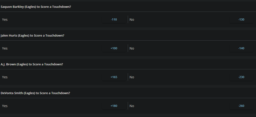
We can convert the lines to win probabilities and add them up to calculate the overround, as covered a couple of articles ago.
For the Saquon Barkley bet, the overround is 8.9%. For Hurts it's 8.3%, for Brown it's 7.4%, and 7.9% for Smith.
The overround for a normal spread bet is 4.5%. We saw it's about the same with NBA money lines. Because this book is reduced juice, overrounds on spread bets are around 2.6% -- for instance odds of -108/-102 or -105/-105 instead of -110/-110.
Prop bets have 2x the juice of a traditional spread bet, and over 3x reduced juice. That requires the gambler to win far more often just to break even.
Ways to potentially reduce bias
I've previously written about an experiment that showed gamblers tend to take the favorite, even when they've been told it's a worse bet than the underdog. That wasn't true of the Ringer teams last week. They only took 11 favorites out of 25, so they didn't show that particular bias. But I think the experiment gives a hint how to reduce bias in general.
The researchers found that people could be corrected of their bias towards favorites by writing out what they thought the lines should be before seeing what the lines were. It causes the person to actually try and do the math problem of whether the bet is a good investment or not, rather than anchoring on the price set by the market, and picking the better team, or the conventional wisdom.
It would be interesting to try having each team member decide what the fair line was, then average them out. Do predictions made that way perform better?
Similarly, it would be helpful to convert any odds from the American style (like +310, or -160) to the equivalent probability. People who have gambled a lot might have an intuitive sense of what -160 means, but for me, the equivalent 61.5%, or "about 5/8" is much clearer. I can imagine a large pizza missing 3 of the 8 slices.
Betting jargon and betting superstitions should be avoided. Does each bet make sense as a financial transaction? Personal feelings and the enjoyability of the bet shouldn't factor in. The quality of the game and who is playing in it shouldn't matter.
The bottom bun
Despite not being a gambler, the gambling podcasts I listened to were fairly enjoyable. It's basically Buddies Talk About Sports, which is a pleasant enough thing to have on in the background. Nobody would listen to Casey's Rational Betting Show, for multiple reasons.
The Mathletix Bajillion, week 2
The Ringer crew had a good week, collectively going 14-11 (56%). One team out of five is now in the green. mathletix still won the week, winning 60% of our bets.
As a reminder, one set of picks is generated algorithmically, the other randomly. I'll reveal which one at the end of the competition.
"line shopping" refers to how much money was saved, or extra money was gained, by taking the best odds available instead of betting at a retail sportsbook.
All lines as of Friday morning.
The Neil McAul-Stars
last week: 5-0, +504
line shopping: +4
- LAC -3 +100 (prophetX)
- TB +5.5 +100 (lowvig)
- MIN -3 +105 (lowvig)
- ARI +3 -101 (prophetX)
- SEA +3.5 -111 (prophetX)
The Vincent Hand-eggs
last week: 1-4, -334
line shopping: +6
- LAR -3 -110 (hard rock)
- SF -3 -101 (prophetX)
- DET +2.5 +100 (lowvig)
- TEN +6 -107 (prophetX)
- GB -7 -105 (prophetX)
Nov 07, 2025
Song: Charlie Musselwhite, "Cristo Redentor"
Are betting experts any good at what they do?
These days, nearly all talk about gambling I see on TV and the internet is sponsored by one of the sportsbooks. How good is all this sponsored advice?
There are quite a few shows that are just about gambling, but more common are ad reads from Youtubers or sportscasters who are sponsored by sportsbooks, but aren't really focused on gambling. These appear on-air in the middle of a game, or an ad break in a Youtube video.
Picks from sports announcers do terribly, as the Youtube channel Foolish Baseball has documented in their wonderful video, Baseball is Ruining Gambling.
As a numbers guy, it's baffling that anybody would follow these obviously sponsored picks at obviously juiced lines, given by obviously casual gamblers, but some people are taking them, because the sportsbooks keep paying for the ads.
Gambling is a social and parasocial activity now, another thing you do on your phone when you're bored that sort of feels like interacting with other humans, but isn't.
Some gamblers want to be on the same side of the bet as their favorite YouTuber, who give their favorite picks as a part of an ad read. The apps also allow you to follow people, and take the same bets they take. It's yet another one-way online relationship.
Other gamblers take bets to feel more connected to their team. Announcer parlays are invitations to take a financial interest in the game that you're already watching, not necessarily because you think the Brewers play-by-play guy is secretly a betting wizard. The baseball announcers don't seem to have much of an interest in gambling, or being touts. They're not there for our wholesome national pastime, gambling on sports, they're true sickos who are only interested the disreputable game of baseball. Putting together some half-ass parlay for the promo is part of their job. It's just another ad read. It may as well be a local roofing company or a personal injury lawyer.
Sportsbooks advertise because it makes them money in the long run. These companies seem pretty well-run, if nothing else. They want to sponsor people who are good at bringing in customers with a high Customer Lifetime Value -- people who will lose over and over again for years, making back the cost to acquire them as a customer many times over. That's it. That's the game. Why would they sponsor people who give good advice about gambling, or good picks?
Do people care whether gambling experts are actually good or not?
Some guys talk about gambling for a living. They discuss sports from the perspective of people who are gamblers first, and sports fans second. Everything's an angle, or a trend, or a bad beat. At the extreme, athletic competitions are interesting because betting on them is interesting, not because sports themselves are. These guys are both living and selling the gambling lifestyle, which I talk much more about in the book:
A parasocial relationship with a guy selling picks or talking about gambling on a podcast causes guys to want to form social relationships around gambling. They're Gambling Guys now. Which leads to an endless parade of dudes complaining about their parlays online, and, I would wager, annoying the heck out of their significant others. "It's a whole lifestyle, Sherri! Of course I had to get my tips frosted! I'm a Gambling Guy now!"
It's all imaginary. An imaginary relationship with a betting guru in the form of a "hot tip". An imaginary relationship with the sporting event or player in the form of a bet. An imaginary relationship with reality itself in the form of the rationalization about why the "hot tip" didn't win. An imaginary relationship between winning and skill.
Being a sports fan is already ridiculous enough.
Poking the bear, a bit
The Ringer is a website about sports and pop culture that has evolved into a podcasting empire. I like a lot of what they do, and I especially appreciate that they publish great writing that surely isn't profitable for the company. For the most part, I can just enjoy their non-gambling content and ignore that it's subsidized by gambling.
But they've done as much as anyone to normalize sports betting as a lifestyle, and deserve an examination of that. The Ringer wasn't worth a bajillion dollars before gambling legalization, back when they were doing MeUndies ad reads.
The Ringer has an incredible amount of content that's just Gambling Guys Talk Gambling with Other Gambling Guys, around 10 hours a week of podcasts, by my count. The Ringer's flagship show is the Bill Simmons Podcast, which usually devotes at least a couple hours a week to discussing which bets Bill and his pals think are good. (Previously satirized in Cool Parlay, Bro)
The site also has an hour long daily podcast about gambling, The Ringer Gambling Show, and several other podcasts that regularly discuss betting. As far as I know, all of their sports podcasts feature gambling ad reads, even the ones with hosts that clearly find gambling distasteful.
Several members of the Ringer's staff are full time Gambling Guys now. They talk about their addictions for a living, which must be nice. I've been talking about my crippling data science addiction on here for months without a single job offer.
Are these guys good at their job, though? (Are they good at their addictions?) The Ringer is currently having a contest betting on the NFL between five different NFL podcasts, four of which primarily cover sports gambling, which they're calling The Ringer 107. Here are their results through Week 9:
Every single one of the five teams is losing money against the spread. They don't make it clear on the website, but some bets are at -120 vig, so the records are even worse than they look.
It might be bad luck, right? I've written at length about how having a true skill level of 55% doesn't guarantee actually winning 55% of the bets.
Based on this data, it's extremely unlikely the gambling pros at the Ringer are just unlucky. I simulated 5 teams taking the same number of bets as the Ringer's contest so far. If every pick had a 55% chance of winning (representing picks by advantage players), then 99.5% of the time, at least one team does better than all five of the Ringer's did.
Even at a 50% winning rate, same as flipping a coin, the simulation does better than the Ringer 91% of the time. Based on this data, you'd be better off flipping a coin than listening to these gambling experts.
The easiest way to know they can't do it
If I talked about gambling for a living and was demonstrably good at it, I'd want everyone to see the proof. These guys almost never post their actual records over a long stretch of time, though. They will crow about their wins, and offer long-winded explanations as to why their losing picks were actually right, and reality was wrong. But it's hard to find actual win-loss records for them.
Last season, The Ringer's Anthony Dabbundo didn't appear to keep track of his record betting on the NFL against the spread at all (example article). This year, he has, so we know he's gone 37-37, and 20-25 on his best bets, despite some of them being at worse than -110 odds. His best bets have had a return of -16.7%, about the same as lazy MLB announcer parlays, and almost 4 times worse than taking bets by flipping a coin.
What odds would you give me that the Ringer goes back to not showing his record next season?
To be clear, I don't think Dabbundo is worse than the average gambling writer at gambling. I've never found a professional Gambling Guy that is statistically better than a coin flip. Dabbundo's job is writing/podcasting the little descriptions that go along with each of his picks. His job isn't being good at gambling, it's being good at talking about gambling. There is no evidence that he can predict the future but plenty of evidence he can crank out an hour of podcast content every weekday that enough people enjoy listening to. Predicting the future isn't really the value-add for these sorts of shows.
The curse of knowledge
I think it's significant that by far the worst team in the contest is the Ringer NFL Show, which is primarily not about gambling. It's a show by extreme football nerds, for extreme football nerds. Once in a while I listen to it while doing the dishes, and I'll go like 20 minutes without recognizing a single player or football term they're talking about. They are all walking football encyclopedias, as far as I'm concerned.
If gambling really were a matter of football-knowing, they should be winning. They aren't, because betting isn't a football-knowing contest.
I can see how being a true expert might make somebody worse at gambling. Every bet is a math problem, not a trivia question. A bet at a -4.5 spread might have a positive expected value, but a -5.5 spread have a negative expected value. People who are good at sports gambling can somehow tell the difference. Like life, sports gambling is a game of inches.
The folks on the Ringer NFL Show know the name of the backup Left Tackle for every team in the league, but I don't think that's really an advantage in knowing whether -4.5 or -5.5 is the right number for a particular game. Most of the cool football stuff they know should already be baked into the line, or is irrelevant. Sports betting is a lot more like The Price Is Right than it is like sports.
A great chef might know practically everything there is to know about food. They might know what type of cheese is the tastiest, how to cook with it, and so on. But if they went to the grocery store, that doesn't mean they would notice that they had gotten charged the wrong price for the cheese, or that they could get it 20% cheaper at another store. That's a totally different skillset and mindset.
People on these gambling shows spend several minutes explaining each of their picks, listing lots of seemingly good reasons. I think that having to give a good reason for each pick forces them into going with what they know, not considering that all the obvious information and most of the non-obvious information they have is already reflected in the line. Needing to be seen as an expert could lead them to pick the side with slightly less value on it, because they want to make a defensible pick. It's much better to have a good sounding reason for making a pick, and losing, than it is to have no reason for making a pick and winning.
In general, I think every bet has a more reasonable side and a crazier side. Anybody prognosticating for a living has a disincentive to pick the crazier side if they're going to have to explain the bet if they happen to lose. It doesn't if there was actually more value than the Browns. Losing on the Browns and then having to live with being the guy who bet on the Browns is two losses at once.
The Mathletix Bajillion, week 10
I figured I should take a crack at it. The season is mostly over, so it will be a small sample size, but let's see what happens. At the very least, it will force me to publish something at least once a week for the next couple of months, and if things go bad, work on developing the shamelessnesss of someone who gets paid to predict the future, even though they can't.
I'm going to make two sets of picks, one based on a proprietary betting model I created, the other purely random, based on rolling dice. At the end, I will reveal which team is which, and see how they do against the Ringer's teams.
I am an extremely casual fan of the NFL, so little to no actual ball-knowing will go into these picks. I probably know less about football than the average person who bets on football. I don't think that's really a disadvantage when the football experts are going 18-27 on the year.
I will take all bets at -110 odds or better. No cheeky -120 bets to goose the win-loss record a bit, like some of the teams in the Ringer competition have done. But I will also shop around between sportsbooks and take the best lines I can find, by checking sites like unabated, reduced juice sportsbooks like lowvig and pinnacle, and betting exchanges like matchbook and prophetx.
For the betting exchanges, I will only take spreads where there is at least $1000 in liquidity -- no sniping weird lines. Part of what I'm trying to show is that bargain shopping, which has nothing to do with football knowledge, can make a big difference. So I will shop pretty aggressively. Even if I lose, I will lose less fake money than I would at -110, which means I don't have to win as often to be profitable. I'm pretty confident I can beat the Ringer pros on that point at least.
Sources will be noted below.
Team names come from the 1995 crime drama Heat, starring Tom Sizemore, in accordance with the Ringer house style.
Picks were made Friday evening.
The Neil McAul-Stars
- ATL +6.5 -108 (fanduel)
- NO +5.5 -109 (prophetx)
- SEA -6.5 -110 (prophetx)
- PHI +2 -109 (Rivers)
- LAC -3 +104 (prophetx)
The Vincent Hand-eggs
- DET -7.5 -105 (prophetx)
- PIT +3 -109 (prophetx)
- TB -2.5 -110 (fanduel)
- CHI -4.5 -105 (fanduel)
- CAR -5 -110 (harp rock casino)
Nov 05, 2025

Song: Geraldo Pino, "Heavy Heavy Heavy"
Code: https://github.com/csdurfee/scrape_yahoo_odds/. See the push_charts.ipynb notebook.
NBA Push Charts
In the past couple of posts, I've looked at NBA betting data from BetMGM. There are multiple types of bets available on every game. A push chart maps the fair price of a spread bet to the equivalent money line bet. How often does a team that is favored by 3 points win the game outright? It's going to be less often than a team favored by 10 points. The money line should reflect those odds of winning.
You can find a lot of push charts online, but they tend to be based on older NBA data. With more variance due to a lot of 3 point shots, and more posessions per game, I wouldn't expect them to still be accurate.
Push charts are useful for assessing which of two different wagers is the better value. Here's an example of a game where different sportsbooks have different lines for the same game:
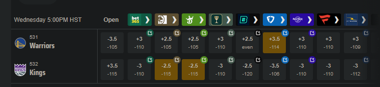
Say you want to bet on the Warriors. They have some players out tonight (Nov 5, 2025) so they're the underdogs, but they are also playing the dysfunctional Kangz, so it might be a good value bet. You could take the Warriors at either +3.5 -114, +3 -110, or +2.5 -105. Which bet has the highest expected value? If the Warriors lose by 3, the +3.5 bet would win, but the +3 bet would push (the bet is refunded), and the +2.5 bet would lose. A push chart can give a sense of how valuable the half points from +2.5 to +3, and +3 to +3.5, are. Is the probability of the Warriors losing by exactly 3 -- the value of getting a push -- worth going from -105 to -110?
[edit: the Warriors, without their 3 best players, led for most of the game before eventually losing by 5 after Russell Westbrook had one of his best games in years. So the line was only off by 2 points. The lines are often uncannily close, even when a bunch of weird stuff happens. Sometimes it all kinda cancels out.]
I'm going to do a push chart two different ways, then combine them. For almost every game over the last 4 years, we have the money line and the spread, so we can match them up directly. These will have the vig baked in. And as we saw previously, the money line for favorites has a slightly better expected value than the average bet on the spread. So it's going to end up a little biased.
We can also calculate a push chart without any vig by looking at winning percentage for every spread -- what percent of the time does a +3.5 point underdog actually win the game. It will need some smoothing, since the data will be noisy.
The retail NBA push chart
I matched up the spread and the money line for both the home and the away team on each game, then took the median of those values. Spreads in the range of -0.5 to +0.5 are very rare, as are spreads over -13.5/+13.5, so I've omitted those.
|spread |money line|
|------:|---------:|
| -13.5 |  -1000   |
| -12.5 |   -750   |
| -11.5 |   -650   |
| -10.5 |   -550   |
|  -9.5 |   -450   |
|  -8.5 |   -375   |
|  -7.5 |   -300   |
|  -6.5 |   -250   |
|  -5.5 |   -225   |
|  -4.5 |   -190   |
|  -3.5 |   -160   |
|  -2.5 |   -140   |
|  -1.5 |   -120   |
|   1.5 |    100   |
|   2.5 |    115   |
|   3.5 |    135   |
|   4.5 |    155   |
|   5.5 |    180   |
|   6.5 |    200   |
|   7.5 |    240   |
|   8.5 |    290   |
|   9.5 |    340   |
|  10.5 |    400   |
|  11.5 |    475   |
|  12.5 |    525   |
|  13.5 |    625   |
This gives us how BetMGM prices the value of individual points on the spread (with the vig figured in). This is sort of their official price list.
American style odds are symmetrical if there is no vig involved. A -400 bet implies a 4/5 chance of winning, and a +400 bet implies a 1/5 chance of winning. If the -400 bet wins 4/5 of the time and loses 1/5 of the time, the gambler breaks even, and vice versa. So a no-vig money line would be +400/-400.
The odds offered by the sportsbooks are asymmetrical, because they want to make money. We see that +13.5 on the spread maps to a +625 money line, but -13.5 maps to -1000. A +625 bet should win 100/(100+625), or about 14% of the time. A -1000 bet should win 1000/1100, or 91% of the time. Adding those together, we get 91% + 14% = 105%. That extra 5% is called the overround, and is the bookmaker's guaranteed profit, assuming they have equal wagers on both sides.
Here's what that data looks like as a graph, with some smoothing added.
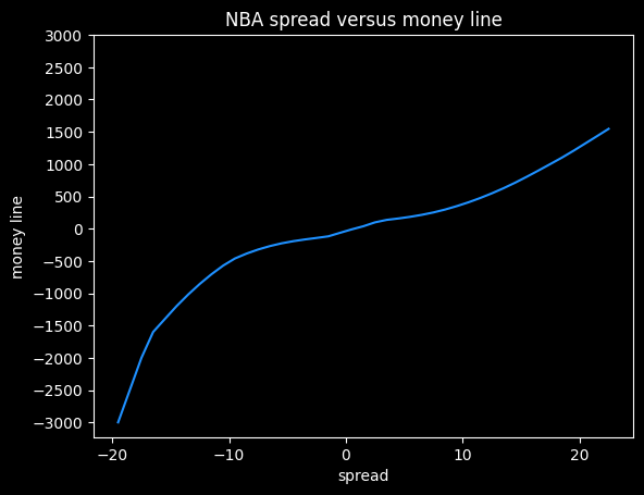
I think this shows the bias against heavy favorites that we saw previously. Note how the line gets much steeper moving from -10 to -20 on the spread, versus moving from +10 to +20.
At -20.5, this graph gives a payout of -5000, but at +20.5, it gives a payout of +1320. The fair payout is somewhere in between those two numbers.
If the fair payout is (-5000/+5000), then the underdog is getting way less of a payout (in essence, paying more in vig) than they should. If the fair payout is closer to (-1360/+1360), then the favorite is paying more in vig than they should. So the asymmetricality gives a clue that sportsbooks aren't splitting the vig down the middle, but it doesn't tell us the fair price.
Push charts based on win frequencies
We can estimate a fair price by going through all the games and see how often a +3.5 underdog wins outright, then convert that percentage to a fair money line. The problem here is that the results will be very noisy. We'd need hundreds or thousands of games at each spread value, and we only have 4,500 or so games overall. So it's gonna be chunky. We'll have to do some smoothing on it, (foreshadowing alert: it will lead to weird results later on)
Here are the win ratios by spread, combining both home and away teams:
| spread| win ratio |
|------:|----------:|
| -13.5 | 0.889764  |
| -12.5 | 0.835616  |
| -11.5 | 0.832487  |
| -10.5 | 0.789474  |
|  -9.5 | 0.747212  |
|  -8.5 | 0.762763  |
|  -7.5 | 0.745763  |
|  -6.5 | 0.701299  |
|  -5.5 | 0.643892  |
|  -4.5 | 0.6       |
|  -3.5 | 0.641682  |
|  -2.5 | 0.562393  |
|  -1.5 | 0.525535  |
|   1.5 | 0.474465  |
|   2.5 | 0.437607  |
|   3.5 | 0.358318  |
|   4.5 | 0.4       |
|   5.5 | 0.356108  |
|   6.5 | 0.298701  |
|   7.5 | 0.254237  |
|   8.5 | 0.237237  |
|   9.5 | 0.252788  |
|  10.5 | 0.210526  |
|  11.5 | 0.167513  |
|  12.5 | 0.164384  |
|  13.5 | 0.110236  |
A team with a -1.5 point spread wins 52.6% of the time, which is very close to the break-even point on standard -110 bets of 52.4%. So a gambler needs to be at least 1.5 points better than Vegas at setting the lines to expect to make money.
These odds have to be symmetrical. If a team favored by -4.5 wins 60% of the time, then a +4.5 point underdog has to win 40% of the time.
Unfortunately, this data is probably too chunky to give good results. -4.5 has a lower win rate than -5.5, which doesn't make any sense. The more negative the spread, the higher the win rate should be. Here's what it looks like with smoothing:
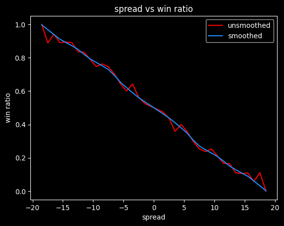
We can convert these winning percentages to fair (no vig) money lines:
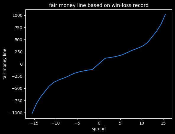
Converting to money lines doesn't break the symmetry. A -4.5 favorite gets a money line of -163, and a 4.5 point underdog gets a money line of +163.
This is just a first attempt. Different ways of smoothing the actual win rates will lead to different results.
|spread |fair ML |
|------:|-------:|
| -13.5 |   -677 |
| -12.5 |   -565 |
| -11.5 |   -454 |
| -10.5 |   -381 |
|  -9.5 |   -338 |
|  -8.5 |   -303 |
|  -7.5 |   -269 |
|  -6.5 |   -227 |
|  -5.5 |   -188 |
|  -4.5 |   -163 |
|  -3.5 |   -144 |
|  -2.5 |   -128 |
|  -1.5 |   -116 |
|   1.5 |    116 |
|   2.5 |    128 |
|   3.5 |    144 |
|   4.5 |    163 |
|   5.5 |    188 |
|   6.5 |    227 |
|   7.5 |    269 |
|   8.5 |    303 |
|   9.5 |    338 |
|  10.5 |    381 |
|  11.5 |    454 |
|  12.5 |    565 |
|  13.5 |    677 |
Crossing the streams, and an abrupt ending
What happens if we look at the difference between the no-vig moneylines, and what the sportsbook actually charges? Will it show us the favorite-longshot bias?
It turns out, it doesn't. The win frequency data is too noisy. I spent a lot of time spinning my wheels on it, before realizing I didn't have enough data. I will come back to the subject, though, because failure is more educational than success.
Oct 26, 2025

Song: Pigeonhed, "Glory Bound" (Dave Ruffy Remix)
Code: https://github.com/csdurfee/scrape_yahoo_odds/
A little crowd wisdom
Last week, we saw that for NBA spread bets, the more popular side wins 49.2% of the time. This matches what I've shown before -- the public is generally worse than a coin flip when betting on NBA basketball.
This week, I have some good news. There are some types of bets on the NBA where the public do a little better than expected. Not enough to make money, but better than picking bets by flipping a coin.
Money line bets and rationality
Last time, I looked at money line bets and showed that there is a bias against slight to heavy underdogs, and a possible bias against very heavy favorites. There's a lot I didn't get to, though. What kind of money line bets do the public prefer?
The public takes the home team 63% of the time, which is a little high given the home team wins 55% of games. The public also takes the money line favorite in 96% (4656/4839) of NBA games.
Is that rational or not? We know that favorites are a slightly better deal than underdogs on the money line, so in one sense it is. If someone offered you a free money line bet on the NBA, you should probably pick the favorite. The expected value is less bad than the underdog, so it's a better choice in the long run, and your chances of making some money on the bet are much higher, so it's perhaps a better choice as a single bet as well.
A gambler taking half favorites and half underdogs has a chance at winning 100% of their bets, but someone taking a highly imbalanced number of favorites (or underdogs) will have a whole lot of guaranteed losses. The gambler might correctly pick every single favorite, but close to half of their bets on favorites are still going to be losses.
Getting pigeonholed
Money lines are all at different odds, which complicates things. For this example, let's say the gambler is taking spread bets, with both sides having a roughly equal chance of winning. There are 1230 games in the season, we'll assume the favorite is a slightly better deal, so wins 51% of the time, and the gambler takes the favorite 96% of the time. Over 1230 games, the favorites go 627-603. The gambler takes 1181 favorites and 49 underdogs on the season.
The best they can possibly do on favorites is 627/1181 (53%), assuming they somehow manage to correctly bet on every single favorite that won that season. The gambler captured all of the favorites that won, so the rest of the games left over are underdog winners, meaning they'd go a perfect 49/49 in underdog games. Overall, the best they can do is (627+49)/1230, which is 54.9%. Since the break-even point is 52.4%, most of the profits are coming from the 49 underdog games.
By taking so many favorites, the pigeonhole principle means the gambler has to be perfect just to hit a 54.9% win rate. As I showed in Do you wanna win?, 54.9% is good enough to have a positive expected value on bets, but it's low enough that losing money over 1,230 bets is very possible, even with proper bankroll management. If hitting that number requires you to be perfect, it seems like a bad plan.
Here are the frequencies of odds taken by the public on the money line. There's an awkward gap in the middle. In the American way of writing odds, favorites are always -100 or smaller, and underdogs are always +100 or bigger.
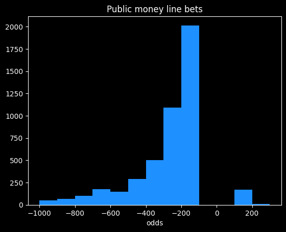
The public mostly takes bets in the -100 to -300 range, which is in the range where money line bets have been a slightly better value than spread bets over the past four seasons, so good for them. The biggest underdog bet the public took in nearly 5,000 bets was at +400 (implying the underdog had a 20% chance of winning.)
The public achieved -2.87% rate of return on money line bets. That's bad compared to the 0% rate of return offered by not betting, but it's better than the -4.5% on spread bets, and way better than the -20% on some types of parlay bets. Someone fading, or taking the opposite bets to the public, would achieve a -6.4% rate of return.
On the rare occasions the public does take the underdog, they make a profit. On those 183 bets, the public notched a +2.43% rate of return. Bets on underdogs will have a high amount of variance, so there could be some luck involved.
Point totals
In addition to who will win the game, gamblers can wager on how many total points will be scored. For instance, if the final score is 120-115, the point total would be 235. If the line was 230, the OVER side would have won, and the UNDER lost.
The point totals are pretty balanced. The over wins 50.6% (2672/5273) of the time. However, the public takes the over 88.3% (4660/4839) of the time.
The public did a little better than a coin flip, winning 51% of over bets, and 54.5% of the 178 under bets.
I was curious whether the percent of bets on one side was correlated with higher winning percentage. If 99% of the public took the over, is that a safer bet than if only 51% of the public took it? I've broken down the public's bets on the over by quartiles:
| start % |
end % |
num games |
win % |
| 50 |
73.9 |
1165 |
50.5% |
| 73.9 |
82.4 |
1164 |
51.4% |
| 82.4 |
88.4 |
1163 |
50.9% |
| 88.4 |
100 |
1168 |
51.5% |
For 1,000 observations, a 95% confidence interval is roughly +/- $\frac{1}{\sqrt{1000}} \approx \frac{1}{\sqrt(33*30)} \approx 3\%$, which is much bigger than the difference between 50.5% and 51.5%. So the difference isn't significant.
Are sportsbooks leaving money on the table?
It's odd to me that the over would win more than 50% of the time when that's the side that usually has the most money on it. That's not a huge imbalance, but the sportsbooks would be making more money if they increased the point totals a bit so the over loses 51% of the time instead.
Gamblers betting on point totals are probably a little more savvy than ones betting the lines. It's kind of an odd thing to bet on. Doesn't matter who won, doesn't matter whether it was a good game or not. All bets are math problems, but point totals are more obviously a math problem than money lines or spreads.
Do point totals tell us anything about the evolution of the NBA?
It's possible sportsbooks haven't kept up with the evolution of the game. NBA point totals have gotten much higher over the past decade due to faster pace, better shooting and more 3 pointers.
Here is a graph of moving averages of the point totals for the past four seasons:
Point totals go down at the end of every year. That's because playoff games tend to be more tightly contested than regular season games. The vertical line is where the playoffs start.
There appears to be an increase in average point totals during the 2021 season, but it's stayed fairly consistent since then, with one notable exception. There's an big dip in point totals during the 2023 season, around game 800. This is almost certainly due to a directive from the NBA telling officials to call fewer fouls. Fans (and presumably gamblers) noticed right away, but the NBA only admitted the change well after the fact. Luckily, nothing has happened since then to further undermine trust in the NBA!
Oct 19, 2025

Song: The Meters, "People Say"
In a previous installment, I looked at statistics about NBA gambling that I obtained from sportsbookreview.com. I thought it was pretty interesting, but there were some huge gaps in the data, and I wasn't sure what sportsbook some of it was coming from. So I didn't have a ton of confidence in my results.
I thought it was a pretty cool idea, though, so I tracked down a better source of data via Yahoo's NBA pages. Yahoo loads gambling data from the BetMGM sportsbook, and I found a nice internal API for getting it all. I was able to get data on the past four seasons of NBA games, and although data is missing for some games, it's much more complete, and has a bunch more info, than the original dataset.
All code and data is available online at https://github.com/csdurfee/scrape_yahoo_odds/. The explore.ipynb notebook has all the calculations and charts used in this article.
As usual with gambling content, I'm presenting this data because I think it is interesting to study how it works, and what it tells us about basketball and human nature. I don't recommend you bet based on information in this article, or at all.
The data I'm looking at is every regular season and playoff NBA game from the 2021-22, 2022-23, 2023-2024 and 2024-2025 seasons. No preseason games or All-Star games, but the Emirates NBA Cup championship game is included.
There are 435 games that are missing stake/wager data (the percentage of money and bets placed on each side, respectively.) That leaves 4,840 NBA games that I have analyzed. The stake and wager percentages seem to be pretty similar to each other, so I'm just using the wager data.
What do the spreads look like? Are there any obvious biases?
The home team went 2393-2447 (49.5%) against the spread over the last 4 years. The favorite team went 2427-2413 (50.1%) against the spread in that time.
The home team was the favorite in 3044/4840 (62.8%) of games. The median spread is the home team -3.5 (favored by 3.5 points). Here are the frequencies:
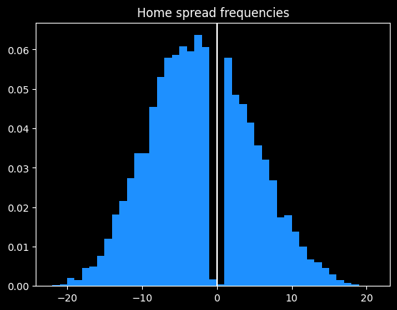
Basketball games never end in a tie, and there are strategic reasons why NBA games rarely end in a one point difference.
Around half of all home lines are one of -2.5, -1.5, -4.5, -3.5, +1.5, -6.5, -5.5, -7.5 or +2.5 (in descending order of frequency).
98.3% of all MGM lines are on the half point (eg 8.5 instead of 8). This is so the sportsbook can avoid pushes (ties), where they have to give everybody's money back.
More evidence of the folly of crowds
First, some betting jargon, if you're new here. Teams that are popular with bettors are known as public teams. The side of a particular bet that gets more action is known as the public side. If that side of the bet won, people say the public won. Betting the less popular side is known as fading the public. When the less popular side wins against the spread, people will say Vegas won or sharps won (a sharp is someone who is good at betting, as opposed to a square, who is bad at betting.)
Looking at the stake/wager data, we can find out which team was more popular to bet on for each game. How do those public teams do collectively? Are the public any better or worse at making picks than just flipping a coin?
Due to well-earned cynicism, I was expecting that the public would be a bit worse than a coin flip. And they are. The public went 2381-2459 (49.19%) against the spread over the past 4 years.
The public greatly prefer betting on the away team. 2742/4840 (56.7%) of public bets are on the away team. The public also greatly prefer favorites. 2732/4840 (56.4%) of bets are on them.
Here's how the bets break down:
|
favorite |
dog |
| AWAY |
1215 |
1527 |
| HOME |
1517 |
581 |
This crosstab is a little misleading. The home team is usually favored, so there are fewer home underdogs than road underdogs. However, there's still a discrepancy. The home team is the underdog 37% of the time, but only 27% of bets on underdogs are on the home team, and 28% of bets on the home team are on underdogs.
Of the 4 categories, the only one with a winning record for the public is away favorites -- 623-592 (51.3% win rate). The second best type is home underdogs, which went 289-292 (49.7%).
The two most popular bet types with the public are big losers. Away underdogs went 742-785 (48.6%), and home favorites went a putrid 727-792 (47.9%).
Overall, someone taking the public side of every bet over the past 4 years would have lost 324 units. If they bet $100 on every game, they would be down $32,400. Someone taking the opposite side of all these bets (fading the public) would "only" lose 160 units, or $16,000.
It would've been profitable betting reduced juice (risk 106 to win 100 instead of 110) to fade the public on all away underdog and home favorite picks. The problem with that strategy is that reduced juice sportsbooks actively attract smart players, so they have sharper (more accurate) lines. A retail sportsbook like BetMGM doesn't need sharp lines because they ban any players who win too much. Against sharp lines, I wouldn't expect the strategy to be profitable.
How have teams done against the spread over the past 4 years?
Over the past 4 seasons, team records against the spread appear fairly random. The only real outlier is the Oklahoma City Thunder, who have won an astounding 59.3% of their games against the spread. This is remarkable to me because they've been one of the best and most hyped teams in basketball the past couple years. They dominated the league last season, winning 68/82 (82.9%) games, and the NBA Championship. They're not exactly an under the radar team. Yet they appear to have been underestimated by both Vegas and the betting public.
|
|
| Oklahoma City |
0.593 |
| Toronto |
0.544 |
| Boston |
0.54 |
| Memphis |
0.529 |
| Orlando |
0.528 |
| Chicago |
0.516 |
| Dallas |
0.515 |
| Cleveland |
0.508 |
| New York |
0.504 |
| Golden State |
0.504 |
| Indiana |
0.503 |
| Houston |
0.502 |
| LA Lakers |
0.5 |
| Miami |
0.499 |
| Philadelphia |
0.498 |
| Minnesota |
0.496 |
| Detroit |
0.495 |
| Utah |
0.492 |
| Denver |
0.491 |
| Sacramento |
0.49 |
| LA Clippers |
0.489 |
| San Antonio |
0.488 |
| Charlotte |
0.487 |
| Milwaukee |
0.484 |
| Brooklyn |
0.483 |
| Portland |
0.477 |
| New Orleans |
0.476 |
| Phoenix |
0.471 |
| Atlanta |
0.442 |
| Washington |
0.439 |
While it's not impossible OKC's record against the spread is due to chance alone, a 59.3% winning percentage over 332 games seems like a failure of the market.
Who are the most common favorites?
Boston has been the most dominant, being favored in 319/361 (88.4%) of their games over the past four seasons, followed by Milwaukee, Denver and Golden State.
Detroit, Charlotte, Washington and San Antonio were the most common underdogs.
|
|
| Boston |
0.884 |
| Milwaukee |
0.734 |
| Denver |
0.711 |
| Golden State |
0.707 |
| Cleveland |
0.706 |
| Phoenix |
0.691 |
| Miami |
0.608 |
| Minnesota |
0.595 |
| LA Clippers |
0.588 |
| New York |
0.572 |
| Philadelphia |
0.568 |
| Memphis |
0.56 |
| Oklahoma City |
0.557 |
| Dallas |
0.542 |
| Sacramento |
0.535 |
| LA Lakers |
0.509 |
| Atlanta |
0.498 |
| Indiana |
0.456 |
| Chicago |
0.426 |
| Toronto |
0.414 |
| Brooklyn |
0.411 |
| Utah |
0.406 |
| New Orleans |
0.385 |
| Orlando |
0.358 |
| Houston |
0.309 |
| Portland |
0.245 |
| San Antonio |
0.215 |
| Washington |
0.213 |
| Charlotte |
0.194 |
| Detroit |
0.188 |
Who are the most common public teams?
We saw the public likes to bet on the away team, and the favorite. Do they have team-specific tendencies?
They certainly do. The LA Lakers and Golden State Warriors are most popular, being the picked by the public in 72% of their games. Detroit and Orlando are the least popular, only getting the majority of bets in 31% of their games.
|
|
| LA Lakers |
0.716 |
| Golden State |
0.716 |
| Milwaukee |
0.694 |
| Phoenix |
0.607 |
| Denver |
0.603 |
| Dallas |
0.577 |
| Boston |
0.557 |
| Memphis |
0.551 |
| Chicago |
0.545 |
| Indiana |
0.541 |
| Philadelphia |
0.538 |
| Cleveland |
0.52 |
| Miami |
0.519 |
| Utah |
0.518 |
| Oklahoma City |
0.518 |
| Minnesota |
0.504 |
| LA Clippers |
0.502 |
| Brooklyn |
0.497 |
| Atlanta |
0.495 |
| New York |
0.484 |
| San Antonio |
0.436 |
| Washington |
0.425 |
| Sacramento |
0.417 |
| Houston |
0.401 |
| Toronto |
0.382 |
| Charlotte |
0.359 |
| Portland |
0.341 |
| New Orleans |
0.322 |
| Detroit |
0.314 |
| Orlando |
0.311 |
This is a very similar ranking to what I saw in the previous data -- the public don't appear to be picking bets for purely rational reasons. They like to bet on popular teams, good teams, and teams with popular players. They don't like to bet on unpopular or bad teams, even though both sides have the same chance of winning against the spread. It makes sense as an aesthetic choice, but not as a mathematical choice.
There is a bit of correlation (r = .08) between team popularity and their record against the spread. Bettors do slightly prefer to bet on teams that do well against the spread:
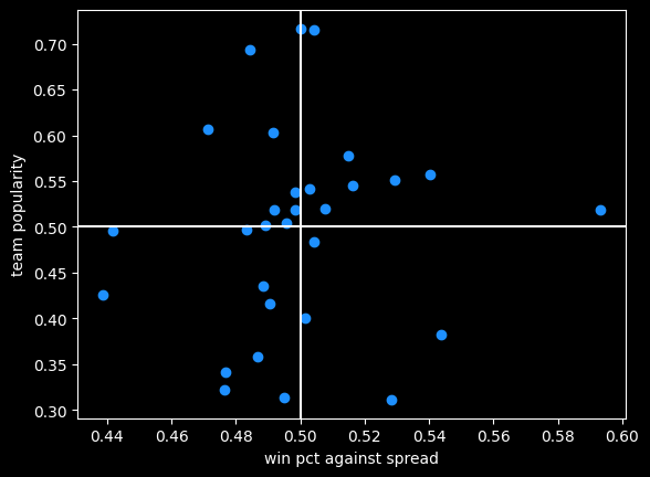
Oklahoma City is that lonely dot far off to the right, far better than every other team but only slightly more popular than average.
Money lines and the favorite/longshot bias
So far I've only been looking at bets against the spread. This new dataset also includes info on money line bets.
In some ways, money line bets are easier to understand -- just bet on the team you think will win. If you like the favorite, you will win less than you risk; if you like the underdog you win more than you risk. If it's say Oklahoma City versus Dallas, the two sides might be OKC -320 (risk $320 to win $100, implying about a 75% chance of winning) and DAL +260 (risk $100 to win $260).
With spread bets, both sides have an equal chance of winning, and are usually priced the same. But with money lines, the gambler doesn't know the true odds, so they don't know the vig they're paying.
There is data to suggest that underdogs pay more in vig, and are therefore more profitable for the sportsbook. This is called the favorite-longshot bias -- conventional betting wisdom is the expected value of taking an underdog money line bet (especially a big underdog) is lower than taking the favorite. People who bet the underdog are in essence paying a premium to have a more thrilling outcome if they do win.
While it's a documented phenomenon in horse racing, there's some debate as to whether it exists in general, so I analyzed the 4,634 games with money line betting data.
If somebody always bet the favorite on every NBA game, or the underdog, what would be their rate of return? Is it better or worse than the -4.5% rate on spread bets?
I did find evidence of the favorite-longshot bias in the NBA money lines. When risking a constant amount of money on each bet, underdogs had a rate of return of -5.47% versus -4.09% for favorites. Favorites between -200 and -400 offer the best rate of return of any type of money line bet, at -2.97%. Every single type of underdog bet does worse than -4.5% of the typical spread bet.
| label |
start |
end |
num games |
return % |
| all faves |
-9999 |
-1 |
4839 |
-4.09% |
| mild faves |
-200 |
-1 |
2174 |
-4.19% |
| heavy faves |
-400 |
-200 |
1612 |
-2.97% |
| huge faves |
-9999 |
-400 |
1053 |
-5.59% |
| all dogs |
1 |
9999 |
4634 |
-5.47% |
| mild dogs |
1 |
200 |
2440 |
-5.60% |
| heavy dogs |
200 |
400 |
1430 |
-5.69% |
| huge dogs |
400 |
9999 |
764 |
-4.65% |
The number of dogs and favorites aren't equal because some games have money lines where both sides are negative, say -110, like a traditional bet with a spread of zero. There's also a big asymmetry when the odds are long. For instance the favorite might be -800 and the underdog is +561. That doesn't represent a huge vig, it's just a quirk of how American-style odds work (covered in the book).
Caveats and bootstraps
The table above isn't telling the whole story. I'm not conveying a sense of the volatility in the rate of return. Huge underdogs have a bigger payout when they do win, so the outcomes are going to be a lot more variable than betting the favorites.
-4.65% is the best estimate of the rate of return for huge underdogs, but maybe we just got lucky, or unlucky. A couple of longshot bets winning or losing could drastically change the overall return rate.
To test volatility, I used bootstrapping, previously covered in one in e. I repeatedly randomly sampled 80% (611/764) of the huge underdog bets and calculated the rate of return on that set. Looking at the range of outcomes helps illustrate the variability of these bets.
Doing that 100 times leads to a pretty wide spread of rates of return:
Although the mean value is close to the overall mean, 15% of bootstrapped samples actually had a positive rate of return. This is similar to what we saw in cool parlay, bro, where due to variance, even gamblers with no advantage over the house had a small chance of making money over a long period of time off of parlays. I described that situation "like a lottery where you have a 12% chance of winning $3,617, but an 88% chance of losing $10,221." This is a similar proposition.
Bridgejumper parlays and p-hacking
We'd need a lot more data to get a crisp estimate of the rate of return on huge underdogs, but we can have more confidence in the estimated -5.59% rate for huge favorites. Huge favorites being disadvantaged kind of contradicts the favorite-longshot bias theory, but it doesn't surprise me at all due to a strange phenomenon I've seen over and over again online.
It's a type of bet sharps might call "bridgejumper parlays" and squares on the internet unironically call "free money parlays" -- a parlay of a whole bunch of heavy favorite money lines together.
The gambler starts with some heavy favorite they like and keep adding more heavy favorites to the parlay till they get plus odds (they can win more than they risk), ending up with 5-6 heavy favorites on the same parlay. They will pick legs of the parlay from different sports, if necessary. There usually aren't enough heavy favorites in the NBA on a particular night to get to the magic > +100 payout.
An example you might see posted on reddit or twitter would be a 6 leg parlay with a payout of +105 like:
- Celtics -600
- Nuggets -900
- OKC -1000
- Lakers -600
- Duke -600
- Some UFC Guy, because they needed a sixth bet -700
I've talked to a couple people who take bridgejumper parlays, and they genuinely seem to think they've found some kind of glitch in the matrix -- all of the legs of the bet have a high chance of winning, therefore the bet is a sure thing.
A sensible person would know that sportsbooks aren't in the business of offering free money so maybe they're missing something. A humble person would assume they probably hadn't discovered some clever trick the sportsbooks don't know about. But most people who get into betting aren't sensible or humble (they think they can see the future, after all), so for a certain class of bettor, this type of wager just feels like a sure thing.
In parlay form, the fallacy seems obvious to me. Just because the individual risk on each leg of the parlay is small, that doesn't mean the combined risk is.
There's a more sophisticated version of this fallacy in statistics called p-hacking. As always, there's an xkcd about it. A particular experiment might have a 5% chance of giving a false result. 5% is a pretty small number. But if you do 13 of those experiments, there's about a 50% chance that at least one of them will give a false result. Even people who are good at math and science probably don't have a good sense of what $.95^{13}$ equals. It's sort of like a 13 leg parlay of money line bets at -1900.
Next time: more on point totals, money lines, and human nature.